
We will go through the remaining five principles from the previous blog in this blog.
Recognition Rather than Recall
Recognition pattern is much more powerful and efficient than making users recall their memory – Try to reduce the information that users have to remember.
Humans have limited short-term memory. It is easier for the human brain to recognize information immediately rather than having to remember from past experiences.
Web User Interfaces has made the application of this principle very easy compared to coding and more error-prone methods. The selection process of what to choose can be easier if the user is presented with a set of options rather than asking, "What and how many do you want?" without any context or choices.
While performing a task, the users must be presented with clear instructions that are visible or easily retrievable whenever appropriate.
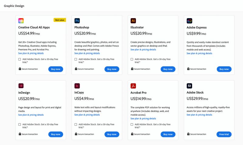
Flexibility and Efficiency of Use
Features that can speed up the task completion time can benefit both novice and experienced users.
Giving users the freedom of which method to use can be very helpful. Shortcuts that are almost invisible with simple actions can sometimes make a huge difference in how the product can be more efficient. Repetitive actions can be solved by using very simple gestures or shortcuts on keyboards which the customers will learn through the use of the product or system.
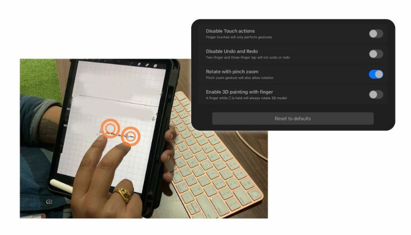
While designing such heuristics, we should keep possible information overload in mind. For example, gestures like the "double-tap like" on Instagram or double-finger double-tap Undo in Procreate are quite minimal and easy to execute actions. We should also consider what other systems or products share in common to avoid drastic confusion.
Aesthetic and Minimalist Design
Removing irrelevant information and focusing on the essentials helps the user reach their primary goals – Communicate, don't decorate.
Keeping only the bare minimum ensures that the visual elements of the interface keep the user away from distractions and helps them prioritize their goals.
Curation of material must be done in such a way so that users don’t become overwhelmed with irrelevant data.
Help Users Recognize and Diagnose and Recover from Errors
Error messages should be direct and precise, followed by a constructive suggestion or solution.
Informing the user that an error has occurred in technical terms won't help general users nor give them various solutions. Users prefer the diagnostics process to be fluid and seamless as possible.
Limiting options reduces cognitive load. Instead of guiding the user to go through the whole UI, offer a solution with a minimum number of interactions.
Help and Documentation
Sometimes it may be necessary to provide documentation to help users understand how to complete their tasks.
Performing complex interactions or high-volume tasks can sometimes overwhelm users and make them forget what to do. In these cases, accessible documentation is required so that players or users can figure out the next step.
For example, displaying suggested questions or options when the user clicks the search bar eases and speeds up the user's task of typing the whole sentence.
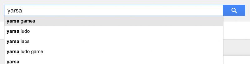
Content should be easy to search and focused on the user's task; moreover, the information suggested must be relevant and easy to scan through.
Thank you for reading, subscribe with the buttons below to keep yourself updated with the latest blogs!