
Heuristics are "rules of thumb" or methods to find usability flaws in design by judging them relative to known principles. This 2 part blog will go through the 10 principles devised by human-computer interaction researcher Jakob Nielsen.
He is best known for the "discount usability engineering" movement for efficiency improvements of user interfaces for websites and has invented several methods, including the heuristic evaluation.
Visibility of System Status
The system should communicate to the user what is going on.
Proper feedback given within a reasonable time prevents the frustration of use. The system should show a meaningful, clear reaction that helps users achieve their goals without friction. Moreover, open and continuous communication between the device and the user makes the system more reliable and predictable.

For example, in a mobile interface, information such as battery life, Network or WiFi connection status, time, etc., are essential to communicate to the user about the phone's status. Similarly, in video games, the omnipresence of health/life bar, time remaining, etc., are crucial information to the gamer/user.

Match between the System and the Real World
Speak the user's language – everybody should be able to understand.
Decision making is easier when there is little need to spend time familiarising themselves with new and unique terminologies. Do not assume your understanding of words or concepts will match your users.
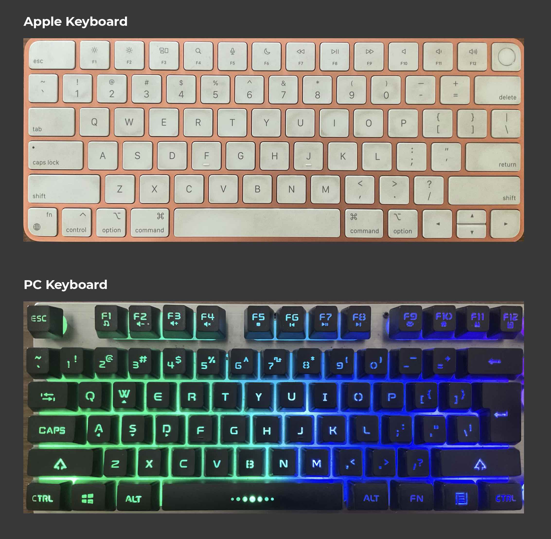
The first mobile interface designs were made in such a way to communicate real-world use of the application in the software, to make it approachable to the world without a smartphone back then.
The skeuomorphic design style was used in the first Computer Operating systems and icons to match the digital system with the real world. This design contained realistic images of what people are familiar with and used to. Today the design style has shifted more to a flat design as the understanding of the digital media is widespread globally.

User Control and Freedom
Make actions reversible – be forgiving.

Your software should have an emergency exit for users after making a mistake. Back, Forward, Undo, and Cancel buttons on web browsers are prime examples of which actions are useful when you end up someplace unintended. This avoids the user getting stuck after a small mistake.
Consistency and Standards
User interface design should be predictable and learnable
Users prefer your product to work the same way as other products they have already used or experienced.
Trends are meant to be followed. Years of design iterations have resulted in concrete standards, just like we see on websites, apps, and video games. The use of terminologies, symbols, colours or actions should not be different from most of the existing designs.
Error Prevention
Design a system that prevents a problem from occurring – eliminate error-prone conditions or present users with a confirmation option before committing to the action.
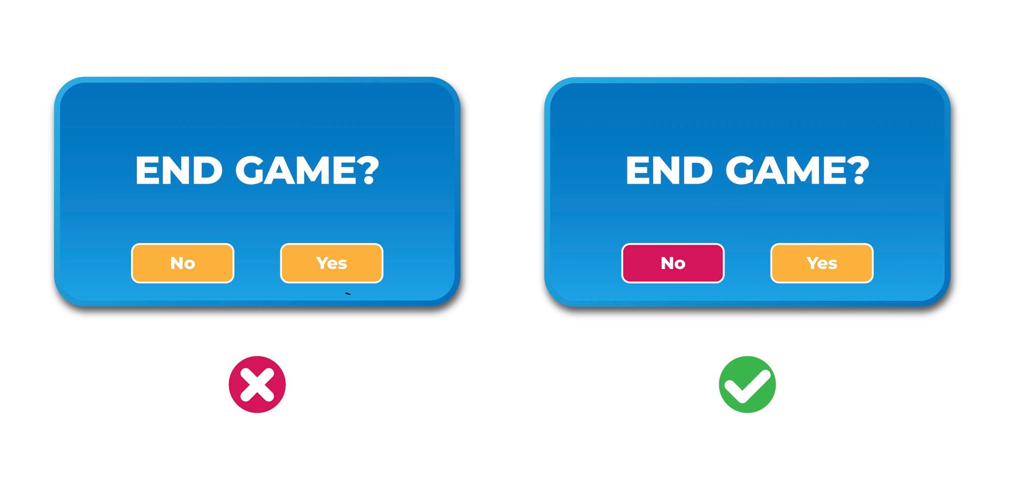
Preventing serious errors through proper designs can be done using clear instructions and indicators: Contrasting colours, sizes, sound or even physical barriers. Due to the speed-accuracy trade-off, fast movements and small targets result in greater error rates.
This article will be continued in Part 2 of Usability Heuristics.