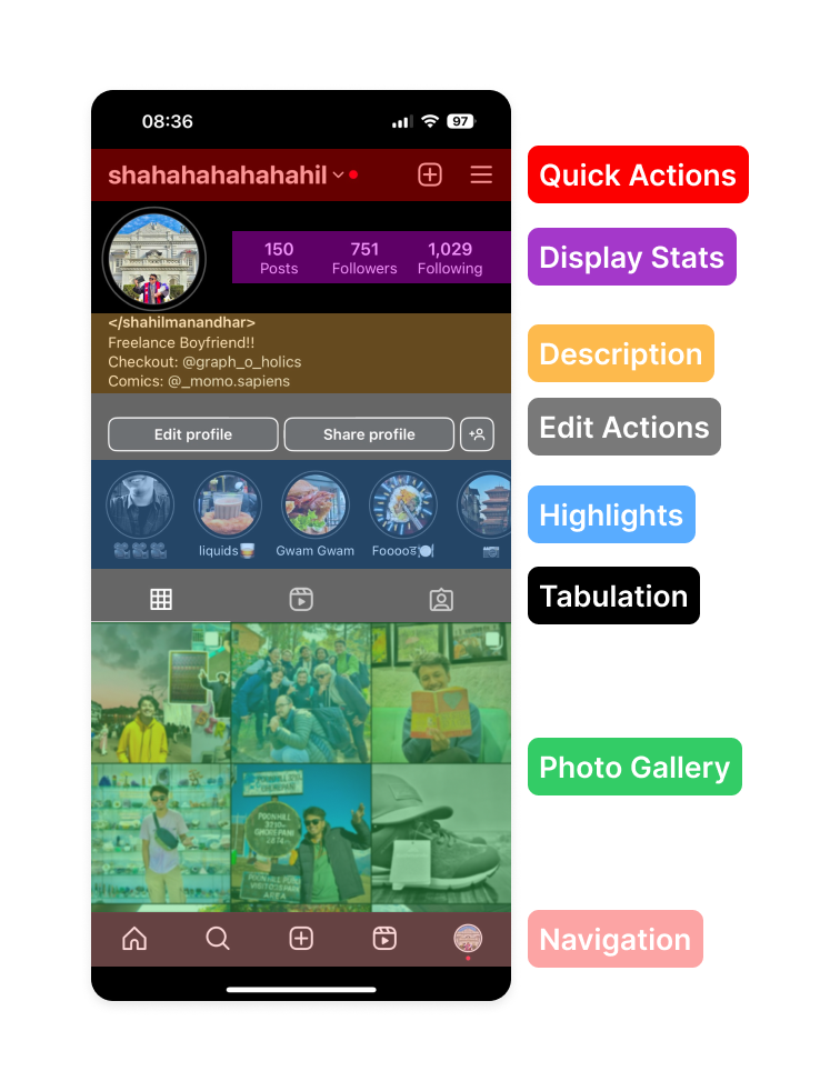
Introduction:
To build smooth and user-friendly interfaces in the ever-evolving field of User Experience (UX) design, where every pixel is important, it is essential to understand and apply fundamental principles. The Law of Proximity is one such foundation. This simple but frequently ignored principle states that objects physically close to one another are seen as related or grouped. We will explore the significance of the Law of Proximity in UX design and how it helps to create user-friendly digital experiences as we delve into the complicated context of this law in this blog.
The Basis of the Law of Proximity:
The Law of Proximity finds its roots in Gestalt psychology, a school of thought that studies how humans perceive and interpret visual information. Coined by Gestalt psychologists in the early 20th century, this law highlights our innate tendency to organize elements based on their spatial closeness. In UX design, this principle is a guiding force behind creating logical and visually comprehensible layouts.
Visual Organization and Grouping:
At its core, the Law of Proximity emphasizes the importance of visual organization. By strategically placing related elements near each other, designers can guide users through content effortlessly. Consider a webpage with a list of products: by grouping product names, prices, and descriptions together, users can swiftly scan and comprehend the information without unnecessary cognitive load.

Creating Hierarchy and Emphasis:
Incorporating the Law of Proximity enables designers to establish a hierarchy within a design. Elements that belong together are visually connected, signalling their relationship and importance. This hierarchical structure aids users in prioritizing information, focusing on key details, and understanding the flow of content. Whether it's a call-to-action button next to relevant information or a series of related icons, proximity helps convey a clear message.
Application in User Interface (UI) Design:
UI design thrives on clarity and efficiency. The Law of Proximity is pivotal in organizing UI elements to enhance user interaction. Take a mobile app, for instance, where buttons, icons, and text must seamlessly work together. Through strategic proximity, designers can ensure that users intuitively recognize how different elements function and relate, streamlining the overall user experience.
Overcoming Clutter and Cognitive Load:
In the digital landscape, cluttered interfaces can overwhelm users and hinder their ability to absorb information. By adhering to the Law of Proximity, designers can declutter interfaces, creating a sense of order and reducing cognitive load. Users can quickly discern patterns and associations when similar elements are visually connected, making the journey more enjoyable and efficient.

Case Studies: Real-World Applications:
E-commerce Checkout Process
Consider an e-commerce checkout page. The billing information, shipping details, and payment options are closely grouped, providing a logical flow for the user. Applying the Law of Proximity simplifies the checkout process, ensuring users can navigate effortlessly from one step to the next.
Social Media Feeds:
In social media feeds, where diverse content is presented, the Law of Proximity comes into play to organize posts and their associated interactions. Comments, likes, and shares are typically grouped near the post they pertain to, fostering a cohesive and understandable layout.

Challenges and Considerations:
While the Law of Proximity is a valuable tool in UX design, balancing proximity with other design principles is essential. Overusing or misusing this principle can lead to unintended associations or hinder the visual flow. Designers must be mindful of the context and content, ensuring that proximity enhances, rather than confuses, the user experience. The end goal of any strategy is to achieve a good user experience rather than just good looking UI.
The Future of UX Design: Beyond Proximity
As technology evolves, so does the field of UX design. While the Law of Proximity remains a timeless and foundational principle, designers continue to explore innovative ways to guide users through digital spaces. From augmented reality interfaces to voice-activated interactions, the principles of proximity will adapt to new modalities, ensuring that users can effortlessly navigate and comprehend evolving digital landscapes.

Conclusion:
In the intricate tapestry of UX design, the Law of Proximity emerges as a silent yet powerful force, shaping how users perceive and interact with digital interfaces. This principle is a cornerstone of effective design, from creating logical layouts to establishing visual hierarchies. As we navigate the ever-evolving digital realm, understanding and applying the Law of Proximity will continue to be a key element in crafting user experiences that are not only visually appealing but also effortlessly intuitive. By embracing the art of visual organization, designers can elevate their creations and pave the way for a more user-centric and accessible digital future.
Thank you for reading the article. Catch you in the next one.
