Keeping things simple and clear in User Experience (UX) design is crucial. One of the key principles UX designers swear by is Occam’s Razor. It's like the golden rule for making user interfaces that just make sense. In this deep dive, let's discuss what Occam’s Razor means, why it's a big deal in UX design, and check out some real-life examples of interfaces that totally nail it.
Understanding Occam’s Razor
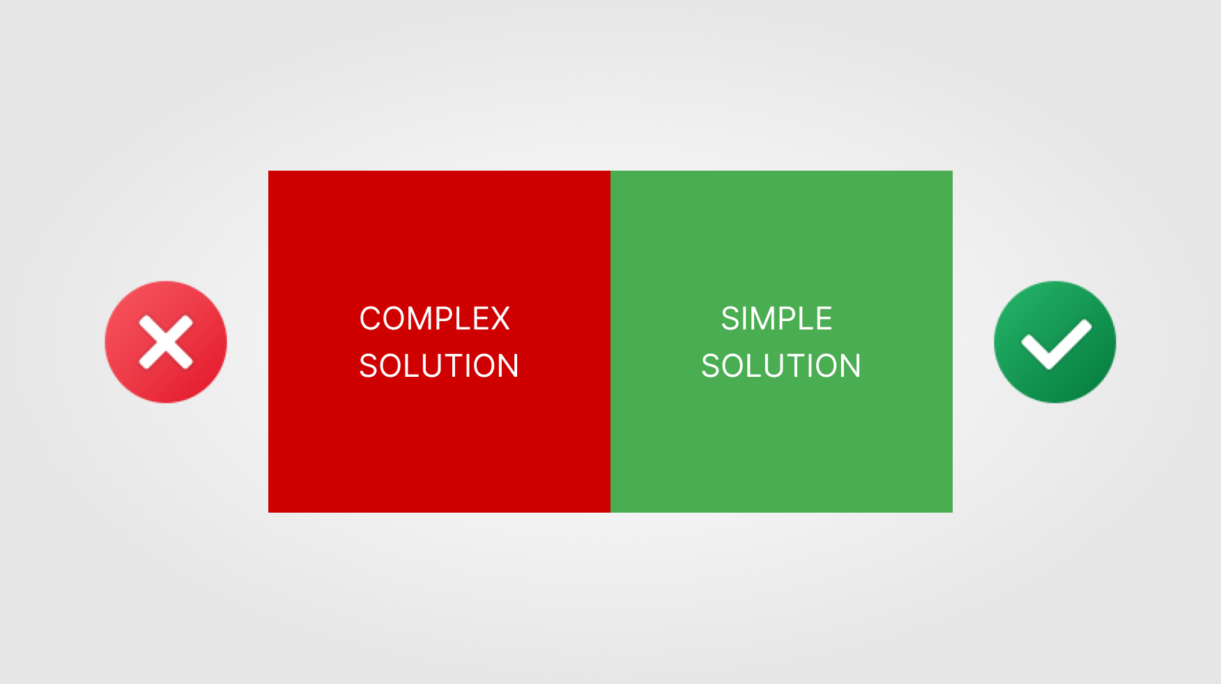
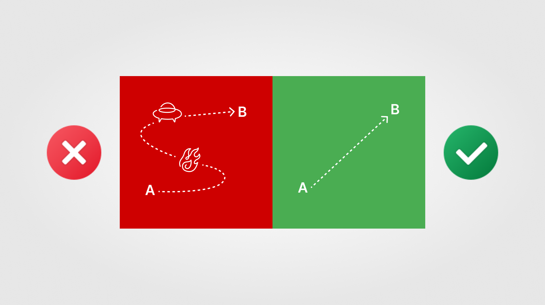
Imagine you're faced with a tricky problem, and it feels like there could be multiple solutions. That's where Occam's Razor, credited to the 14th-century thinker William of Ockham, steps in. This nifty problem-solving principle suggests that the simplest one is usually the right call when different ideas compete for attention.
So, instead of getting tangled up in complex theories or adding unnecessary complications, Occam's Razor nudges you for a straightforward, stripped-down explanation. It's all about making things simpler and more straightforward, trimming away any unnecessary bits. So, next time you're scratching your head over a problem, remember:
The simplest solution is often the way to go.
The Relevance in UX Design
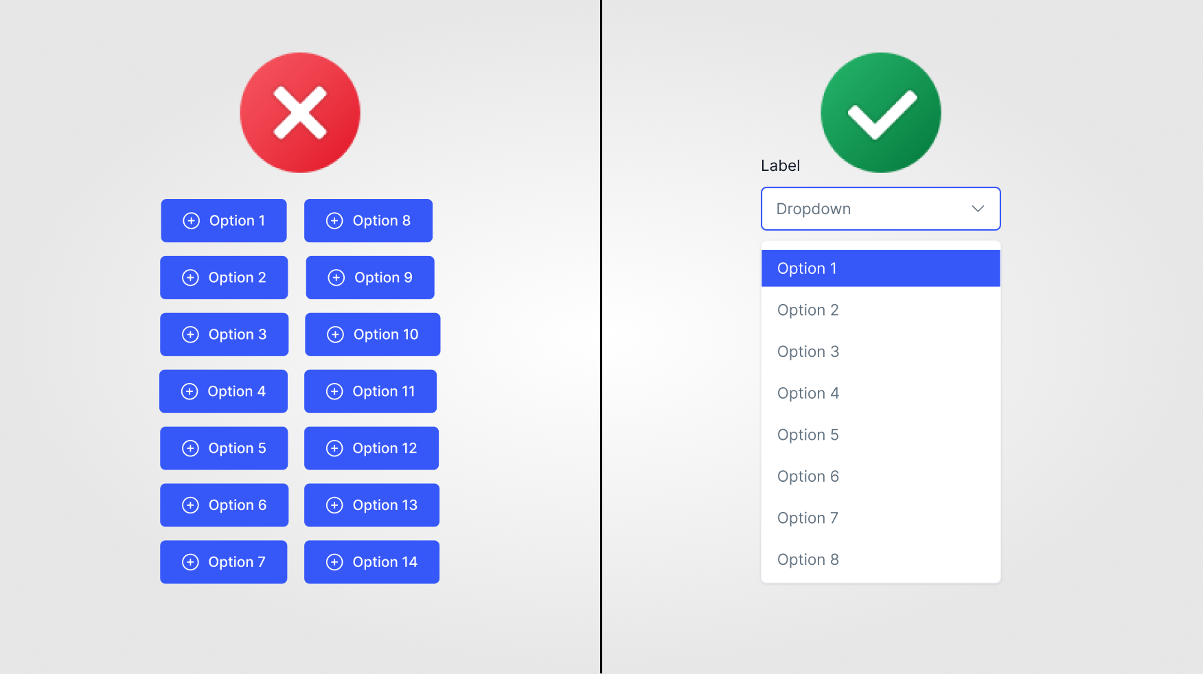
When UX designers talk about Occam's Razor, they're basically saying, "Keep it simple, silly!" It's like their golden rule for creating websites or apps that don't make your brain hurt. They want you to have a smooth ride, like cruising down a clear highway instead of navigating a crazy maze. By adhering to simplicity, designers strive to minimize cognitive load, streamline navigation, and enhance user satisfaction.

Real-Life UI Examples
Let's explore how Occam’s Razor influences UX design through real-life UI examples:
1. Google Search:
Google’s minimalist interface embodies the essence of Occam’s Razor. With a single search bar and minimalist design, Google eliminates clutter and distractions, allowing users to focus solely on their search queries. By prioritizing simplicity, Google delivers a seamless and intuitive search experience that resonates with millions of users worldwide.
2. Apple’s iPhone Interface:
Apple’s iPhone interface exemplifies Occam’s Razor by prioritizing intuitive design and functionality. From the clean layout to the straightforward navigation, every element is meticulously designed to minimize complexity and enhance user accessibility. By adhering to the principle of simplicity, Apple has redefined the smartphone experience, setting the standard for user-centric design.
3. Airbnb’s Booking Process:
Airbnb’s booking process embraces Occam’s Razor by simplifying the complex task of finding and booking accommodations. Through clear visuals, concise descriptions, and intuitive navigation, Airbnb streamlines the booking experience, empowering users to easily make informed decisions. By removing unnecessary steps and distractions, Airbnb fosters a seamless and enjoyable user journey that encourages exploration and discovery.
4. Dropbox’s File Sharing:
Dropbox’s file-sharing interface embodies Occam’s Razor by offering a straightforward solution to a complex problem. Dropbox simplifies collaborating and exchanging files with a simple drag-and-drop interface and intuitive sharing options. By prioritizing clarity and efficiency, Dropbox enhances productivity and fosters seamless communication among users.

Strategies for Applying Occam’s Razor in UX Design
Prioritize User Needs:
Prioritizing user needs involves understanding your target audience's core objectives and preferences; UX designers gain insights into users' specific pain points, goals, and expectations by conducting user research, surveys, and interviews. Once these needs are identified, designers can focus on addressing them directly, eliminating any unnecessary features or complexities that may detract from the user experience. By aligning the design with user needs, designers ensure that the interface remains intuitive, efficient, and relevant to the user's goals.
Simplify Navigation:
Navigation is a cornerstone of user experience, as it guides users through the interface and facilitates access to content and functionality. To apply Occam’s Razor to navigation, designers streamline navigation pathways by organizing content clearly and intuitively. This involves employing hierarchical structures, intuitive labels, and logical groupings to minimize cognitive load and help users find what they're looking for quickly and effortlessly. By reducing complexity and providing clear signposts, designers enhance usability and ensure that users can easily navigate the interface.
Embrace Minimalism:
Minimalism is a design philosophy that advocates for interface design simplicity, clarity, and elegance. To embrace minimalism, designers strive to remove clutter and distractions from the interface, focusing only on essential elements contributing to the user experience. This involves simplifying visual layouts, using ample white space, and employing minimalist typography and colour schemes. By decluttering the interface, designers enhance user focus and comprehension, making it easier for users to engage with the content and complete tasks efficiently.
Iterative Testing:
Iterative testing is a crucial aspect of the UX design process that involves continuously evaluating and refining the design based on user feedback and testing results. By conducting usability tests, user interviews, and surveys, designers gather valuable insights into how users interact with the interface and identify areas for improvement. Through iterative testing, designers can uncover usability issues, identify pain points, and gauge user satisfaction. By incorporating user feedback into the design process, designers can iteratively refine the interface, making adjustments to simplify the user experience and enhance overall usability.

Conclusion
Occam’s Razor is a guiding principle for UX designers. It advocates for interface design simplicity, clarity, and efficiency. By embracing the principle of parsimony, designers can create intuitive and user-friendly interfaces that resonate with audiences and drive engagement.
Incorporate Occam’s Razor into your UX design process and witness its transformative impact on user satisfaction and usability. By prioritizing simplicity and clarity, you can create experiences that delight users, streamline interactions, and ultimately elevate your product or service in the digital landscape.
Thank you for reading this article. Please consider subscribing for more such articles.
