
Introduction:
Within the wide area of User Experience (UX) design, psychological concepts are frequently essential to understanding how users engage with a system. The Law of Similarity, a foundational idea based on Gestalt psychology, is one of these rules. According to this law, consumers automatically see comparable items as related or grouped, which impacts how information is arranged and presented by designers. In this article, we explore the fundamentals of the Law of Similarity, revealing its importance in UX design and its role in creating aesthetically pleasing and logical digital experiences.
The Essence of the Law of Similarity:
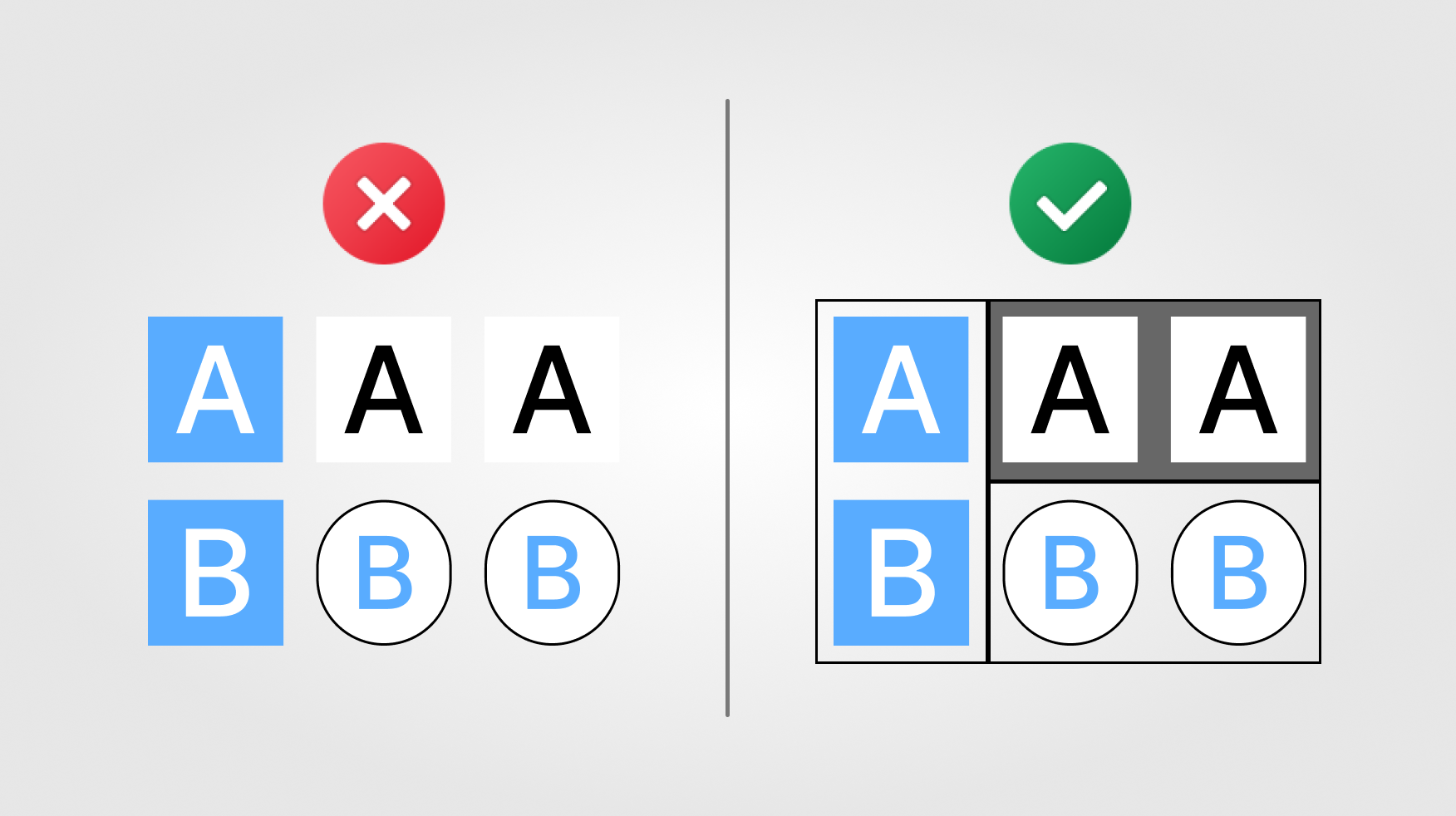
The human desire to put similar objects together is the fundamental basis of the Law of Similarity. This theory, first put forth by Gestalt psychologists in the early 1900s, claims that people automatically group objects with similar qualities when faced with a wide variety of inputs. The Law of Similarity is a guiding principle in UX design that affects how interfaces are organized to improve user understanding and engagement.
Visual Unity through Similarity:
Fundamentally, the Law of Similarity highlights the strength of visual structure. Users consider a group of items in the same category when they come across elements that share characteristics, such as colour, shape, size, or orientation. Designers use this ability to produce logical and well-organized layouts that make it easy for users to recognize connections.
The Role of Similarity in Perception:
In user experience (UX), it is critical to understand how users receive and use visual information. Utilizing visual clues to lead consumers through a design in a natural manner is essential, as the Law of Similarity highlights. Reducing mental workload and improving the user experience are two benefits of similarity, whether it be a group of buttons that indicate similar activities with the same colour or a collection of icons with the same shape.
Types of Similarity:
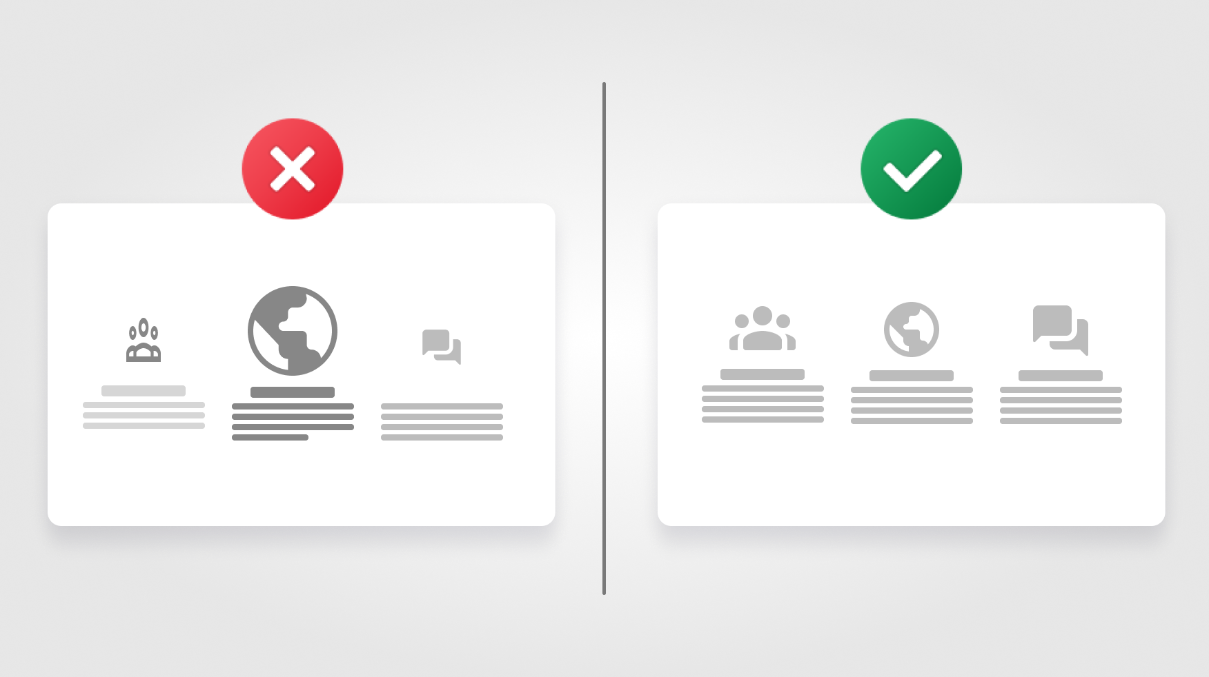
1. Colour Similarity:
In UX design, colour is a powerful tool for forming relationships and communicating meaning. Designers frequently use this idea to highlight parallels between interacting parts or create a feeling of visual hierarchy since similarly coloured elements are viewed as linked.
2. Shape Similarity:
A sense of unity is created by shared shapes. Similarly shaped buttons or icons refer to a shared purpose or function. Shape similarity is a tool designers use to communicate uniformity and speed the consumer's understanding of interactive elements.
3. Size Similarity:
Similar-sized elements are frequently connected to one another. Designers can highlight the significance of particular pieces or establish a sense of balance within the design by utilizing size similarity.
4. Orientation Similarity:
Components with the same orientation—vertical, horizontal, or diagonal—are assumed to be linked. This design idea gives the design a sense of structure and flow.
Real-world Applications:
1. Navigation Menus:
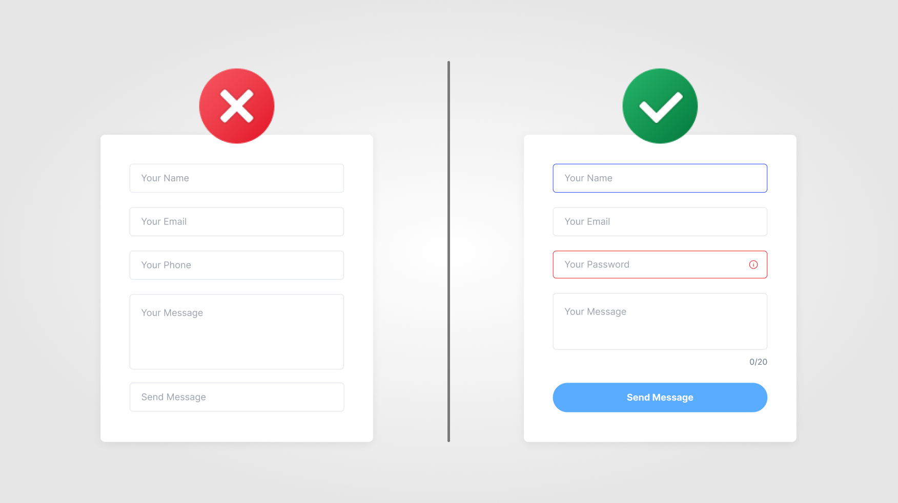
Designing navigation menus for apps and websites using the Law of Similarity results in a logical and seamless user experience. Comparable colours, shapes, or symbols between menu items indicate their shared purpose and point users to certain sections or features.
2. Data Visualization:
The Law of Similarity is essential to data visualization because it enables users to rapidly spot patterns and relationships by clustering similar data points together based on form or colour. Charts, graphs, and dashboards apply similarity to enhance information clarity.
Overcoming Challenges:
While the Law of Similarity is a useful tool for designers, certain challengesen applying it. Overuse of similarity could make the image uninteresting or confusing. To preserve user engagement and prevent misunderstandings, the design context must be carefully considered.
Case Study: Social Media Feeds
Take a look at a social media feed, which is a common feature of digital encounters. The Law of Similarity is in effect because posts from many people have characteristics in common. A visually unified and user-friendly environment is created by using similar colours for likes and comments, standard shapes for post containers, and consistent iconography, which makes it easy for users to interact with information.
Beyond the Visual: Functional Similarity
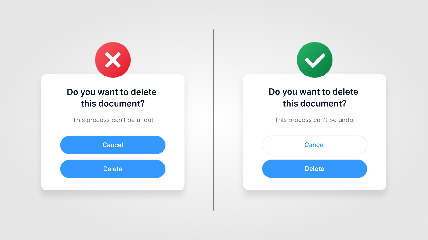
The Law of Similarity applies to both functional and visual characteristics. Comparable functionalities are frequently shared by comparable interactive elements. Consistent shapes or iconography for buttons throughout a platform help to create a seamless and predictable user experience.
The Future of UX Design:
The Law of Similarity will continue to adjust to new mediums and interfaces as technology develops. Designers will investigate new ways to use similarity to improve user understanding and experience, from voice-activated interactions to virtual reality environments.
Conclusion:
In the intricate tapestry of UX design, the Law of Similarity emerges as a key player, contributing to creating harmonious and user-friendly digital experiences. By applying similarity in colour, shape, size, and orientation, designers guide users through interfaces with clarity and coherence. As the digital landscape evolves, the timeless principles of similarity will remain fundamental, ensuring that users can seamlessly navigate and interact with the ever-expanding realm of digital interfaces.
Thank you for reading this article. See you in the next one.