Introduction
In User Experience (UX) design, where every interaction, button, and pixel counts, designers look for guiding principles to help them navigate the difficulty of producing simple and seamless experiences.
The Pareto Principle is a timeless law that provides insights into efficiency, priority, and optimisation among the many principles that guide UX design. The Pareto Principle also called the 80/20 rule, is a basic idea with a major impact on UX designers who want to make effective, user-focused designs.
Understanding the Pareto Principle
The Pareto Principle, named for Italian economist Vilfredo Pareto, resulted from his discovery that 20% of the country's land was held by 80% of its people. Since then, this idea has expanded beyond its economic foundation and found use in several fields, such as management, business, and user experience design.
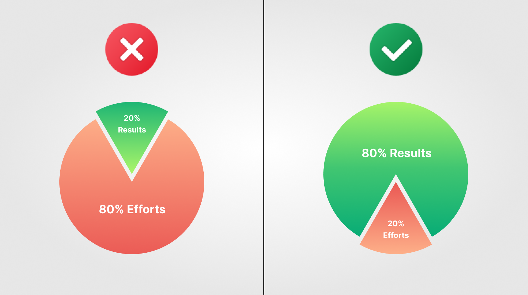
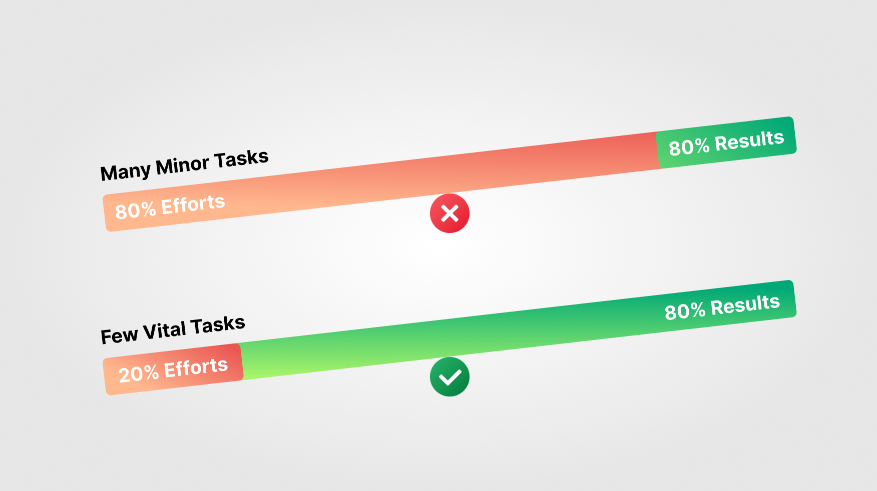
The Pareto Principle's fundamental tenet is that 20% of causes account for 80% of results. In terms of UX design, this suggests that a tiny group of features, aspects, or activities inside a digital product or service may be held responsible for a large percentage of user issues, preferences, or interactions.

Applying the Pareto Principle to UX Design
Adopting the Pareto Principle in the context of UX design requires understanding the relationships that exist between user behaviours and design components and how these relationships affect the overall user experience. The Pareto Principle may be applied in UX design in the following ways, and designers can benefit from its insights:
Identifying Key User Interactions:
By recognising that a minority of user interactions often drive the majority of user satisfaction or frustration, UX designers can focus on optimising these critical touchpoints. Through user research, analytics, and usability testing, designers can pinpoint the key interactions that significantly influence user perceptions and experiences.
For instance, in an e-commerce platform, the checkout process and product search functionality may represent vital interactions where users are most likely to encounter friction. By prioritising improvements in these areas, designers can enhance the platform's overall usability and conversion rates.
Prioritising Features and Functionality:
Understanding that most user happiness or irritation results from a small percentage of user interactions, UX designers may concentrate on making these crucial touchpoints as efficient as possible. Designers can identify the critical interactions that have an important effect on user experiences and perceptions through user research, analytics, and usability testing.
For example, in an e-commerce platform, the product search feature and checkout procedure can be important contact points where consumers are more likely to encounter issues. By prioritising these areas for development, designers may improve the platform's general usability and conversion rates.

Streamlining User Flows:
The Pareto Principle encourages UX designers to rank features and functionality according to how well they affect user engagement and satisfaction. Rather than aiming for complete feature sets, the Pareto Principle encourages design professionals to optimise the most commonly used pathways and minimise obstacles to simplify user flows.
Through studying heat maps, user journey maps, and behavioural data, designers can pinpoint the obstacles and pain points that limit users' progress. By employing techniques such as simplicity, consolidation, and thoughtful design decisions, designers may build more seamless and intuitive user experiences that enable users to achieve their goals more quickly.
The Pitfalls of Misapplying the Pareto Principle
The Pareto Principle is useful for understanding UX design, but it must be applied carefully and sensitively. A misapplication or misinterpretation of the concept may result in design choices that ignore crucial user requirements or parts of the user experience.
Neglecting Edge Cases and Diversity:
The Pareto Principle may have a drawback in that it ignores special demands, varied user behaviours and edge cases. "Edge cases" are scenarios or situations that lie at the very edge of what a design is supposed to be able to manage, as defined by design principles. These examples are usually anomalies or rare circumstances that may not happen often, but they still need to be considered and considered throughout the design phase. Designers must consider the demands and preferences of various user groups, as well as the majority of users and frequent use scenarios.
Through inclusive design methods, complete user research, and empathy-driven design techniques, designers may guarantee that their creations suit a wide range of users, including those with unique requirements and viewpoints.
Ignoring Long-term Sustainability:
Overdependence on the Pareto Principle also risks threatening the long-term survival and progress of digital products and services. In addition to optimising current features and interactions, designers also need to consider upcoming trends, technology developments, and user expectations.
By developing a community that values innovation and continuous improvement, designers can continuously improve their designs based on user feedback, market trends, and future technology. By finding a balance between short-term optimization and long-term innovation, designers may produce long-lasting digital experiences that last.
Real Life Example
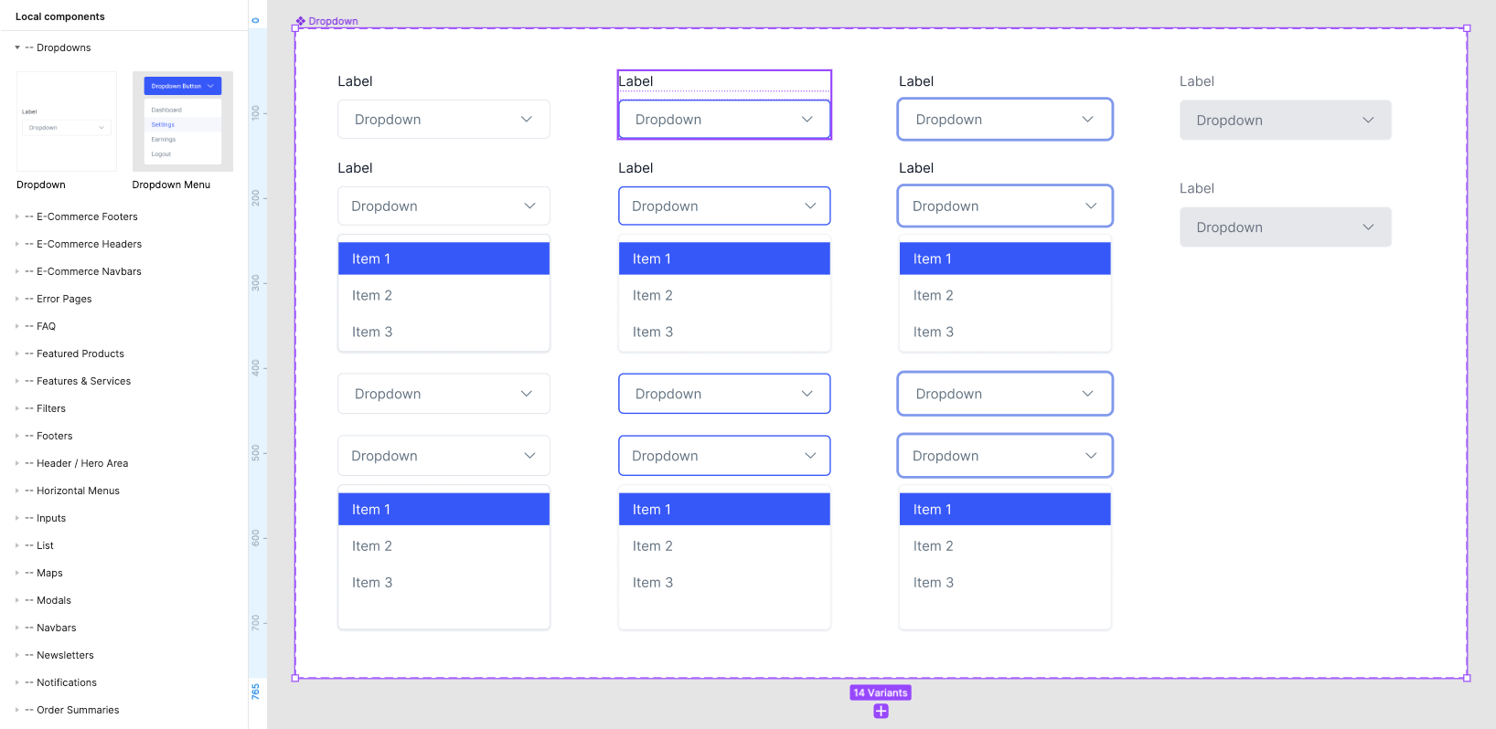
While designing a website or mobile application, rather than spending your time making shapes and typography, invest your time making component sets. These will help in every step while designing your product. So, you focus 20% on component design, and by using those components, the rest of the product design will be much faster and maintain a uniform design.

Conclusion
The Pareto Principle provides guidance for designers who are looking for clarity in the midst of complexity in user experience design (UX design), where the search for simplicity, efficiency, and user-centricity is important. By knowing the power of the 80/20 rule, designers may prioritise, optimise, and simplify digital experiences to better meet user wants and preferences.
This law serves as a helpful reminder for designers as they navigate the always-changing field of digital design. It emphasises the significance of focus, prioritisation, and empathy in producing meaningful and memorable user experiences.
Thank you for taking the time to read this article. If you enjoyed it, consider subscribing for more insightful content like this!
