Fitts's Law and other guiding principles help designers create understandable and efficient interfaces in the ever-evolving field of user experience (UX) design. The Paul Fitts' UX law, which deals with the connection among goal size, distance, and user performance, offers valuable insights into human-computer interaction. We'll delve into Fitts's Law in this blog article, talk about when and where to use it, and look at two fascinating examples to show how it applies in practice.
Unpacking Fitts's Law
Fitts's Law defines that the time it takes for someone to navigate a pointer (such as a mouse cursor or a finger on a touch screen) to a target is determined by the ratio of the distance to the target and the target size. In simple terms, the farther the distance and the smaller the target, the more time it will take to reach it. The Law is founded on two main principles:
Target Size
The target area's width or diameter. It is simpler to hit a bigger target correctly than a smaller one. "Target Size" in Fitts's Law refers to the physical dimensions of the object or area a user tries to interact with, typically by pointing or clicking. In the context of the Law, a larger target size means that the object is physically larger or easier to click on, while a smaller target size indicates a smaller or more challenging target to hit accurately.
Fitts's Law states that the time it takes for a user to move their pointer (e.g., a mouse cursor) to a target is influenced by both the size of the target and its distance from the starting point. Larger targets are easier to hit, and users can reach them more quickly and accurately. Smaller targets, on the other hand, are more challenging to hit precisely, leading to slower and less accurate movements.
Designing with consideration for target size is essential in user interface and interaction design. Ensuring that interactive elements, such as buttons or icons, have an adequate size makes it easier for users to interact with them, reducing errors and enhancing the overall user experience.

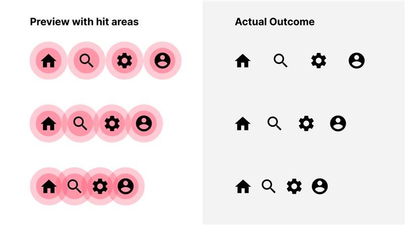
The image shown above highlights the red-circled areas, which are the designated "hit areas" where users will click or tap. Larger hit areas for icons make it more user-friendly, simplifying actions. When these hit areas are close together, the risk of unintended clicks on other icons increases, leading to potential errors.
Distance to Target
Fitts' Law describes the distance or separation in space between the user's input device's starting point (such as a mouse cursor or finger on a touchscreen) and the target's centre, which they plan to interact with. Fitts' Law states that this distance impacts how long it takes a user to travel toward a target.
According to the Law, actions made closer to the object will be quicker and more accurate than those made farther away, which will take more time and effort. Practically speaking, this means that it is essential to take interactive elements' placement into account while designing user interfaces. Faster and more effective interactions may result from placing frequently used components near the user's starting point. In conclusion, Fitts's Law's "Distance to Target" focuses on the need to reduce the actual distance between the user's input point and the target they want to select or interact with. This idea is essential for improving user interface design and ensuring users can easily engage and navigate digital systems.

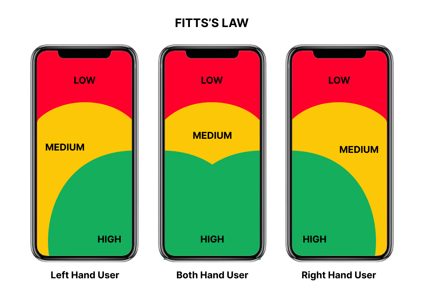
The picture above showcases three distinct regions, each colour-coded to denote varying degrees of accessibility and the placement of specific components to optimize user experience. In the Green region, marked as highly accessible, critical elements like the navigation bar are positioned for easy and frequent interaction. In the Yellow portion, accessibility slightly diminishes, and this area accommodates components such as visual cards, which demand fewer user actions. Finally, the Red area represents the least accessible region, housing components like account settings, which are infrequently used and primarily accessed only when needed, ensuring an efficient and user-friendly experience.
The fundamental formula that represents Fitts's Law is:
T = a+b .log^2(2D/W)
Where:
• T is the time required to complete the movement.
• a and b are empirical constants that depend on the device and user.
• D is the distance to the target.
• W is the width of the target.
In simpler terms, Fitts's Law tells us that it takes longer to move to smaller, more distant targets and less time to move to larger, closer targets. This understanding has profound implications for designing user interfaces that are both efficient and user-friendly.
When and Where to Apply Fitts's Law
Fitts's Law is a versatile principle that can be applied in various contexts and scenarios:
• Icon and Button Design: In interface design, buttons and icons are frequently used as clickable targets. By making these targets larger and more properly placed, Fitts' Law can be used to increase user participation. For instance, a window's close button should be bigger and simpler to reach than other controls because it is often used for quick tasks.
• Touchscreen Interfaces: Fitts' Law is very important when designing touchscreen interfaces since consumers interact with gadgets via touch actions. To avoid accidental touches that improve the user experience, it is essential to ensure that touch targets are large enough and spaced properly.
• Navigation Menus: Fitts's Law helps navigation menus in desktop and mobile applications. To reduce the time and effort needed for users to reach menu items, designers can arrange menu items so that commonly used alternatives are closer to the pointer's starting location.
Thank you for reading! Subscribe to learn more about the different UX laws.
