

Introduction
Without a doubt, Figma has emerged as the most practical tool available today for creating visually appealing UI designs. It is also utilized for brainstorming and prototyping. Most designers and developers use it for routine and work-related tasks. We will explore today the fundamental setup procedures (such as frame, grid, auto layout, and constraints) that I used to create the mobile user interface in Figma. Before you start creating a mobile user interface, hopefully, this guide will help you make your workflow more efficient.
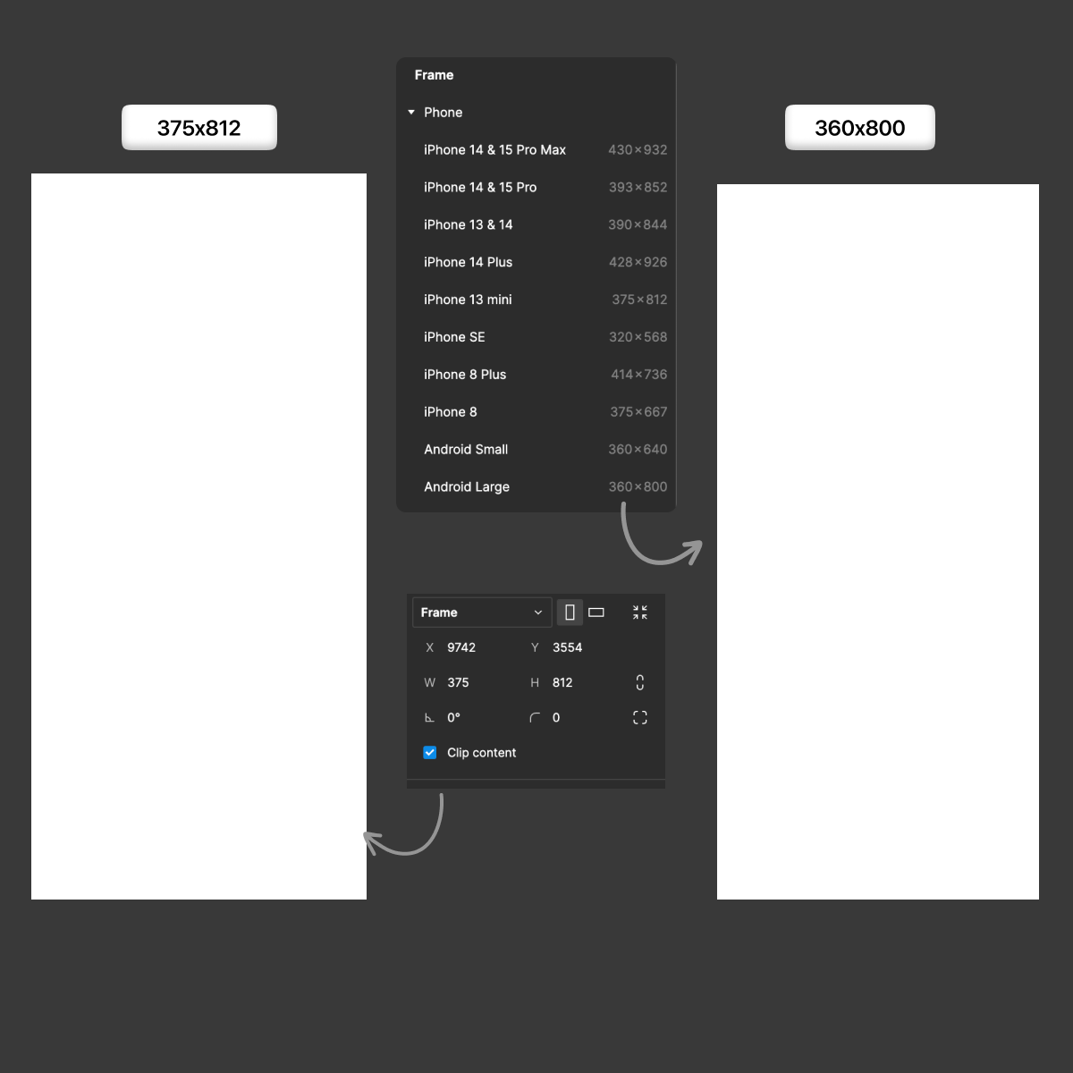
Select the Correct Frame
We must prioritize our needs and choose the right frame. Various frames are available for Android and iOS. I prefer iOS with the 13 mini (375x812), and we'll use Android, small or large for Android.
Begin with a Small Frame
Most of us like to start working on bigger frames because we feel that's the best idea to put our work into. However, that's not the best case for creating a UI component. The best way to start is with a smaller frame because of responsive design. It will be easier to scale up than down to maintain responsiveness across the other frame or screen. When our contents fit on a bigger frame, they might not fit on a smaller frame.
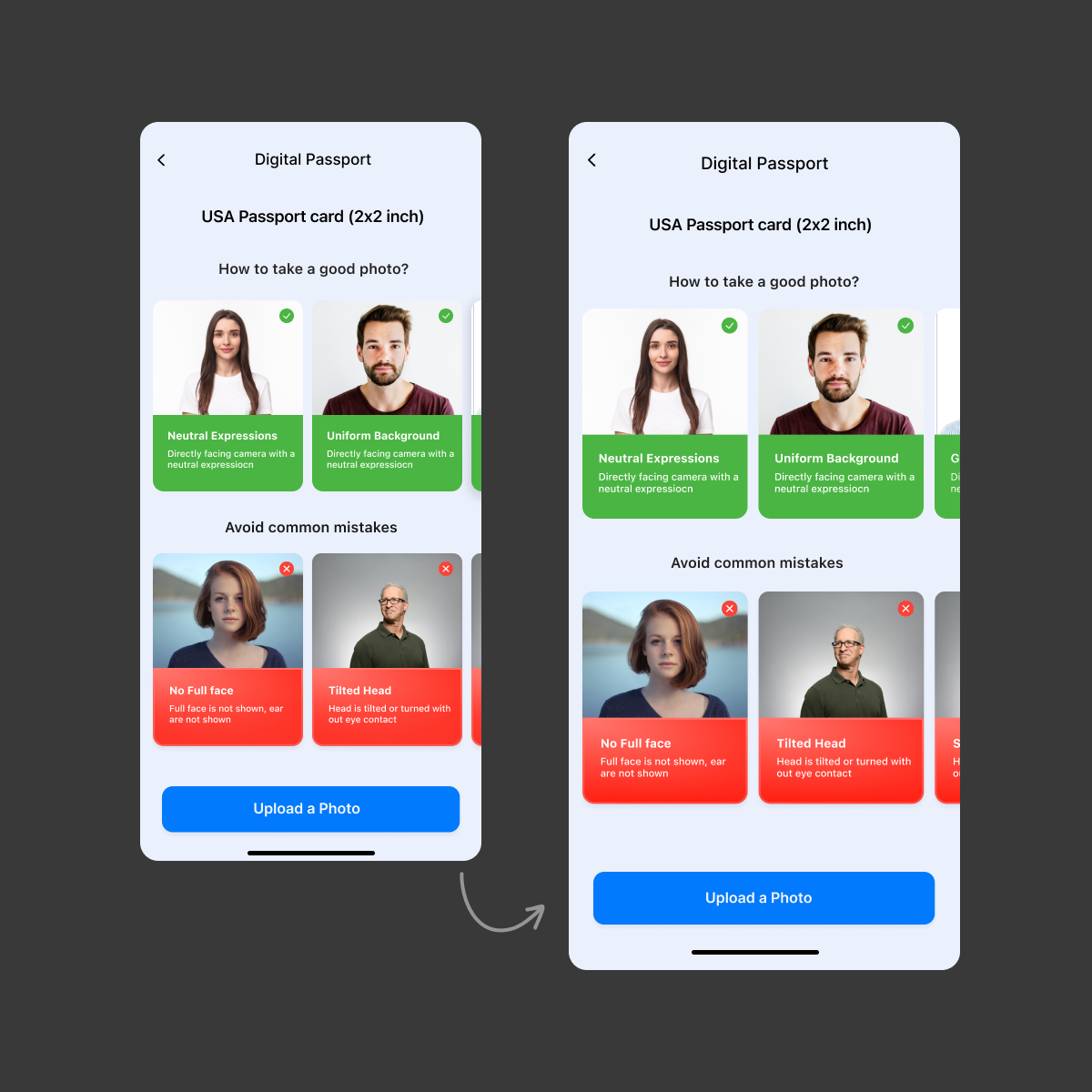
I created two frames for the image above. The iPhone Mini is the smaller of the two, and the larger iPhone 14/15 Pro Max is the larger of the two. Additionally, content keeps its proportion when we enlarge it.
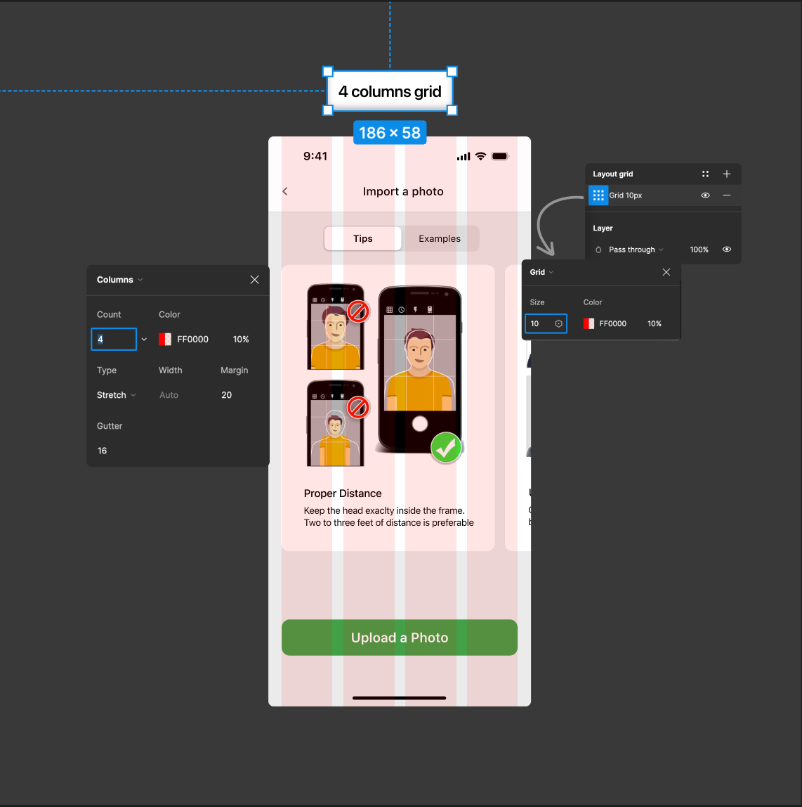
Add grid
The ideal grid system for mobile design should include a four-column grid. This grid system helps keep your design consistent throughout the design process. Create a frame (F) with your specifications, add a layout grid, and then modify the columns to add this grid. Make the type stretch and set the column count to 4. Set the margins to 20 points, but you can occasionally go up to 24 points. Furthermore, maintain the gutter value at 16 points.
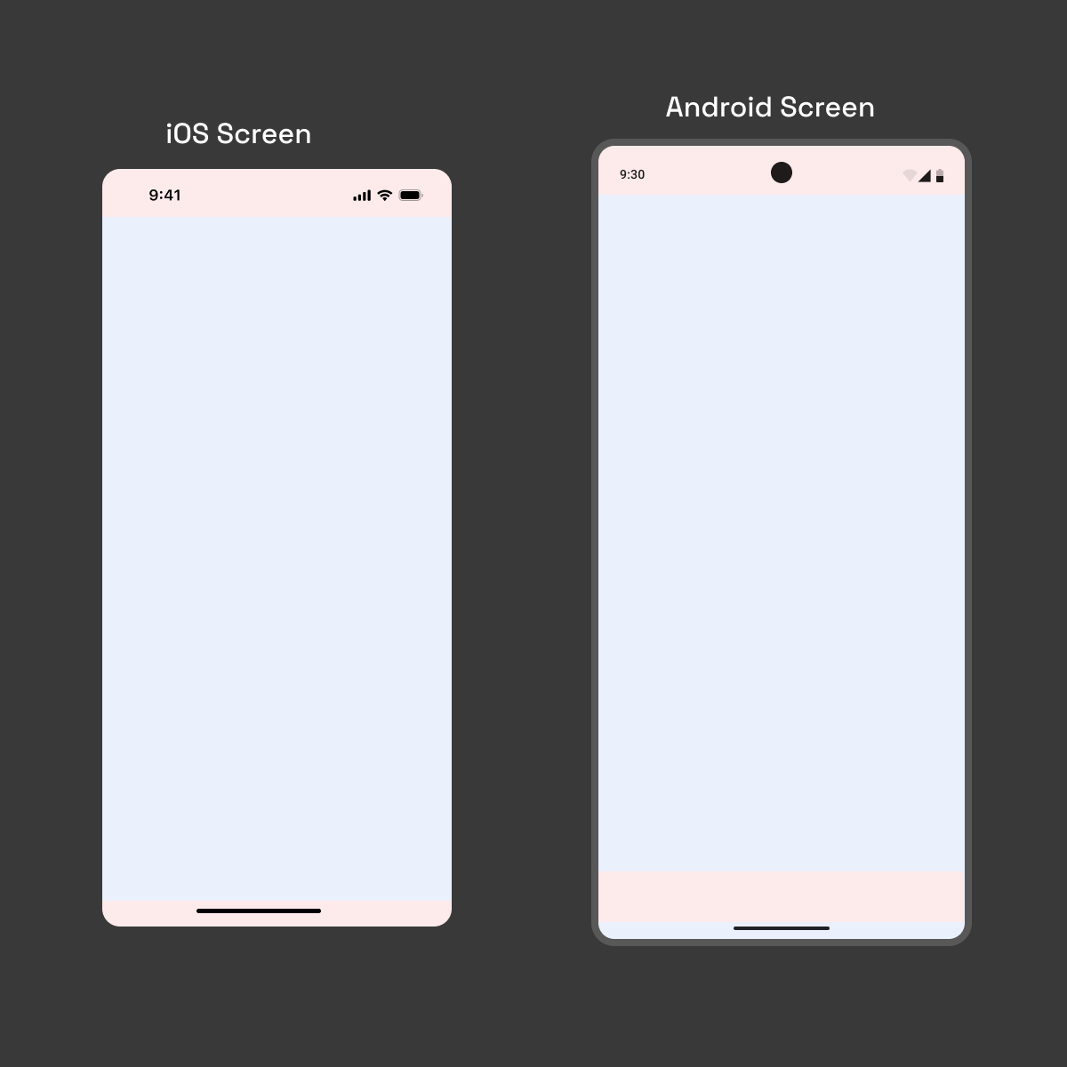
Include system components
Since we must design for both iOS and Android devices, we frequently create the iOS screen in Android view, which is not recommended. To uphold the standard, utilize the relevant system components for iOS and Android screens, such as the status bar and footer grabber. We can easily find those resources by visiting the official Figma community page.
Auto Layout
With the help of the strong auto-layout feature, elements can be resized and arranged inside a predetermined frame to guarantee proper alignment and spacing. Rather than grouping layers into auto-layout containers, I prefer using frames. It will assist in making UI elements responsive to various screen sizes.
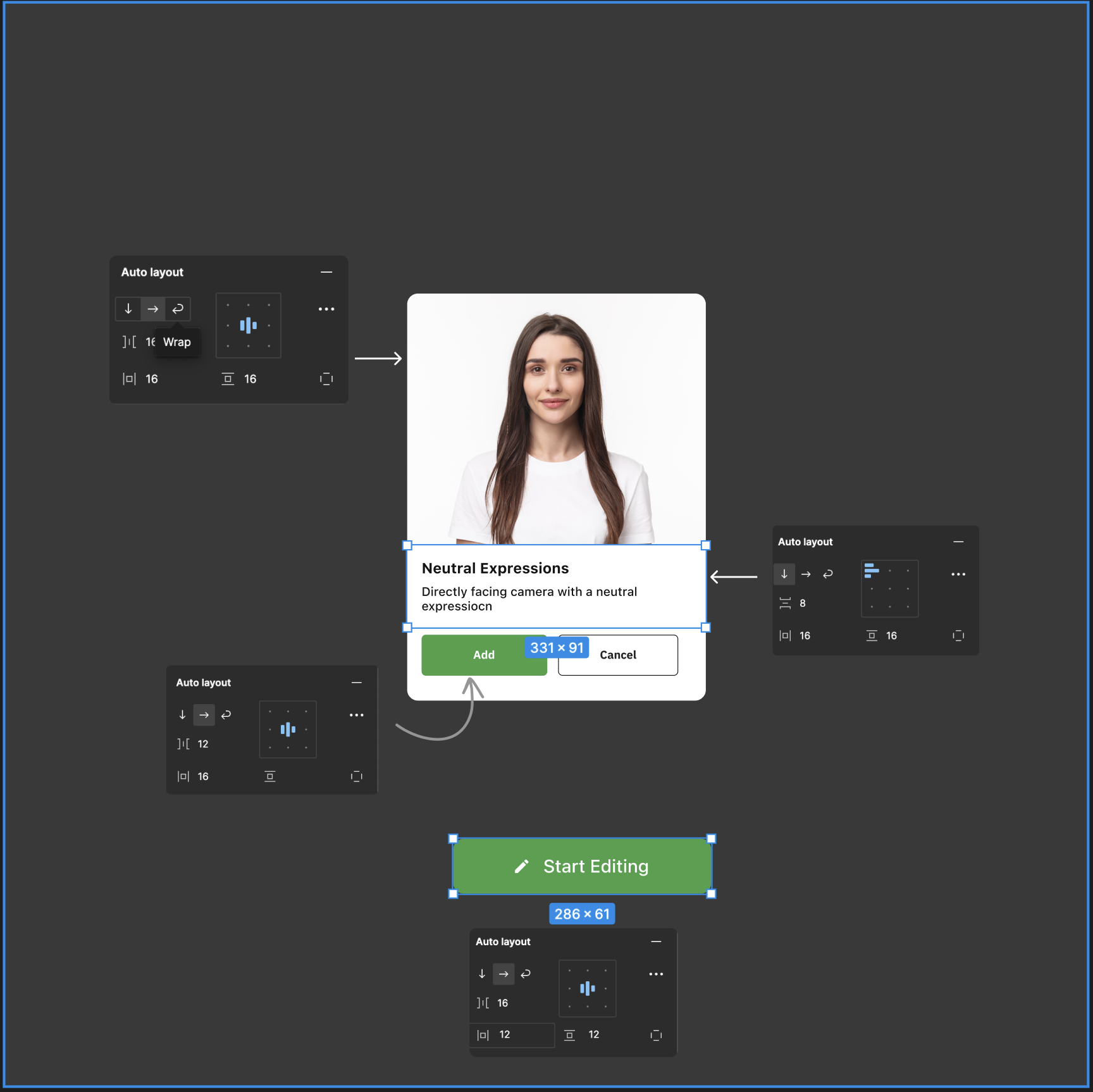
I made a card container using Frame turn into an auto-layout container. It has a vertical, horizontal, and wrap flow. The main image stays in the centre by making the frame fill the container. The heading and body text are in a frame with the vertical direction aligned left. Meanwhile, the two primary and secondary buttons are set to horizontal. We can customize the numbers using the horizontal and vertical padding available in the Auto Layout panel. I used a multiple of 4 for spacing to keep everything consistent throughout the design.
Using Auto Layout, our button's text and icon can be easily aligned vertically or horizontally. Clicking on the eye icon makes it simple to hide the icon (edit) within the button; however, manual resizing is not required because of the auto layout.
Set Constraints
Constraints help manage the way designs appear on various screen sizes and devices. They can be applied along the y (vertical) and x (horizontal) axes. With the aid of the horizontal constraints, you can position your designs at a specific location along the x-axis in your frame. With the aid of vertical constraints, you can place your designs at a specific location along the y-axis in your frame. Using big frames makes this work incredibly well.
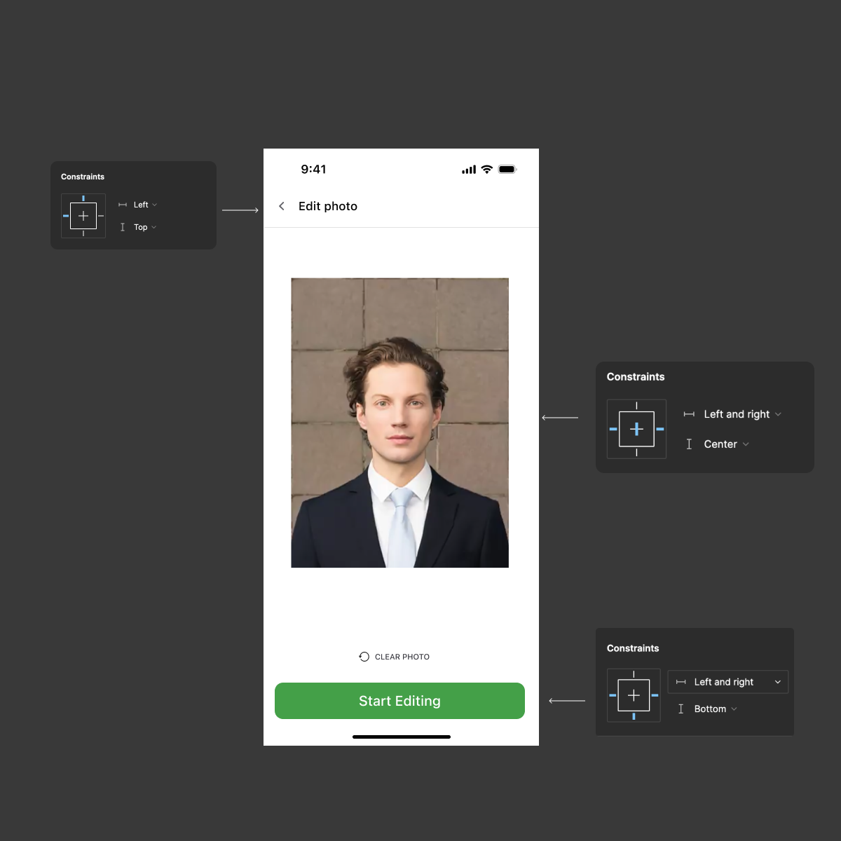
I've made a navigation bar in the screen above that is oriented vertically on top and horizontally left to stay in that position even if the device width changes. Since the main image must stay in the centre, the layer's size and position are maintained by setting the x-axis left and right constraints. However, by centring the y-axis, we ensure that the elements remain in the middle of the frame and retain their vertical positions. Use this only after you are certain of the behaviour you want your design element to display.
Furthermore, I would like the main call to action to remain in the lower portion of the frame. Setting bottom constraints for the vertical and left and right constraints for the horizontal will accomplish this. Constrained auto-layout containers maintain elements in their proper locations even when the device width changes. This is the primary advantage of using constraints.
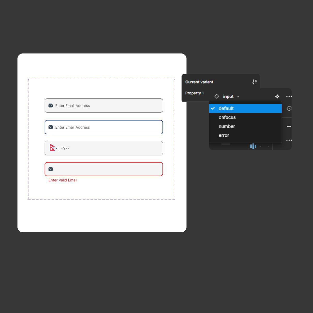
Use Components
It would be laborious to keep using the same element when creating the user interface. Since the same elements need to be used repeatedly, they should be dynamic components in Figma. By creating variations of an element, we can make it dynamic with Figma's component feature. This will facilitate design file editing while preserving consistency throughout the design.
I created variations of the input text field in the image file below, setting it to various states such as onfocus, number, and error. By choosing the variant property value on the right side of the bar, we can quickly alter them, saving a ton of time.
Also Read: Buttons in Figma: Part 3 - Boolean Property and Variant Property
Conclusion
When creating a mobile application for iOS and Android, having the proper setup in place is helpful to maximize productivity and effectiveness. Examining auto-layout, constraints, dynamic components, and their functionality can greatly expedite our mobile design workflow. By reading this post, I hope you'll be able to improve efficiency while creating visually appealing mobile apps.
Thank you for reading this article. See you in the next one.