
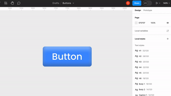
In my previous blog, we learned how to create a functional button using auto layout and added style to it. Continuing this blog, we will be creating different types of buttons using icons with their states: Enabled, Hover, Pressed or Clicked and Disabled states.
We will continue from the auto layout button and create its 16 different types. The goal is to create a dynamic button which will be fully controllable from the properties panel while reducing the redundancy.
Providing Properties for Boolean and Variants
Step 1: Setting the Stage
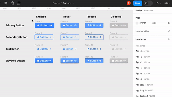
After creating a button using auto layout and styling it with colours and font properties, we jump straight into creating the types of buttons with all their previously mentioned states. After creating all these 16 buttons, we’ll add a button icon and a CTA button.
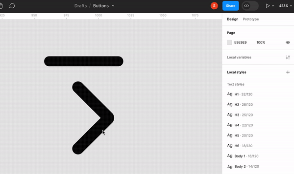
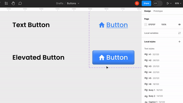
Button Icon: Icons which define the button is called button icons. For example, if the button is labelled home, we must use icons representing home that will redirect the page to the Home screen. This helps better in navigation and is self-explanatory, so the user knows what happens when they click it.
CTA Icon: The Call to Action icon is a purposefully positioned component in a user interference that prompts users to take a certain action. The CTA icon plays a key role in directing user journeys and gives a visual message that it's leading somewhere.
For example, most CTA icons are arrows which point to the right, indicating that if the icon is pressed, it will take the users to the next page. They are typically highlighted with contrasting colours and engaging wording.
How to create an icon?
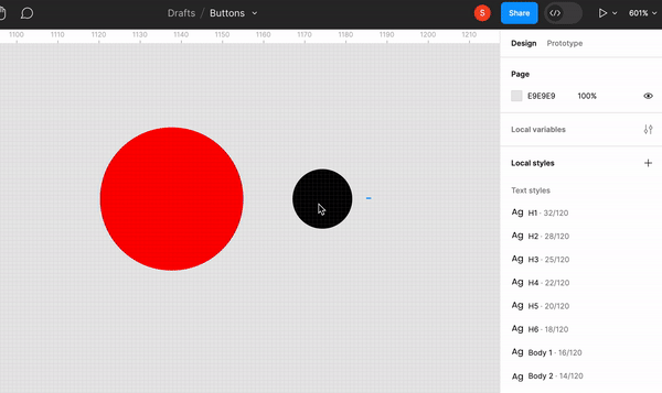
Union Selection: This selection helps combine multiple shapes into one element. By selecting shapes and applying the union operation, you create a new shape surrounding the area covered by the original selections.
- Used to make shapes like arrows joining two elements like rectangles and
90ºtriangles.
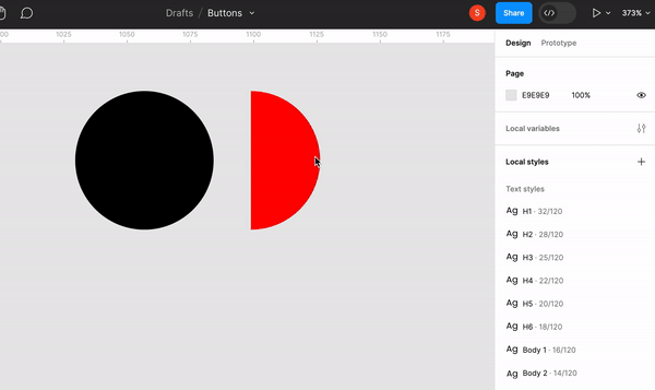
Subtract Selection: To create cutouts, we need to select two or more elements; whichever element is on top of another, the overlapped portion will be subtracted, leaving the remaining cutout behind.
- Used to make shapes like a quarter moon, subtracting full circle or a semi-circle.
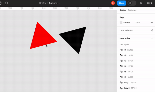
Intersect Selection: As in the name, when two or more elements are applied with intersect selection, the overlapped section will remain, and the rest portion will be excluded. Simply, you generate a shape that retains only the areas where the selections intersect.
- Used to make hexagon shape intersecting two triangles.
Exclude Selection: Using the exclude selection, the overlapping section will be excluded, and the elements remaining around the excluded part will be grouped.
- Used to make shapes like doughnuts.
Step 2: Create a Component Set
Creating a component set in Figma is collecting elements like buttons, icons, forms or any type of UI components and grouping them in an organised format for a standardised and consistent design. These component sets allow designers to create and manage a library of reusable components so it’s easy to work in a team and maintain consistency across the projects.
When you create a component set in Figma, you establish a central design asset repository. This approach offers several benefits:
- Consistency: Using the components from a set, you start to maintain uniformity in your UI Design. Maintaining consistency positively affects user experience by bettering it across different screens and interactions.
- Efficiency: This boosts the designer's efficiency by creating a component which can be used again from the assets panel from the set by a simple drag and drop. Else you’ll have to create the design from the beginning every time. It saves a lot of time and effort.
- Updates: If any changes are needed in the component, like editing colours and fonts or changing the icons, you can edit the master component set. All the major and minor changes you make will be reflected across all instances of that component.
- Scaling and Responsiveness: As your design evolves, component sets make scaling to different screen sizes and devices easier. By using responsive components, you ensure that your design adapts effectively.
Step 3: Applying Boolean Property
Let's apply boolean properties in Figma for true or false icons. To do this, select all the similar icons. For now, we’ll select the home icon. Head to the Layers section from the Control Panel and select Apply Boolean Property. This helps us to create a component property, and we can set their name and values, which are true or false. So when we create an instance of the button, we’ll be presented with a toggle switch either to show the icon or not.
Boolean properties empower designers to seamlessly refine icons, craft cutouts, overlays, and complex forms, and adapt designs for various contexts. This eases the design process and guarantees that icons are easy to use and aligned with the overall design language. Whether you're crafting a simple button or an intricate interface, embracing Boolean properties empowers designers to create icons that capture attention and communicate effectively.
Step 4: Editing Variant Property
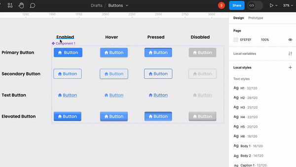
The first thing we do is select the component set and check the default property section on the control panel. We can edit the variant properties name to our Button Type, and the next thing we’ll do is select the entire primary button row and name it Primary in the current variant section. Similarly, we’ll select the entire secondary button and name it Secondary. Repeat the process for the text button and elevated button as well. When we check the variant property, the values for button types will be set.
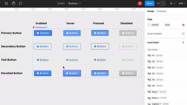
For Button State, we’ll apply the same logic by creating a variant and editing its name to Button State. After that, we’ll select all the enabled state columns and name them Enable. Continue this process for hover, pressed and disabled states as well.
Editing variant properties in Figma is a game-changer for creating adaptable designs. Variants allow designers to efficiently manage design variations within a single component, such as different button types and state schemes. Designers can swiftly customise instances by editing variant properties without creating multiple components. This will help designers to boost their efficiency because they can fully control the button’s type, state, icons and label from the Control Panel itself.
Final Results
Thanks for reading! Catch you in the next one.