Introduction
Many concepts in the broad fields of psychology and cognitive science provide light on human thought and behaviour. The Zeigarnik Effect, named so in honour of Russian psychologist Bluma Zeigarnik, is one such concept. This effect has fascinating consequences for user experience (UX) design, since better digital interfaces may be created by recognizing and utilizing human cognitive patterns. In this article, we will learn about the Zeigarnik Effect, its significance for UX design, and useful applications that may improve user happiness and engagement.
Understanding the Zeigarnik Effect
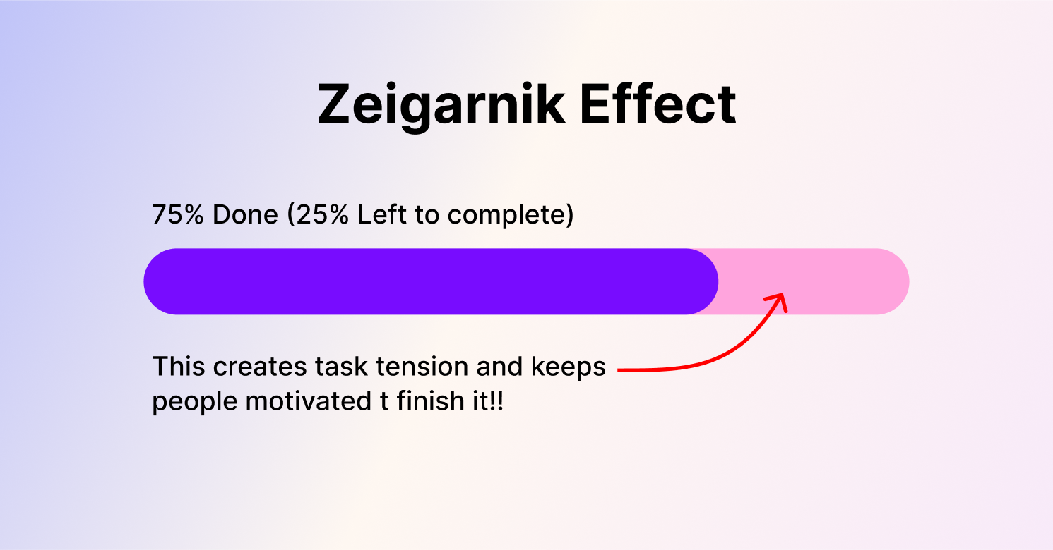
The Zeigarnik Effect suggests that people remember tasks that are interrupted or incomplete better than ones that are finished. In the 1920s, Bluma Zeigarnik discovered that waiters in a café were better at remembering orders that were still in progress rather than those that had already been completed. This led to several studies indicating that people are more likely to remember incomplete activities in greater detail than completed ones.

Real Life Example
In real life, the Zeigarnik Effect is used to increase motivation and engagement by creating a sense of incomplete tasks. For instance, on digital platforms, users are motivated to complete tasks by progress indicators in forms or multi-step procedures. Cliffhangers in television series and prompts in productivity applications also take advantage of this phenomenon to motivate viewers to come back and complete the task at hand. This impact increases retention and task completion rates by using our innate propensity to prioritize and recall incomplete work.

Why the Zeigarnik Effect Matters in UX Design
The Zeigarnik Effect can significantly increase user motivation and engagement in the context of UX design. To encourage users to revisit an application or website, finish a desired task, or carry on interacting with the interface, designers might purposefully introduce breaks or create a sense of incompleteness. Why it matters is as follows:
Increased User Engagement: Through using the natural human tendency to retain incomplete activities, interface designers may craft user experiences that maintain user engagement. When people abandon an unfinished activity, their minds keep thinking about it, which motivates them to go back and complete it.
Enhanced Retention: Utilizing this law can help increase the retention of users. Users are inclined to revisit the site if they recall that they have assignments or activities that are yet to be completed. This can work especially well for services and apps that depend on consistent user interaction.
Improved Task Completion Rates: By instilling a sense of urgency, designers may utilize this law to motivate users to finish tasks. Users are more driven to complete tasks when they perceive that something is unfinished, which increases the likelihood that desired activities will be completed.

Practical Applications of the Zeigarnik Effect in UX Design
Now that we understand the significance of the Zeigarnik Effect, let's explore some practical ways to apply it in UX design:
Progress Indicators and Step-by-Step Processes
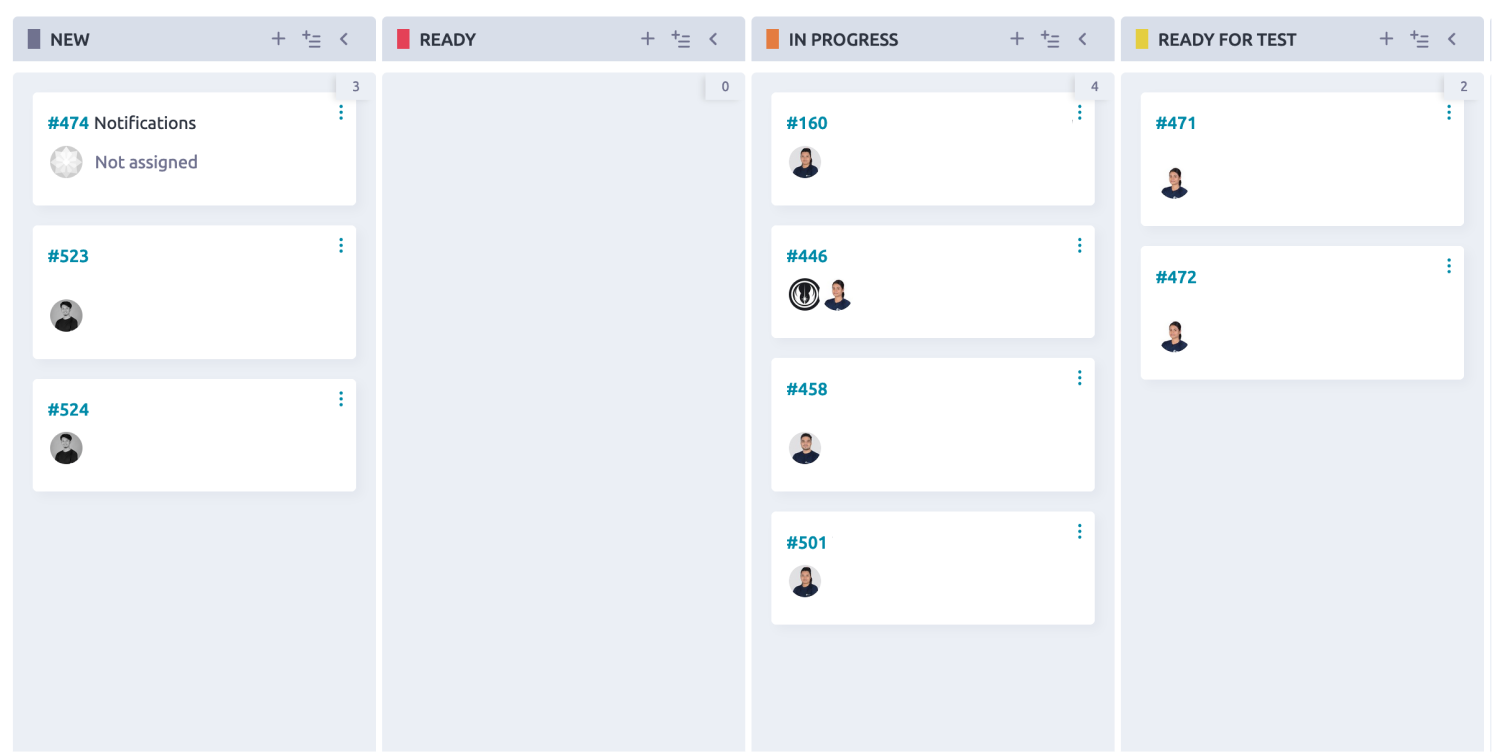
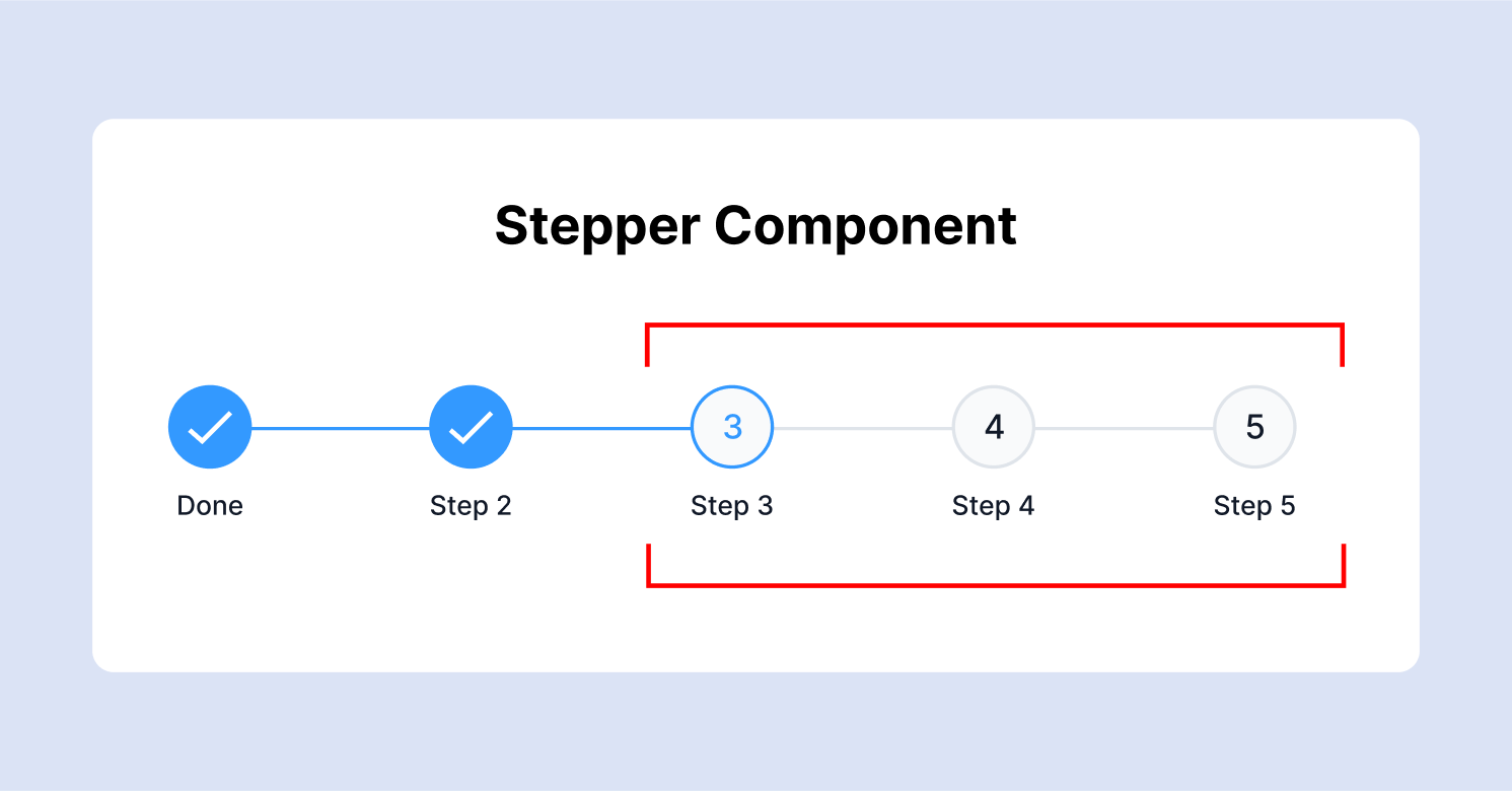
The Zeigarnik Effect may be effectively utilized by including progress indicators into sequential procedures. Whether it's a checkout procedure, an onboarding flow, or a multi-step form, letting users know where they are in the process and what stages are left will encourage and engage them to finish it. Checklists, progress bars, and numbered stages are examples of visual signals that create a sense of incompleteness and motivate users to go on.
Gamification and Achievement Systems
The Zeigarnik Effect may be used by gamification as an effective method to increase user engagement. Designers may convey a sense of continuing progress and unfinished goals by including components like badges, levels, and achievement systems. Sustained engagement is ensured by motivating users to return to the site to complete tasks, gain prizes, and reach higher levels.
Reminders and Notifications
Utilizing alerts and reminders strategically can help you take advantage of the Zeigarnik Effect. Through timely alerts regarding incomplete tasks, hovering deadlines, or ongoing activities, designers may encourage users to revisit the app or website. Reminders like this act as mental clues, encouraging users to continue what they started.
Content Teasers and Cliffhangers
For content-driven platforms, like blogs, streaming services, or news websites, teasers and cliffhangers work well in holding consumers in. Designers could create curiosity and anticipation by hinting at upcoming plot points or leaving unsolved storylines. It is more probable that users will visit the site again to read the entire content or to see what occurs next.

Designing with Empathy: Balancing Engagement and User Experience
Although utilizing the Zeigarnik Effect can improve user engagement, it's important to avoid manipulative design techniques and instead create with empathy. The following guidelines should be kept in mind:
Respect User Autonomy: Make sure users aren't annoyed or frustrated by a feeling of interruption or incompleteness. Show them that you respect their liberty by making it simple for them to pick up where they left off or finish assignments.
Provide Clear Feedback: Provide consumers with clear, useful feedback to help them along the way. Inform them of the steps they have finished, the ones still to come, and how they might accomplish their objectives.
Avoid Overuse: Although the Zeigarnik Effect has great potential, overusing it might wear users out. Achieve a balance between providing consumers with interesting experiences and not overburdening them with unfinished business or disruptions.
Conclusion: Harnessing the Power of Unfinished Business
The Zeigarnik Effect provides insightful information about human memory and cognition that can be used to improve UX designs and make them more interesting and functional. Designers can create user interfaces that keep people motivated, interested, and eager to return by understanding and applying this principle. The options are endless and include gamification, progress indicators, content teasers, and reminders.
In the end, empathy and user-centric design are essential for the effective deployment of the Zeigarnik Effect. Through a balanced approach, clear feedback, and consideration for users' wants and preferences, designers may produce digital experiences that genuinely connect with consumers. Thus, let's embrace the potential of unfinished business and create engaging, inspiring, and enjoyable UX designs.
Thank you for reading this article. Please consider subscribing if you liked this article.

