
Introduction:
Simplicity always wins out in the complicated User Experience (UX) design world. The Law of Prägnanz is one of the fundamental ideas that help designers achieve this simplicity. This law, which has a foundation in Gestalt psychology, highlights how people frequently view confusing or complex signals as straightforward shapes. We'll look into the Law of Prägnanz's fundamentals and its significant influence on UX design in this blog post, showing how it creates our everyday digital experiences.
The Roots of Prägnanz:
The German word "Prägnanz" means "conciseness" or "pithiness." The Law of Prägnanz, also called the Law of Good Figure, is a fundamental concept in Gestalt psychology, an area of psychology that examines how people perceive and understand visual signals. Gestalt psychology, which dates back to the early 20th century, holds that people are naturally attracted to simplicity and order in the world.
Prägnanz in Action:
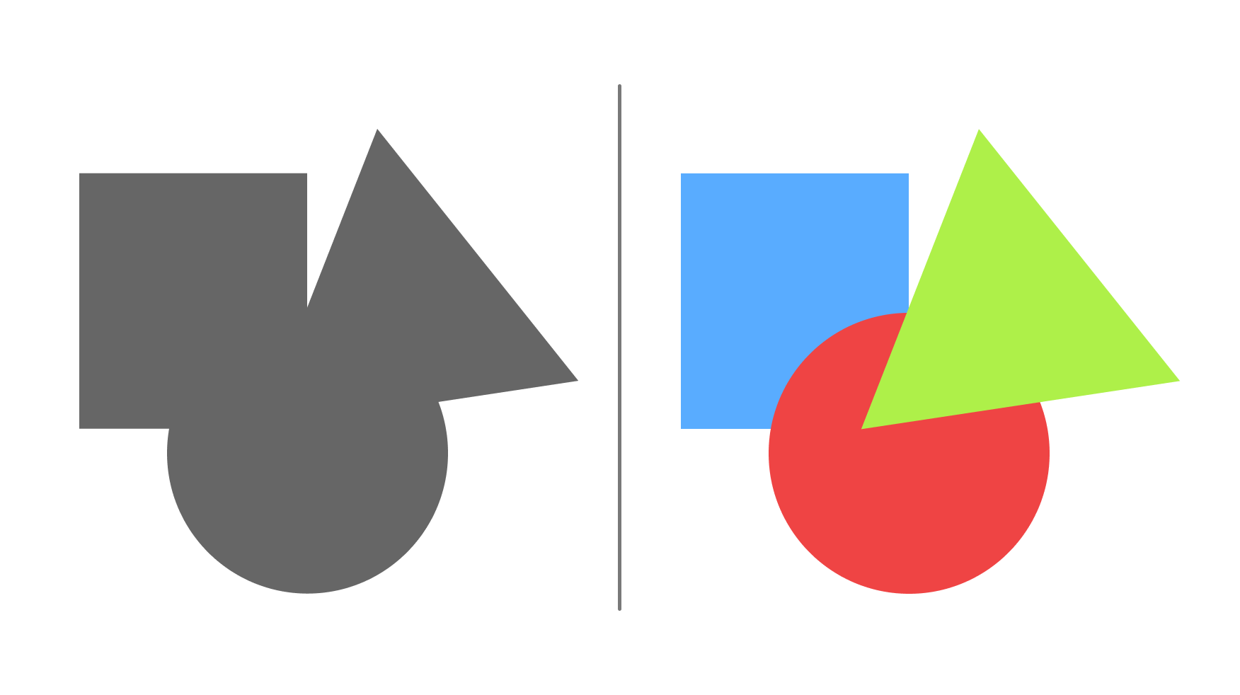
Fundamentally, the Law of Prägnanz posits that individuals tend to perceive stimuli in a streamlined and balanced manner. Our cognitive processes simplify intricate visual scenes, allowing us to discern easily identifiable shapes or patterns. This cognitive principle explains our perception of a simple square instead of the observation of four interconnected lines.
The Impact on Visual Perception:
The Law of Prägnanz has major consequences for UX design regarding how users view and engage with digital interfaces. This idea is used by designers to create visually pleasing and understandable layouts. Clear and simple information presentation lets designers capitalize on users' built-in desire for simplicity, resulting in a more productive and pleasing user experience.
Simplicity and Cognitive Load:
Simplicity and Prägnanz are mutually beneficial. Reducing cognitive load in digital media is important because users are flooded with information. By reducing unnecessary detail and ensuring that users can rapidly understand a design element's main idea or purpose, the Law of Prägnanz enables designers to simplify images. Simplicity promotes user engagement and retention on a website, mobile application, or interactive interface.
The Four Principles of Prägnanz:
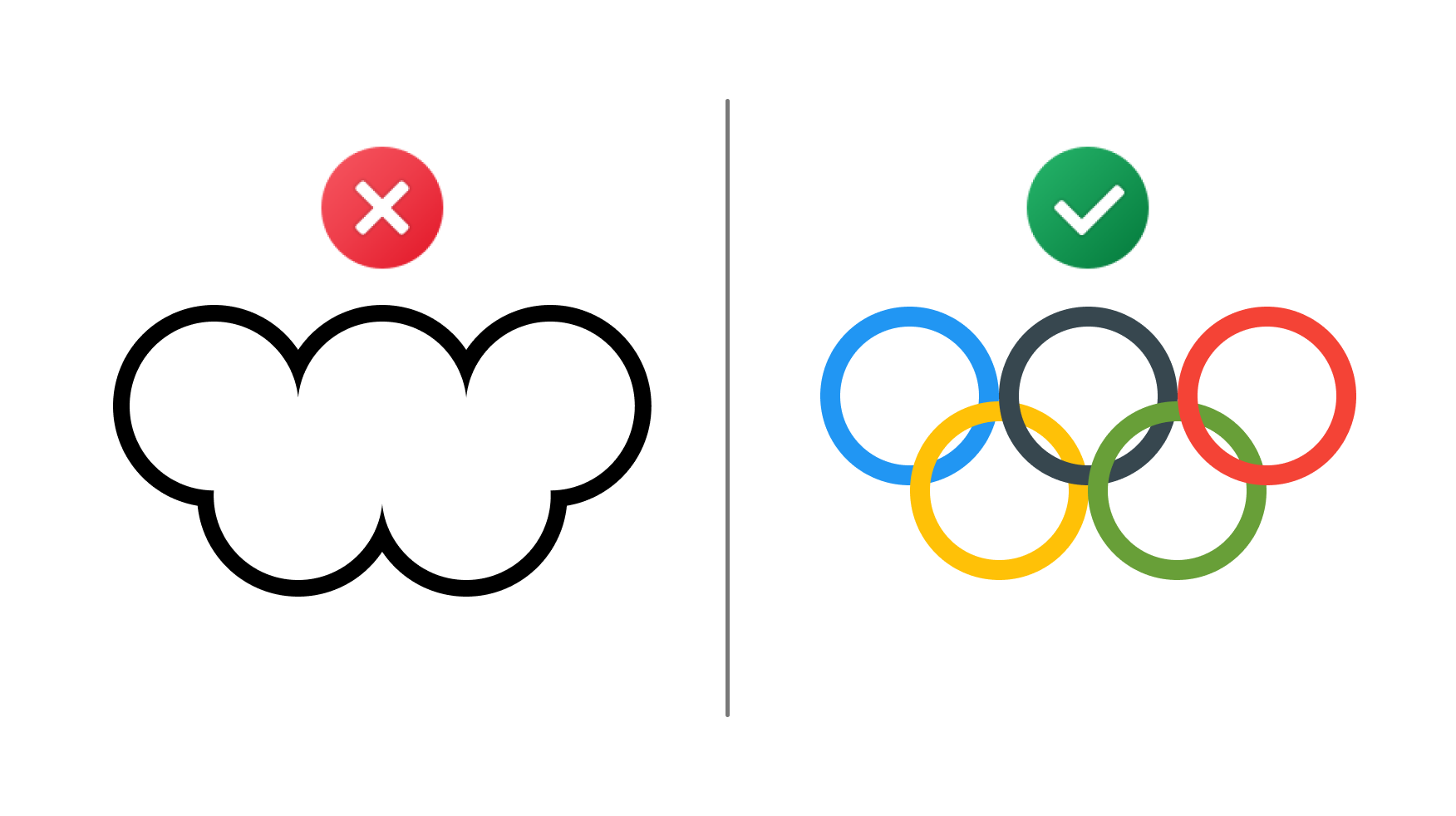
Closure: The mind fills in the blanks in shapes, making a whole even when some components are absent. This is seen in design when a part of an image is left up to the viewer's meaning in logos or icons.
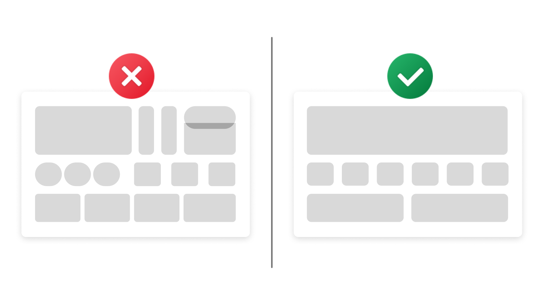
Symmetry: People tend to view symmetrical forms as more harmonious and stable. Symmetry is a tool that UX designers frequently use to balance layouts and appeal to users' sense of order.
Continuity: Objects arranged in a flowing or continuous line are thought to be more related. This idea is applied when creating user flows or navigation menus to guarantee a seamless combined experience.
Similarity: In thinking, similar elements are grouped together. This principle highlights related elements' similarities and sets them apart from other elements in UX design, helping to create a visual hierarchy.
Application in UI Design:
Iconography:
A good illustration of the Law of Prägnanz in action is found in icons. Icons simplify complex actions into easily recognizable forms, such as a magnifying glass symbolizing search functionality or a home symbol representing the homepage, thereby improving user understanding.
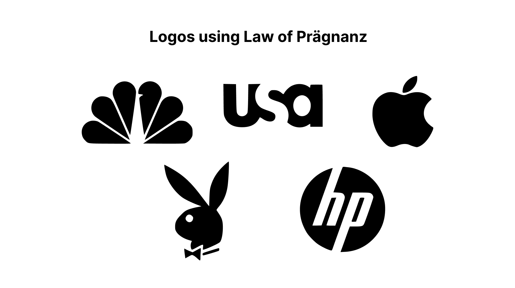
Logo Design:
Logos should implement Prägnanz in every aspect. Simple logos clearly representing a brand's essential identity or values are frequently memorable. Consider the Apple logo or the Nike swoosh. Both designs follow the rules of simplicity and closure.
Challenges in Prägnanz:
Even though the Law of Prägnanz is an effective tool for UX design, establishing a balance between simplicity and the requirement to communicate complex or detailed information can present issues. A solid understanding of the context and target audience is necessary to strike the correct balance.
Real-world Examples:
Apple's iOS Icons:
Prägnanz is perfectly expressed in the icons on Apple's iOS. They are easy to use, instantly recognizable, and communicate their purposes effectively. This design decision adds to Apple's devices' overall simplicity of use.
Google's Search Bar:
The search bar on Google is an excellent example of simplicity and clarity. The Law of Prägnanz is followed by a simple, clutter-free design, which frees users from needless distractions so they can concentrate on the essential features.
Looking Ahead:
The Law of Prägnanz will always be a timeless essential concept in UX design, even as newer technologies develop and new design theories appear. The growing use of augmented reality, virtual reality, and voice interfaces will require designers to apply Prägnanz to reduce complex interactions into experiences that are simple to understand and simple to use.
Conclusion:
A guiding principle in the search for simple, user-centric design is the essence of the Law of Prägnanz. By implementing this principle, UX designers can develop user interfaces that connect with users and encourage engagement and satisfaction. Prägnanz's ability to create concise, easy-to-understand, and aesthetically beautiful designs will become increasingly important as digital experiences continue influencing our daily lives.
Thank you for reading this article. Please consider subscribing if you loved this blog.