
A Carousel is a slideable widget with images or other general components in Flutter. Carousels are used in applications for a better user experience when navigating. A carousel with images or widgets allows users to drag and scroll through content smoothly. Users can slide left to right or from top to bottom, making navigation natural.
Usually, sliding widgets are used if there are many contents to go through. For example, a carousel can be used on a landing page to view different details or instructions about certain things in the app. It can also be used to display different types of products sold by the website, etc.
Many packages are available on pub.dev for integrating carousels into your Flutter application. We can easily use a package made by others and customize it to our liking, but to know how the feature works, we must create our own carousel.
Therefore, this blog will help anyone who wants to create a carousel from scratch and use it on their project.
What We Will Learn
- Structure of the carousel widget
- Use of PageView widget
- Adding page controller
- Controlling the page
- Adding positional dots indicator
- Final result
- Benefits of creating custom widgets
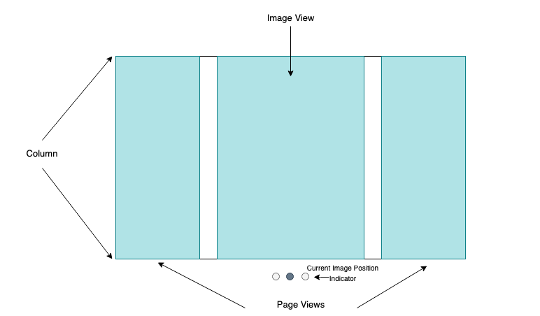
Structure of the Carousel Widget
Let's get started by finalizing our carousel structure.
We will create an image carousel widget for this blog. We will add a PageView widget to make images slidable, the image view to display the actual images, and a styled container widget to create the dot indicator for the images.
A representation of our structure is shown below.
Use of PageView Widget
To get to the final result, we will use a PageView builder to create a scrollable list. This list will work as a page-by-page representation of our required widgets.
The PageView builder maintains the item count and the contents that need to be displayed accordingly. The following snippet shows how to create a PageView with the builder.
 PageView.builder(
     itemCount: 2,
     pageSnapping: true,
     itemBuilder: (context,pagePosition){
       return Container(
         margin: EdgeInsets.all(10),
         child: Image.network("url"));
     })
Adding PageController
A PageController helps manipulate individual pages in a PageView by giving us control over making the required page visible.
So, we define a PageController with a late modifier and later assign it in the initial state of the carousel class.
late PageController _pageController;
Controlling the Page
When displaying images or content, our pages in the carousel should be in a pattern of start to end or from a specific point. It should either start from the list's first item or a specific point. By default, the carousel displays the first item from the list.
What about in cases where the image or widget has a different priority? So, to change the initial page, the PageController provides a parameter called initialPage for setting the initial page.
The following changes need to be made in the initState of the class to change the starting page of the carousel.
_pageController = PageController(viewportFraction: 0.8,initialPage: 1);
Adding Positional Dots Indicator
An indicator to show the currently viewed page is necessary for a carousel. We will create our own simple circular dots indicator, which will have a different colour for a page when it is being displayed.
Create a widget that takes currentIndex and imagesLength as its parameter. By checking the current index, we can change the indicator's properties.
  List<widget> indicators(imagesLength, currentIndex) {
    return List.generate(imagesLength, (index) {
      return Container(
        margin: EdgeInsets.all(3),
        width: 10,
        height: 10,
        decoration: BoxDecoration(color: currentIndex == index ? Colors.blue : Colors.black26, shape: BoxShape.circle),
      );
    });
}To know the currently active page from the page view builder according to the user-selected image, we define an active page variable and assign the current value via the onPageChanged method inside the builder.
onPageChanged: (page) {
            setState(() {
              activePage = page;
            });
          }
After the above addition, we can call the indicators at the required position with the active page. We can see the indicators per the image count and the selected current page with different coloured active dot indicators.
Final Result
Here's how the full code looks like.
import 'package:flutter/material.dart';

// Main page of the widget (Carousel)
class CarouselScreen extends StatefulWidget {
  const CarouselScreen({
    Key? key,
  }) : super(key: key);

  @override
  State<CarouselScreen> createState() => _CarouselScreenState();
}

class _CarouselScreenState extends State<CarouselScreen> {
  int activePage = 0;
  late PageController _pageController;
  List<String> images = [
    "https://images.pexels.com/photos/1191403/pexels-photo-1191403.jpeg?auto=compress&cs=tinysrgb&w=1260&h=750&dpr=1",
    "https://images.pexels.com/photos/9020063/pexels-photo-9020063.png?auto=compress&cs=tinysrgb&w=1260&h=750&dpr=1",
    "https://images.pexels.com/photos/12437389/pexels-photo-12437389.jpeg?auto=compress&cs=tinysrgb&w=1260&h=750&dpr=1",
    "https://images.pexels.com/photos/58997/pexels-photo-58997.jpeg?auto=compress&cs=tinysrgb&w=1260&h=750&dpr=1"
  ];

  @override
  void initState() {
    super.initState();
    _pageController = PageController(viewportFraction: 0.8, initialPage: 0);
  }

  @override
  Widget build(BuildContext context) {
    return Column(
      children: [
        Padding(
          padding: const EdgeInsets.symmetric(vertical: 5),
          child: SizedBox(
            width: MediaQuery.of(context).size.width,
            height: 250,
            child: PageView.builder(
                itemCount: images.length,
                pageSnapping: true,
                controller: _pageController,
                onPageChanged: (page) {
                  setState(() => activePage = page);
                },
                itemBuilder: (context, pagePosition) {
                  bool active = pagePosition == activePage;
                  return slider(images, pagePosition, active);
                }),
          ),
        ),
        Padding(
          padding: const EdgeInsets.all(8.0),
          child: Row(
            mainAxisAlignment: MainAxisAlignment.center,
            children: imageIndicator(images.length, activePage),
          ),
        ),
      ],
    );
  }
}

// Animated container widget
AnimatedContainer slider(images, pagePosition, active) {
  double margin = active ? 10 : 20;

  return AnimatedContainer(
    duration: const Duration(milliseconds: 500),
    curve: Curves.easeInOutCubic,
    margin: EdgeInsets.all(margin),
    decoration: BoxDecoration(
      image: DecorationImage(
        image: NetworkImage(
          images[pagePosition],
        ),
        fit: BoxFit.cover,
      ),
    ),
  );
}

// Widget for image animation while sliding carousel
imageAnimation(PageController animation, images, pagePosition) {
  return AnimatedBuilder(
    animation: animation,
    builder: (context, widget) {
      print(pagePosition);
      return SizedBox(
        width: 200,
        height: 200,
        child: widget,
      );
    },
    child: Container(
      margin: const EdgeInsets.all(10),
      child: Image.network(images[pagePosition]),
    ),
  );
}

// Widget for showing image indicator
List<Widget> imageIndicator(imagesLength, currentIndex) {
  return List<Widget>.generate(imagesLength, (index) {
    return Container(
      margin: const EdgeInsets.symmetric(vertical: 5, horizontal: 4),
      width: 10,
      height: 10,
      decoration: BoxDecoration(
        color: currentIndex == index ? Colors.teal.shade400 : Colors.black26,
        shape: BoxShape.circle,
      ),
    );
  });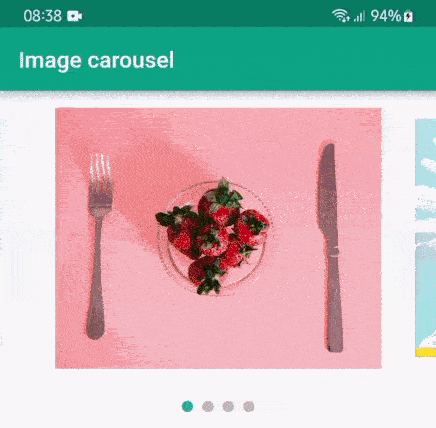
}The final result after integrating all the code can be seen in the example below.
Benefits of Creating Custom Widgets
Using packages can sometimes be very expensive as they have many dependencies and a huge code base. So we should create our own custom widget instead. Some benefits of creating custom widgets in Flutter are:
- A better understanding of the code logic
- Easy maintainability
- Unlike using a package, one does not have to worry about package support and discontinuity
- Easily change or add features as per the requirement
- Full control over the look and feel of a widget
- Easy for testing
Conclusion
Creating an image carousel is as simple as that. We do not have to use any packages for implementing this feature in a Flutter application. All you need is a basic understanding of PageController and basic logic in Dart.
Custom widgets are also very customizable. Building custom sliders and indicators are all done using simple widgets and passing of selected index to the PageController. You are not only limited to using images; if you want, you can use any widgets instead as per your requirement. Why waste resources and storage using a package for such a simple feature?
Check it out and tell me what you think!
Leave a comment and subscribe!