Introduction
The current world of mobile gaming is very competitive. In an age where people constantly look for quick content and entertainment, first impression matters a lot. When the players first open a game or an app, the splash screen is one of the first things they see. This screen needs to intrigue the viewer to stand out from the masses. It sets an overall tone for their gaming experience. If the players are excited by seeing the splash screen, it can grab their attention and ensure that they might stick around more.

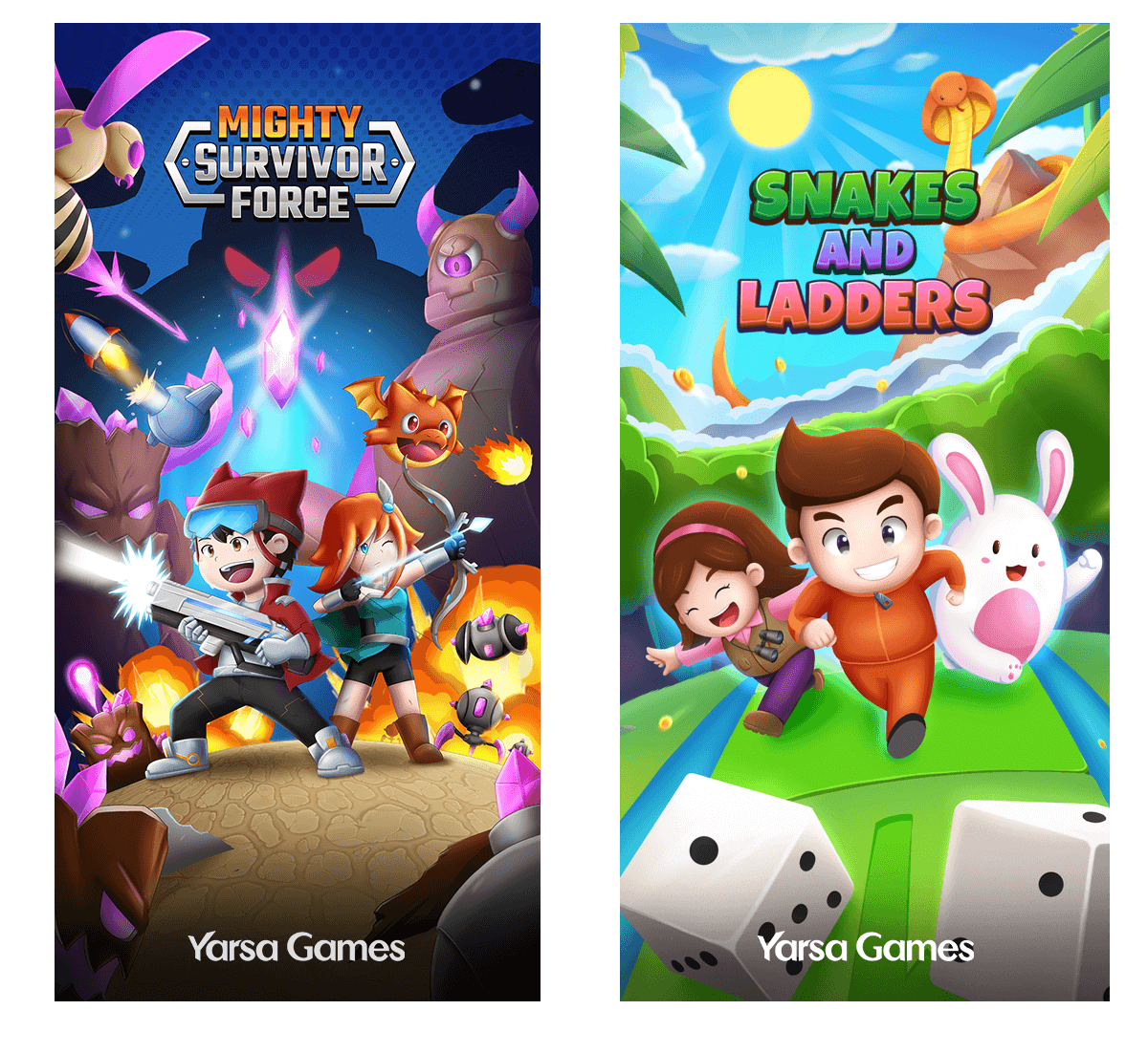
You can see two examples of illustrated splash screens in the above image. I will explain my process of creating Mighty Survivor Force's splash screen.
The Purpose
Before designing a splash screen, you will need to understand its purpose. A splash screen can serve many functions:
- First impression: As mentioned before, it gives the players the first taste of what they can experience in the game. Since it is the first thing the audience sees after opening the game, if they are fascinated and "wowed", it will increase their anticipation for the game.
- Branding: As it is the first thing they see every time they open the game, it can build the game's perception. The colour scheme, logo, patterns and visual style will establish and reinforce the brand identity.
- Loading duration: Splash screens also work as loading screens. While the game assets are being loaded in the background, the players can view and explore the splash screen illustration instead of just looking at a loading bar. When the game or app is ready, the home screen is launched by replacing the splash screen.
- Engagement: A memorable splash screen can captivate the player's interest immediately. It will make them excited to explore the game further.
- New Updates: When there is a big update with major changes, some games change their splash screen to inform the players of changes or additions. They can introduce new characters, locations, game modes, and holiday events like Christmas and Halloween. Since the players always encounter the splash screen, they will become accustomed to that image, and when it switches, they will realize that some changes may have been made to the game, too.
The Planning and Concepts
Before starting, try to understand the main goal and genre of the game. Play the game numerous times to get an idea of what feelings the splash screen must evoke in the players before they start the game.
For this article, I will describe my working process on the splash screen for Mighty Survivor Force. The splash screen was created after most of the game was already ready. It was done during the end of the development cycle, so the game was also ready for testing. I had most of the ideas ready because I had worked on the concepts and gameplay ideas from the beginning of this game's creation. If you are making the splash screen for a game you have not worked on before, be sure to ask about the concepts of the game and overall story to get most of all the ideas in the game from other designers. Of course, play the game a few times, too.
Emotion is the most important part you must consider while creating the splash screen. To create an effective splash screen, you must know about the game's genre, central theme and target audience. For example, if the game is about mystery, darker colours, like deep blue, purple or black, can help set the mood for the players as they prepare to play. Similarly, brighter, inviting colours and rounder shapes will work for a casual game. Focusing on clarity and visual appeal with playful fonts and shapes that match the game's style will work more in this case.

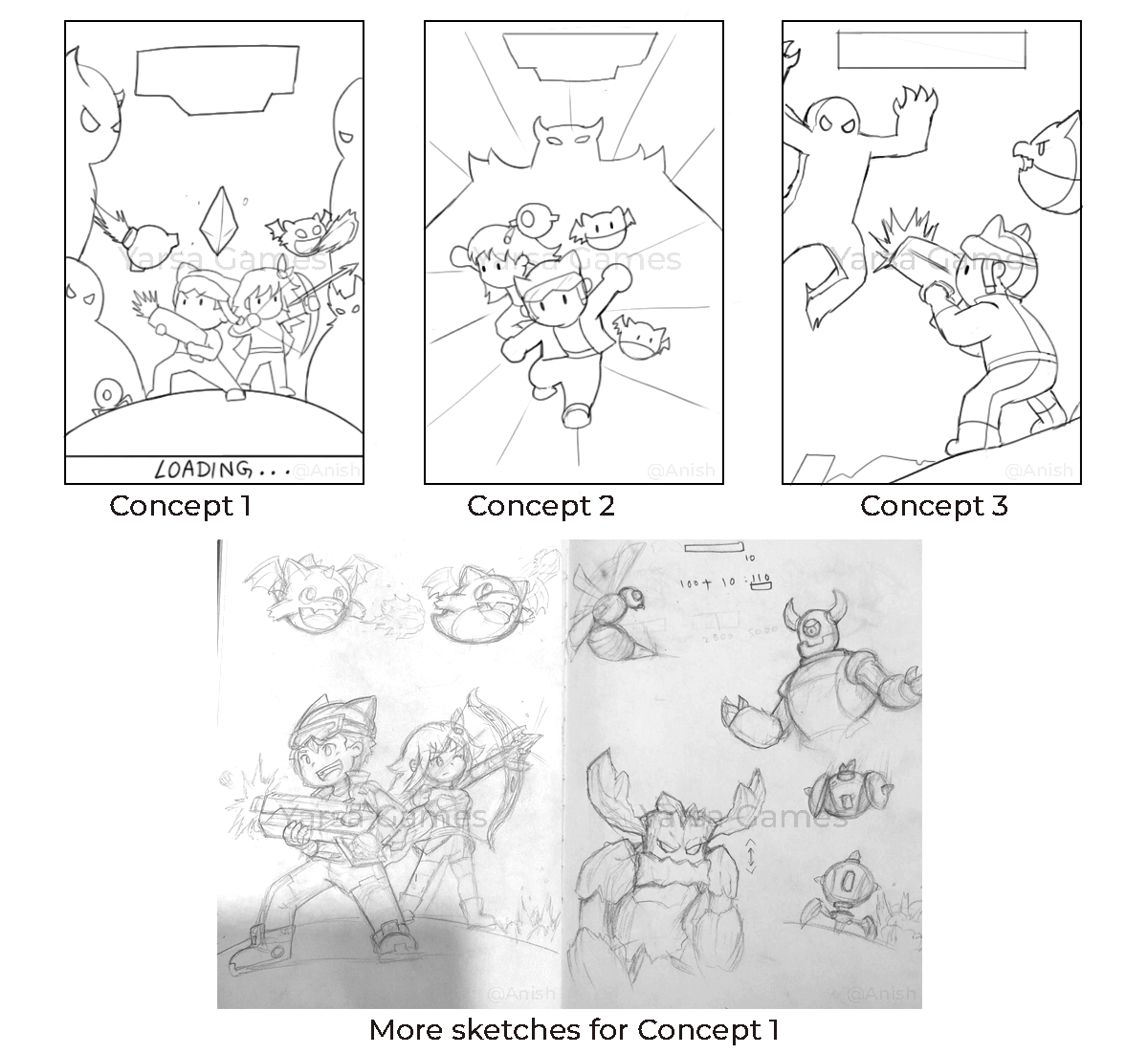
The game I am working on is an action survival top-down shooter game. I decided to evoke a sense of excitement and intrigue in the players whenever they opened the game. Since the game's main elements are the player characters, the enemies, and a mystical power source, I included all of those elements to create an action scene. I thought an exciting splash screen for this game would be an illustration of the characters in the middle of a fierce battle. With the concept of the different elements I wanted in the scene, I decided to move on to sketching the ideas to create a good composition.
See You In The Next Part
In the next part of this article, I will delve deeper into my creative process and design journey for Mighty Survivor Force's splash screen. In this section, I focused on a comprehensive exploration of the rationale and utility of the splash screen. It is important to note that our game will be accessible across a spectrum of mobile devices and tablets, each varying in screen dimensions. Therefore, the subsequent segment will delve into the intricacies of the technical facets, specifically the optimization procedures.
Thank you for reading. Hopefully you found this article insightful.
