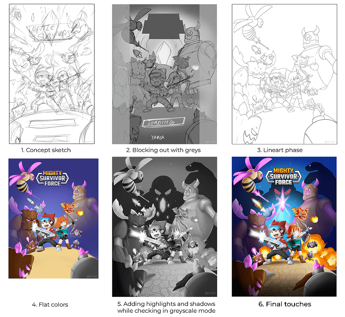
In the preceding article of this blog, I explained the significance and the fundamental role of splash screens in mobile games and applications. I had also sketched a few concepts to pick from. I will walk you through my illustration process and image optimization for different mobile devices and tablets in this part.
The Design
This was the final concept chosen by me and the design team. So why was this concept chosen over other concepts?

A clear visual hierarchy is needed to guide the viewers' attention. In this concept, the main focus is on the two characters and the gem in the middle. The eye then follows the characters' attacks (Bullets), goes to the enemies they are aiming at and goes up to see the huge enemies in the back and the game logo.
Simplicity is also key in splash screens. This screen needed to convey its message quickly and clearly that the game is about fighting monsters. I did not need to add all the enemies, only a few to give the feel that this game will feature fighting many enemies simultaneously.
Since the main characters' energy and UI involve blue colour the most, I wanted to use it as the background. This will also make the transition to the game seamless. To add contrast to the image, I added highlights to make some parts of the image pop. I also converted the image to black and white to check that the colours of the same saturation do not blend and make the screen look flat.
The bottom part of the splash screen was also left empty without any major elements in case a Start button, company logo or loading bar needed to be added.
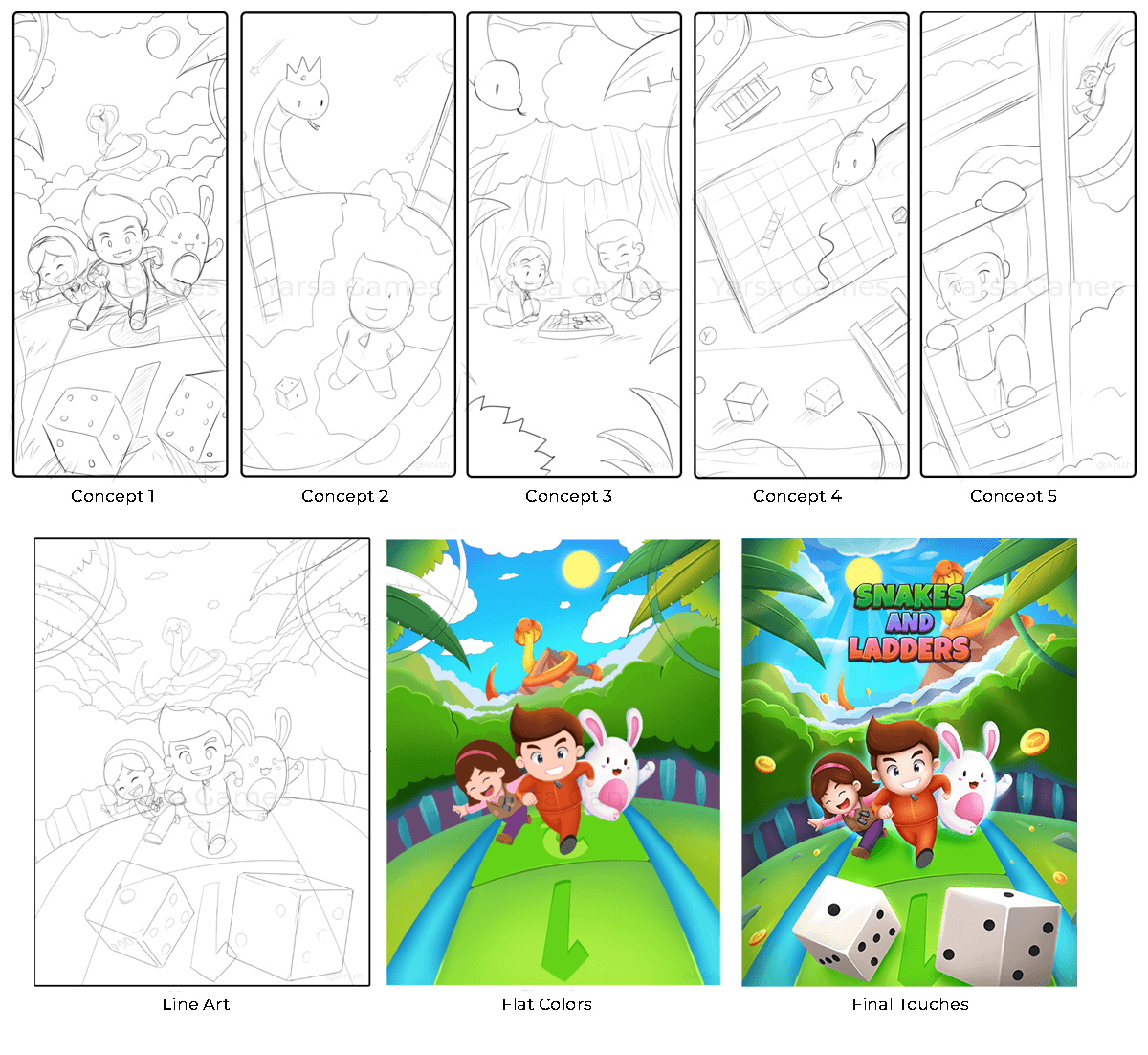
Here is another example of the creation process for another game, Snakes and Ladders. The plan for this splash screen was to add the mascot characters, a snake, a dice, a forest theme and the feel of a fun children's game.

The Optimization
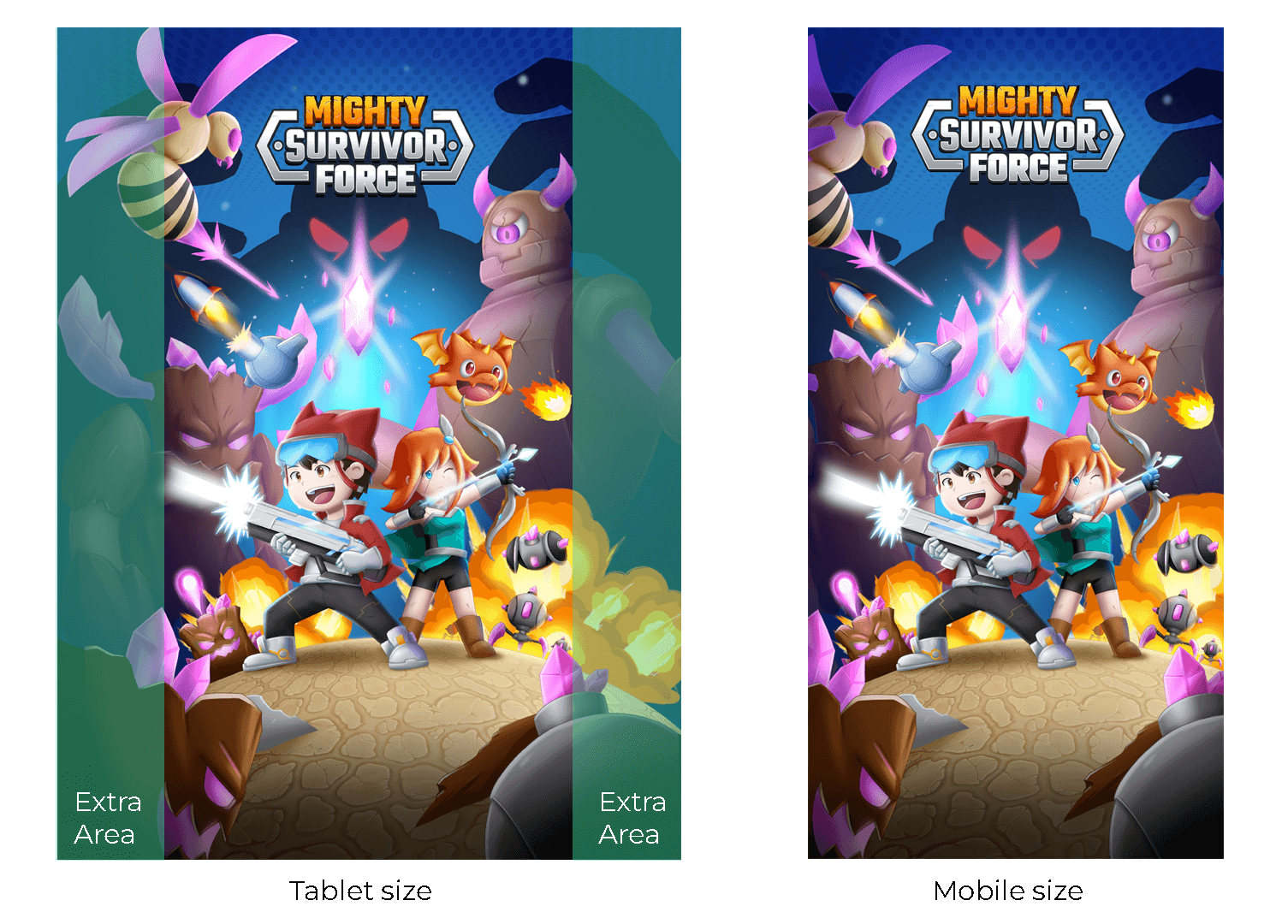
Mobile devices come in various sizes and resolutions. The splash screen should be responsive and look great on small and big screens. We must ensure that our artwork seamlessly adapts to different devices by preserving its quality.
I usually start with a big canvas (3072px x 4096px). Since I mostly work with raster paint tools in Adobe Photoshop, I tend to work on a bigger canvas than is actually needed. I can crop the image later or shrink the image to the required sizes by compressing the image without losing much pixel quality.

If your game is going to be launched on both mobile and tablet, it's best to work on tablet size first and crop the edges. For this, ensure not to add necessary elements at the edges of the image. The image for tablet size should be of the aspect ratio 9:10, and the image for mobile size should be of the aspect ratio 9:16. The main thing while designing for tablet sizes is to only add main elements inside the aspect ratio of mobile screens. The edges might be cropped in some tablet sizes. So, if you make the illustration in this way, no important element will be cut off.
I also exported character and background images separately in case certain parts of the image needed to be animated or moved to add text or buttons that were not in the initial plan. All the assets were exported as PNG formats in a size that is in the power of 2 (like 128 px, 256 px, 512 px, 1024 px, 2048 px) or divisible by 4 since these sizes will be easier to resize and compress in Unity game engine.
The Conclusion
Creating a captivating splash screen requires careful planning and execution. By understanding your game's identity and objectives and following good design practices, you can craft a splash screen that can help the players dive into your game's world. In the pursuit of introducing your game and getting the players excited to play, I wish you all the luck in creating amazing splash screens.
You can play Mighty Survivor Force on your mobile devices by downloading the game from Google Play Store.
Thank you so much for reading this article. Please consider subscribing and if you have any questions, you can comment down below, I'll answer them.
