
Introduction
The tab bar is a basic user interface component important to user navigation and interaction in mobile app design. You've likely used tab bars in various apps on your tablet or smartphone. The structure of an app tab bar will be thoroughly examined in this blog post, including its design elements, functionality, and suggested procedures for an enjoyable user experience.
Design Components of an App Tab Bar
A well-designed tab bar improves your app's visual appearance while giving users a simple way to access different features or functions. Let's analyze the main tab bar design elements:
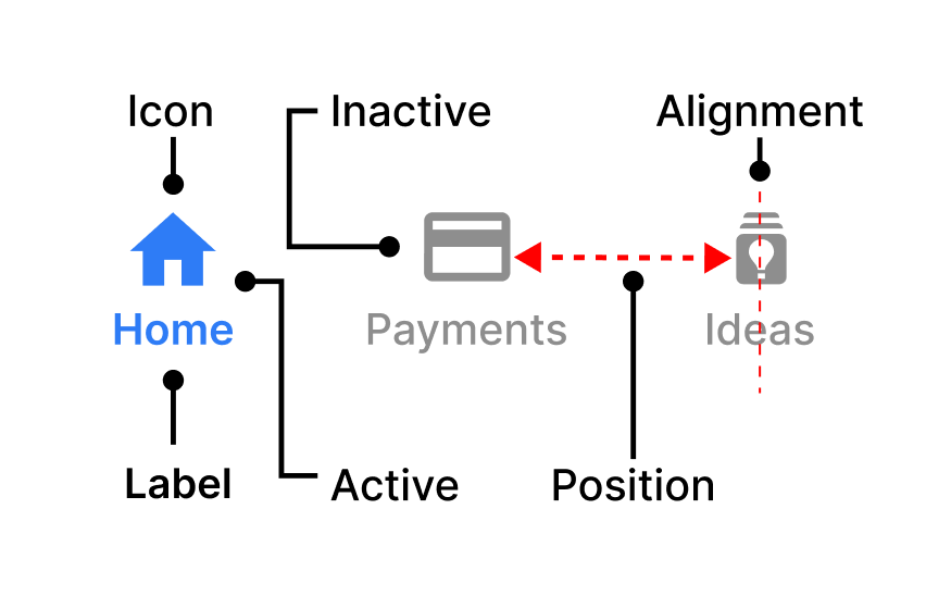
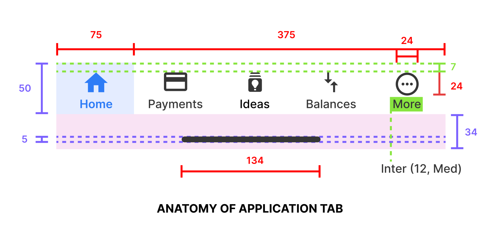
1. Tabs (Icons and Labels)
The individual buttons that represent different components or features of your app are known as tabs. Normally, each tab contains two parts:
- Icon: Icons are visual representations of the tab's associated content or function. These icons must be simple, recognized, and in keeping with your application's branding.
- Label: Users are able to understand what each tab does thanks to labels, which are written descriptions. Labelling is especially important for usability and accessibility.
2. Active and Inactive States
There are two possible states for tabs: active (chosen) and inactive. The inactive tabs represent alternative possibilities, while the active tabs indicate the area or feature that is currently being provided. Active tabs can often be visually separated from other tabs by an individual or design, indicating which area the user is currently in.
3. Positioning and Alignment
The screen's tab bars can be placed at the bottom or top. Top tab bars might be an appropriate choice for some usage situations, even if bottom tab bars are more common. To maintain balance and consistency, tabs should be evenly distributed and aligned regardless of position.
4. Color Scheme and Theming
Your tab bar's colour scheme must match your app's overall style and branding. A user interface that is functional and visually appealing benefits from consistent colour choices. Consider using unique colour shades to indicate different situations, such as chosen, unselected, or disabled tabs.
Functionality of an App Tab Bar
Beyond their visual design, app tab bars serve several crucial functional purposes. Let's explore these functionalities in detail:
1. Navigation
The main purpose of a tab bar is to give users an easy and quick way to navigate between different app sections or features. Without having to click through multiple buttons or pages, users can access various information or perform various tasks by switching between tabs.
2. Contextual Awareness
Users can maintain context during the program via tabs. Users predict that the content and user interface will change when they switch between tabs. The tab bar makes it easier for users to understand the application's design and find the required data or features at any given time.
3. State Persistence
One important aspect of tab-bar functionality is state persistence. When users switch between tabs, their previous interactions within each tab should be preserved. For example, if a user is composing a message in one tab and switches to another, the draft of that message should be retained.
4. Feedback and Interaction
Tabs should provide clear feedback to users when tapped or selected. This can be done through animations, transitions, or visual cues. Additionally, tabs should respond to user interactions with smooth transitions, ensuring a seamless and enjoyable user experience.
Best Practices for Designing an Effective App Tab Bar
Creating an effective app tab bar goes beyond just adding icons and labels. Here are some best practices to consider:
1. Keep It Simple
Limit the number of tabs in your tab bar to a manageable amount. Overcrowding the tab bar with too many options can overwhelm users and make navigation challenging. Focus on essential sections or features that align with your app's core functionality.
2. Prioritize User Needs
Identify which sections or features are most frequently used by your target audience and prioritize them in the tab bar. User research and analytics can help you make informed decisions about what to include.
3. Use Consistent Icons and Labels
Maintain consistency in the design of your tab bar icons and labels. Ensure the icons are easily recognizable and the labels provide clear descriptions. Consistency fosters familiarity and ease of use.
4. Test for Accessibility
Accessibility is crucial in app design. Test your tab bar with screen readers and ensure that all elements are accessible to users with disabilities. Use appropriate contrast ratios, alt text for icons, and focus states for keyboard navigation.
5. Consider Platform Guidelines
Different mobile platforms (iOS, Android) have different design guidelines for tab bars. Familiarize yourself with these guidelines and ensure that your tab bar aligns with the conventions of the platform you are designing for.
6. Provide Feedback and Animation
To enhance the user experience, incorporate subtle animations and feedback when users interact with the tab bar. This can include highlighting the selected tab or providing a smooth transition when switching between tabs.
7. Test Across Devices and Resolutions
Test your tab bar on various devices and screen resolutions to ensure it scales and functions correctly. Address any issues related to responsiveness and layout.
8. Iterate Based on User Feedback
Collect user feedback and analytics data to continually refine and improve your tab bar design. Iteration is key to creating an app that meets the evolving needs of your users.
Conclusion
In summary, the app tab bar is a critical component of mobile app design that impacts both aesthetics and usability. Its design components, functionality, and adherence to best practices can significantly influence the user experience. A well-designed tab bar not only enhances navigation but also contributes to the overall appeal and accessibility of your app. By following best practices and considering user needs, you can create a tab bar that provides a seamless and enjoyable interaction for your app's users.
Thank you for reading this article. Catch you in the next one.