
Introduction
In web and mobile app design, navigation bars are essential because they are the users' main way of navigating the application's features and content. Over time, distinct styles of navigation bars have emerged, each tailored to meet the diverse needs of both designers and end-users. In this article, we will delve into four prevalent navigation bar styles — the traditional navigation bar, the discreet hamburger menu bar, the sleek side navigation drawer, and the dynamic floating action button. Without further ado, let us begin our comprehensive exploration of these navigation bars, shedding light on their defining characteristics, optimal use cases, and industry best practices.
Standard Navigation Bar
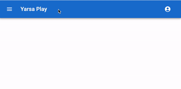
We'll likely see the common navigation bar on websites and apps, also called the top navigation bar. It often sits at the top of the screen and comprises links or menu items that direct users to other parts of the website or app. The following are some important features and ideas for standard navigation bars:
- Visibility: Standard navigation bars are constantly visible, making them a fantastic option for websites and apps with a few to a few hundred pages or sections.
- Space Efficiency: They effectively use the screen space at the top of the page to make the key material visible and easily accessible.
- Menu Items: Limiting the number of menu options available in the default navigation bar is important. The UI can get overcrowded, and users can become overwhelmed.
- Responsive Design: Make sure the standard navigation bar is responsive to adjust to different screen sizes and orientations.
Hamburger Menu Bar
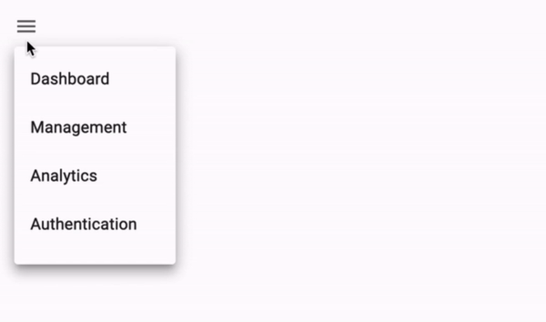
The hamburger menu bar, also known as the "hamburger icon," consists of three horizontal lines stacked on top of each other. The icon opens a hidden menu when users click or tap it. Following are some things to keep in mind when utilizing the hamburger menu:
- Space Conservation: Hamburger menus help minimize screen space, which makes them popular in responsive web design and mobile app development.
- Hidden Navigation: By default, the menu components are hidden, which can make the user interface look cleaner and less confusing. To access navigation options, users must tap the hamburger icon.
- Mobile-First: Hamburger menus are frequently associated with mobile-first design principles, but they are also used in desktop web design, especially to simplify complex navigation.
- Icon Clarity: Ensure users understand the hamburger icon's meaning. A label or popup addition could improve user understanding.
Side Navigation Drawer
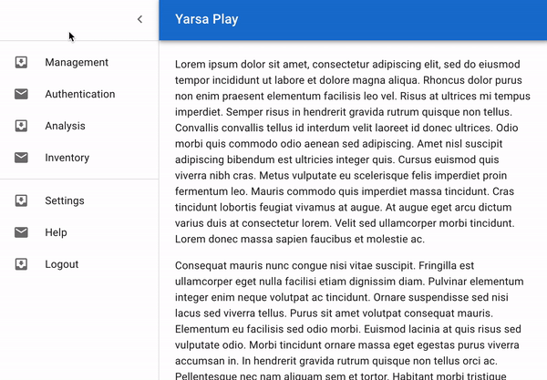
The side navigation drawer is a common navigation design found in multiple websites and mobile apps. When activated, a hidden panel or drawer moves in from the side of the screen. What you need to know about side navigation drawers is explained below:
- Space Utilization: Similar to hamburger menus, side drawers efficiently save screen space by hiding navigation options when not in use.
- User Engagement: The navigation drawer is user-friendly and intuitive because users can access it by swiping from the edge of the screen or touching a particular button.
- Complex Navigation: Side drawers provide plenty of space for organizing and displaying menu items, making them perfect for apps with many sections or features.
- Customization: To match the identity and functionality of the app, designers may change the side navigation drawers' appearance and behavior.
Floating Action Button (FAB)
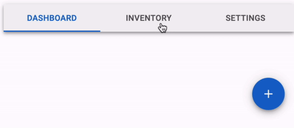
The floating action button, commonly called FAB, is a unique navigation element primarily used in mobile app design. It typically appears as a circular button with an icon in the centre of the screen. Here are some key points about FABs:
- Prominence: FABs aim to be visible and catch people's attention. They are typically used for features or behaviours seen as necessary or frequently used.
- Single Action: Single, focused tasks like adding a new item or writing a message are best performed with FABs.
- Positioning: To provide simple access to the action, they often hover above the content and stay visible while users scroll.
- Usability: To avoid confusion, ensure the FAB's icon or label properly identifies its purpose.
Where to Use Navigation Bars
There are multiple situations where navigation bars are suitable, including:
- Websites: Users can browse between pages, sections, or categories on websites using navigation bars, which are normally found at the top of the page.
- Mobile Apps: Users can navigate through mobile apps using the navigation bars frequently at the bottom of the screen.
Best Practices for Choosing a Navigation Bar Type
Selecting the right navigation bar depends on multiple factors, including the type of website or application. The number of sections or features and your target audience. Here are some best practices to guide your decision:
- User-Centred Design: Put the user experience first by noting how different navigation options will impact user engagement and usability.
- Content Hierarchy: Analyze your features or content to determine which are most important. High-priority things should be given the best space in your navigation.
- Mobile Responsiveness: Check that your chosen navigation design works properly on desktop computers and mobile devices. When designing for different screen sizes, take into consideration responsive design ideas.
- Testing and Feedback: User testing and feedback are important for improving your navigation design. The trick to designing the ideal user experience is iteration.
- Consistency: Keep your website or app's navigation structure consistent to make it easier for users to become used to your interface.
Conclusion
The user experience can be greatly affected by web and mobile app design navigation bars. Consider your project's requirements or goals carefully before selecting a normal navigation bar, hamburger menu bar, side navigation drawer, or floating action button. You may design a simple and user-friendly navigation system that improves your application's general usability by understanding the traits and best practices related to each form. To provide users with the greatest user experience possible, keep in mind that there is no one-size-fits-all solution and modify your selection to the particular needs of your design project.
Thank you for reading this article. See you in the next part of this series of articles.