
In the second part of this blog series, we’ll look at how to create a fully functional, visually appealing button in Figma. Allowing both the user and designer a great experience.
How to Make a Button?
Buttons are the most common components in designing field. Buttons guide the users to take actions and interact with UI. With the help of Figma, designers can create a fully functional button for a better user experience.
In this blog, we’ll learn how to make buttons in Figma. From creating basic shapes to a fully interactive state, this tutorial will also be useful for other designing platforms, such as Adobe Photoshop and Illustrator.
Step 1: Set the Stage
Open Figma: Launch the Figma application or log in with your browser. You can either create a new Figma file or import an existing project.
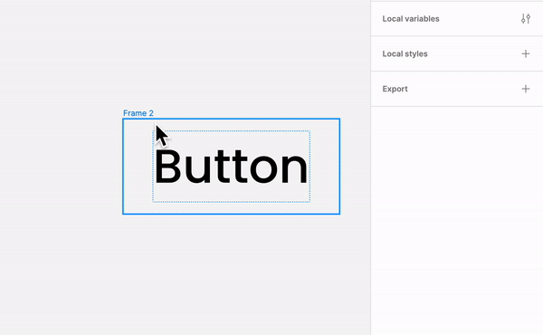
Select a Frame: A frame is just like paper where you design any artwork. In the context of Figma, frames are containers that hold your design elements, such as buttons, navbar, and cards. It acts like a paper/canvas, and you create your elements inside it.
Simply put, frames act as virtual windows through which you view and manipulate your design, helping you maintain a sense of order and hierarchy. Additionally, frames are also convenient for the following reasons:
- Boundary and Clipping: Frames give your design a distinct boundary. Everything positioned outside the frame's boundaries is immediately clipped to ensure a neat and focused layout. When designing responsive interfaces for various screen sizes, this is quite helpful.
- Hierarchy and Organization: Using frames, you can create a hierarchical structure for your design. Frames can be nestled inside one another to form a parent-child connection that helps organize intricate patterns.
- Responsive Design: A key component of responsive design is frames. Building interfaces that function flawlessly across various devices is simpler when you can instantly observe how your design elements adapt to different screen sizes by resizing a frame.
- Interactivity and Prototyping: The development of interactive prototypes requires the use of frames. You can specify interactions inside frames and link them to other frames to display user flows and simulate navigating an app or website.
- Collaboration and Version Control: The cornerstone of collaborative work is frames. Frames make the guarantee that each component stays organized and editable when numerous designers are collaborating on a project, improving collaboration effectiveness.
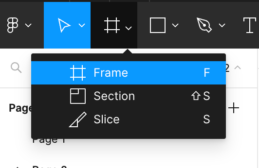
Multiple options will be given to choose a frame, such as:
- Phone Screen: Designer for mobile UI screens, This screen is ideal for creating responsible app screens.
- Tablet Screen: Similar to phone screens, this larger layout is for tablet view to check the responsiveness of your application.
- Desktop Screen: This frame represents your monitor or larger display.
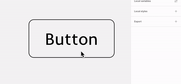
Step 2: Add Text and Customize
In UI Designs, font size, font weight, and font style play an important role in creating a brand image. Type the name of your button. You create any button and customize their styles according to your needs.
- Font Styles: Choosing the right style reflects the brand. For example, Montserrat means modern, Arial reflects clear, and Lato represents clean. For a better user experience choosing a clean and minimal style will help users understand your information.
- Font Weight: Weights focuses on contrast. Bold, Semi Bold, Medium, Regular and Light are examples of font weights. Regarding fonts, bold and heavy weight means important and light weight means less important. Combining different weights will help the users to read properly.
- Font Size: Choosing the right font size helps the users to read properly on various screens and devices. Small font sizes can put pressure on the eyes of the user, and large font sizes can disturb the content flow. They also help to create a hierarchy, stating larger text for heading and smaller text for information. H1 is the largest, and H6 is the smallest font size.
Step 3: Auto Layout Magic
Using Auto Layout, we can easily align our button’s text vertically or horizontally with a click. Padding - the space around the text and spacing will auto-adjust, giving our button a breathing space.
We can customize the numbers from the horizontal and vertical padding available in the Auto Layout panel. This process will maintain the consistency of padding as the text increases and decreases.
Hug and Fill also play an important role in responsiveness. Fill follows the parent properties, and Hug acts as a sole frame which is less responsive.
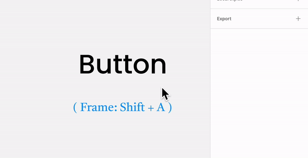
Shift + A to Create an Auto Layout FrameStep 4: Stylize the Button
Now we're colouring the button with the Fill option and adding a stroke. While stylizing the button, we should keep in mind to either use primary colour or secondary colour.
Primary colours are usually the colours that reflect the brand identity. But we can experiment with different colour combinations to achieve the desired look. We must create a style for danger, warning, information, and success buttons.
Applying the border using the stroke feature in the properties panel on the right will create an outline of the button, maintaining the padding. The stroke's thickness and colour can be adjusted, and we can also add a border radius to it for a visually pleasing look. After the fill and stroke are set, we can change the button centre text.
Overall Impact on User Interface
Branding and Consistency: Font choices, including size, weight, and style, contribute to a brand's identity and consistency across platforms. A well-defined typography system reinforces brand recognition.
User Accessibility: Proper font size, weight, and style contribute to accessibility. Text that is easy to read benefits users, including those with visual impairments.
User Experience: Careful consideration of font properties enhances the user experience by making content more readable, scanable, and engaging.
Congratulations on successfully designing a button! Stay tuned for the final part of this blog series, where I'll discuss how to control a button using Boolean and Variant properties.
Thanks for reading! Subscribe to not miss out on our fresh blog posts.