
Buttons – the most used component in any user interface design that provides interactions and makes for a great user experience. Button designing is a simple concept, but mastering it can create a solid user experience and positively impact the whole user interface.
In this blog, we’ll learn all types of buttons, mainly focusing on four types: Primary, Secondary, Text, and Elevated Buttons. Additionally, we'll be discussing their states: Enabled State, Hover State, Pressed or Clicked State and Disabled State.
Let's create a visually attractive button by following UX laws.
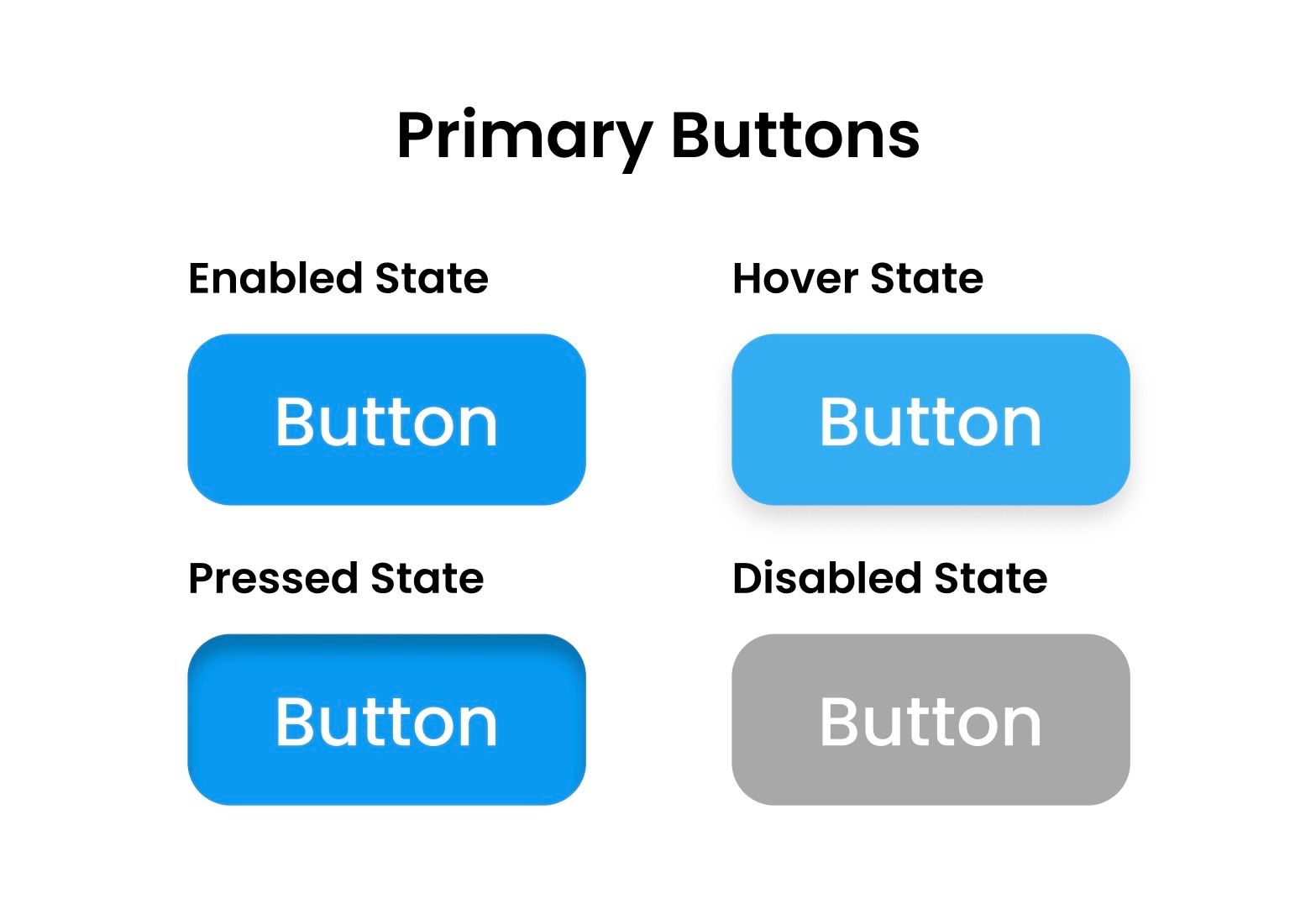
Primary Buttons: Guiding the Way
Primary buttons are the most common button. The familiarity of these buttons includes their appearances and placements. Their sole purpose is to guide the users towards important tasks, submit information through forms, upload photos, and log in or sign up for any application.
Enabled State
This state features opaque or solid colours that stand out from the rest of the design. This helps the users to locate where to click and interact due to their contrast and placement.
Hover State
When a user hovers their mouse on a button, there is a slight change in their appearance. It may be their colour shade or text size. This interactivity will encourage the user to click based on visual feedback.
Pressed State
A pressed state is when a user clicks on a button. The button changes its appearance and undergoes a slightly darker shade while casting shadows. It also provides haptic feedback for mobile users and sound confirmation for gamers contributing towards a better user experience.
Disabled State
During the disabled state, the button appears to be greyed out and has properties of a primary button, such as text style and button size. The grey in user experience indicates the button is disabled and its function is unavailable. This helps users to not waste their time clicking or interacting with it.
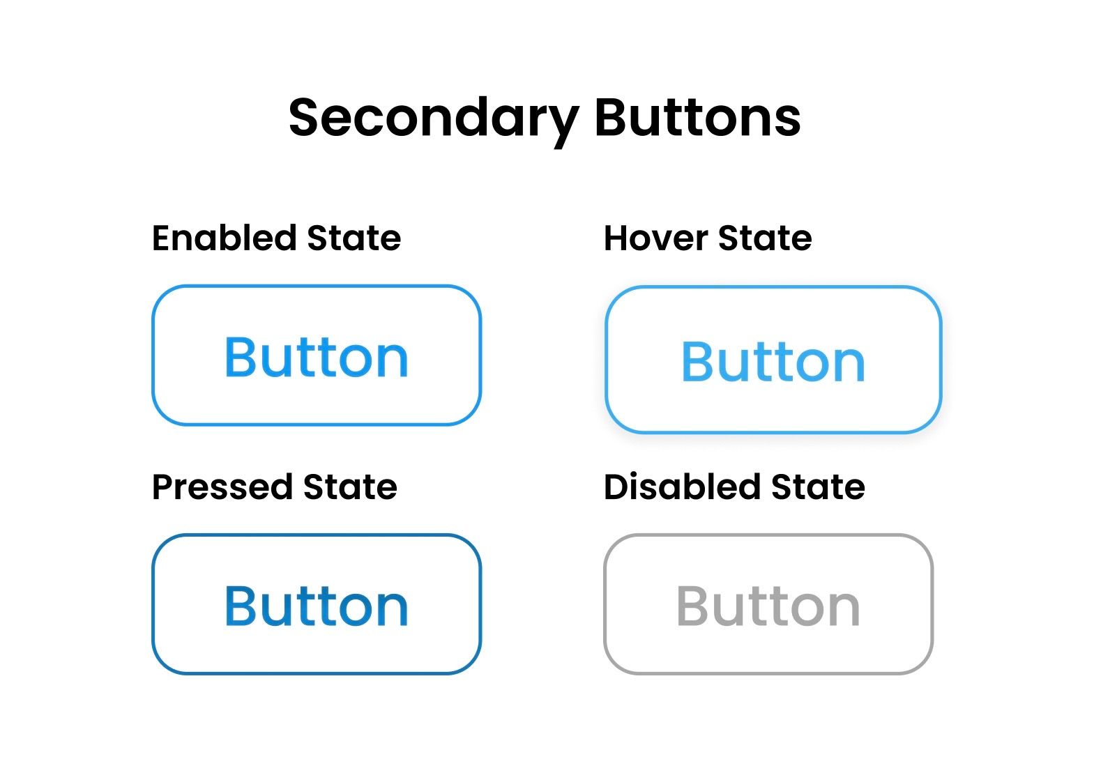
Secondary Buttons: Balancing Act
Secondary buttons are more subtle CTA (Call To Action). These types of buttons are less prioritized buttons, such as navigating backwards and cancelling drafts buttons. Secondary buttons keep a uniform style while taking styles of primary buttons such as text style and button size.
Enabled State
Secondary buttons have a subdued appearance in their enabled state with a border. Additionally, their colour opacity is reduced, or no colour is used, with a transparent background of their design’s colour palette.
Hover State
In this state, the secondary button’s border and background colour change and present a highlighting primary colour while hovering. It also displays short text explaining what the button does if you click, catering for a better user experience.
Pressed State
Like primary buttons, when pressed, the button's appearance can change slightly darker and a drop shadow may appear. For a better user experience, haptic feedback and sound confirmation are also applied.
Disabled State
In their disabled state, they appear in a grey version of the primary button and help the user to identify this button doesn’t possess any functionality.
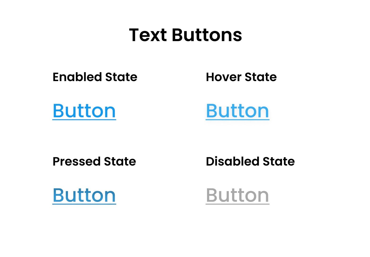
Text Buttons: Less is More
Text buttons speak for themselves. In appearance, they are minimal in nature, with no background and no stroke. The button mostly contains text. Hence, the name – Text Buttons. The functionality remains the same, usually with an underline present under the text.
Enabled State
In their enabled state, these text buttons appear with plain text with an underline of their primary colour.
Hover State
On hover, the text colour will change slightly on text and underline to a lighter shade of the primary colour from the Enabled State.
Pressed State
Clicking the text button will change their appearance to a darker version of the primary colour. We can also add an underline animation when clicking or hovering the button.
Disabled State
Like primary and secondary buttons, the text appears greyed out, indicating the functionality is disabled.
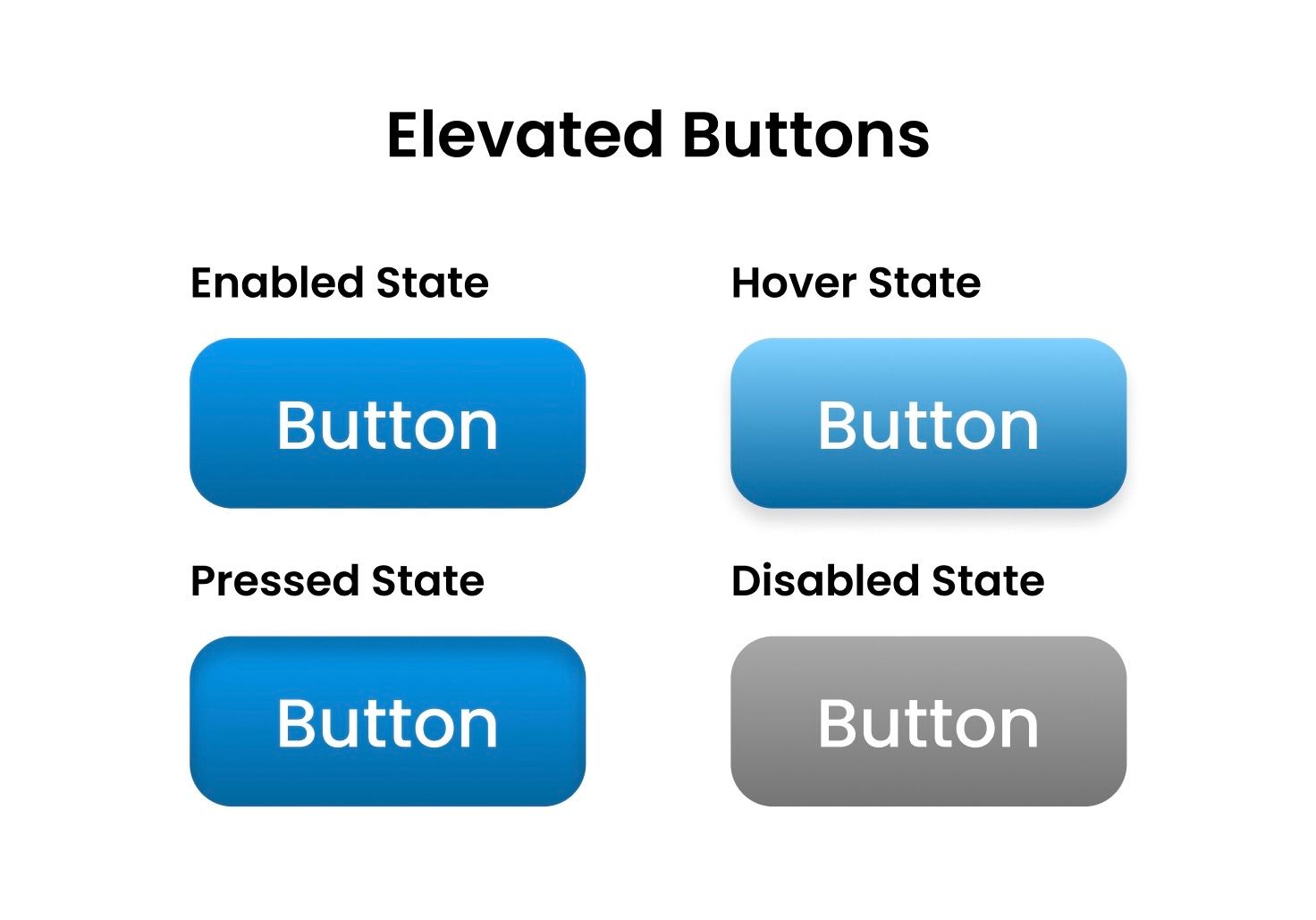
Elevated Buttons: Adding Depth
Elevated buttons use subtle shadows as a sense of depth and often use gradients to make them stand out. Gradients like liner and radial will make it appear above the surface, giving an elevated look.
Enabled State
In this enabled state, the button features drop shadows and gradients to create an illusion of elevation and encourage the users to interact with it.
Hover State
Hovering the elevated button creates a short animation on the gradients for an aesthetically pleasing effect.
Pressed State
When the elevated buttons are clicked, they can temporarily suppress the shadows and gradients. Highlights are added to the top and shadows to the bottom for an elevated effect.
Disabled State
The disabled state in elevated buttons maintains the shadow and takes properties from primary buttons, such as text styles and button size but appears in grey.
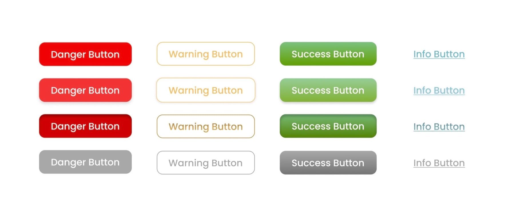
Other Buttons
There are other styles of buttons: Danger Button, Informative Button, Warning Button and Success Button. Each has its own Enabled, Hover, Pressed and Disabled states. These buttons are mostly identified with colours.
Danger button
- Appears in red or crimson, indicating a warning signal to others, like some type of critical action which may result in consequences or data loss.
Warning button
- The warning button is a beacon of caution, alerting people to potential dangers or problems. It serves as a visual cue for users to continue with caution by being dressed in vivid hues of yellow or orange. This button is frequently used for tasks that can have unforeseen repercussions or call for special care.
Success button
- These buttons contain shades of green or teal, displaying accomplishment or positivity. They signal the user that their actions are completed successfully and are mostly used for transactions and transfers.
Informative button
- A user interface's info button is a resource for information and direction. It's intended to give users more details or context and is covered in serene colours like blue or turquoise.
Stay tuned for the next part of this blog to learn how to make these interactive buttons, start to finish.
Thanks for reading! Don't forget to leave a comment below and subscribe for more DevBlogs.