
The first article went through the basics of navigation and the different tools available in Figma. This article will explore more features in Figma to create different components used in UI design.
This article will cover the following topics:
- Auto Layout in Figma
- Using Plugins in Figma
- Creating Styles in Figma
Auto Layout in Figma
One of the best features in Figma is the auto layout feature, which helps immensely in designing responsively.
You just need to define how to align the items and the padding, and Figma will automatically resize and align different items set to the auto layout feature. This means you don't have to go in and keep resizing your elements. Here is a quick example of a button with an auto layout.
Step 1: Creating a Button
We will only use the text tool to create a button. Select the text tool, or use the shortcut key T. And type in 'Download' to create a download button.
Step 2: Adding Auto Layout to the Button
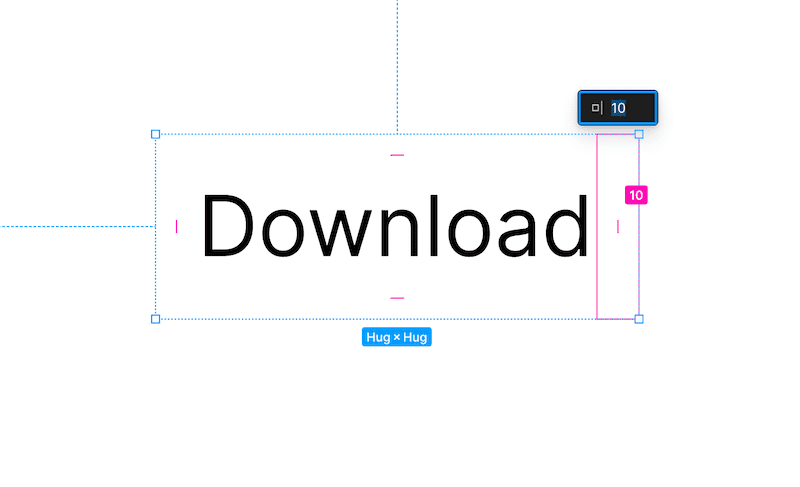
Then we will add an auto layout to it. Select the text with the selection tool (shortcut V), and press Shift + A. This will add an auto layout to the text. If you click the text and hover over it, you can see that Figma has automatically added 10px padding to all its sides.
Adding an auto layout will automatically add a frame to your text.
Step 3: Styling the Button
You can add a background for the button by adding a fill property to the text box. The fill property can be found on the right side under the Design tab. You can also change the text style and colour properties of the text itself in the same way. Double click on the text to select the text, and play around in the design tab.
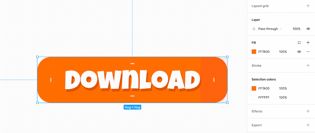
I used the font Luckiest Guy and added a drop shadow with 0 blur value to the text.
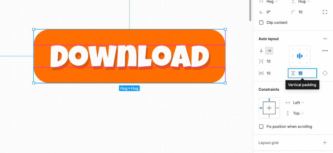
Step 4: Modifying the Auto Layout Property
You can modify the auto layout properties from the Design tab on the right-hand side. You can specify the pixel value for the padding horizontally and vertically.
You can also specify the different values of padding for the right and left sides by specifying the value separated by commas as 10, 16.
There you have it! You can now change the button's text, and the background should automatically increase or decrease according to the text size and the padding specified.
Plugins in Figma
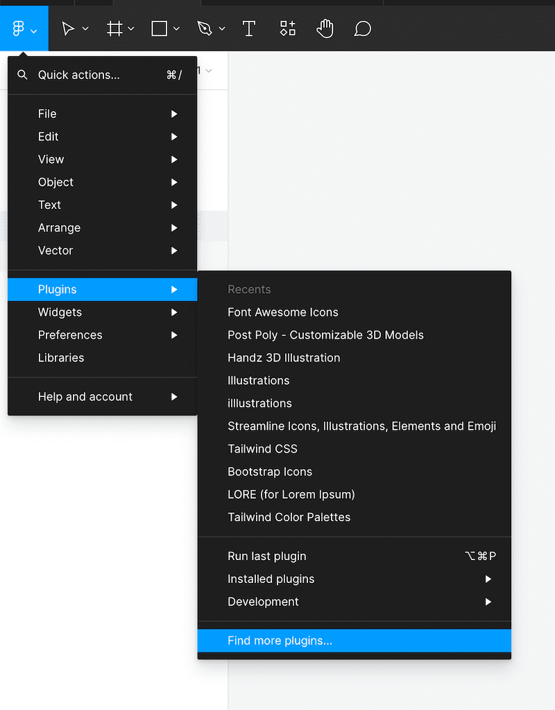
Plugins make your life so much easier. Figma has a ton of helpful plugins that can easily be accessed with a few taps. Open the Figma Menu and click Plugins > Find More Plugins. You can search for plugins there and install them.
After installing a plugin, you can use them by simply clicking on the plugin name.
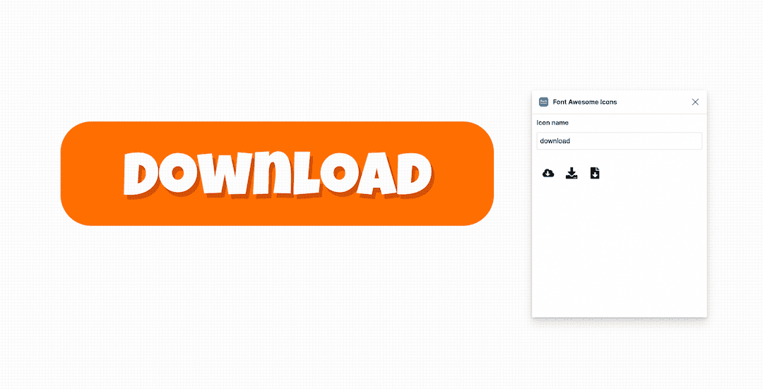
Let's say you want to add a download icon to the button. First, install the Font Awesome Icons plugin, then run the plugin. You can now get vector icons from the Font Awesome Library to use in your designs.
Step 1: Adding the Download Button
Search for the download icon on Font Awesome Icons. And click on the icon to add it to your working file.
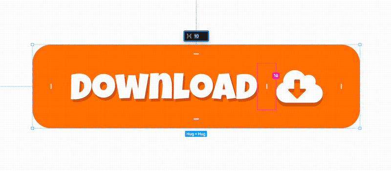
Step 2: Adding the Icon to Your Auto Layout
You can drag and drop your download icon from the layers panel inside your auto layout frame. Once you drop it on top of the text layer, the icon will be added to the button with auto layout.
You can drag it to move it to either side of the text. You can also change the spacing between the 'download' text and the download icon by hovering over the gap, sliding the gap with your mouse, or clicking to add a number value manually.
Creating Styles in Figma
Creating and defining styles in Figma will help make your design process faster and more efficient. These styles are file-dependent, and anyone with access to the design file can use the same styles from the style library. Styles can be used to define colours, fonts, and any other effects.
This makes it so much easier for designers to collaborate on a project. If more than one designer is involved in a design project, they can easily use the same font and colour styles.
Creating Text Styles
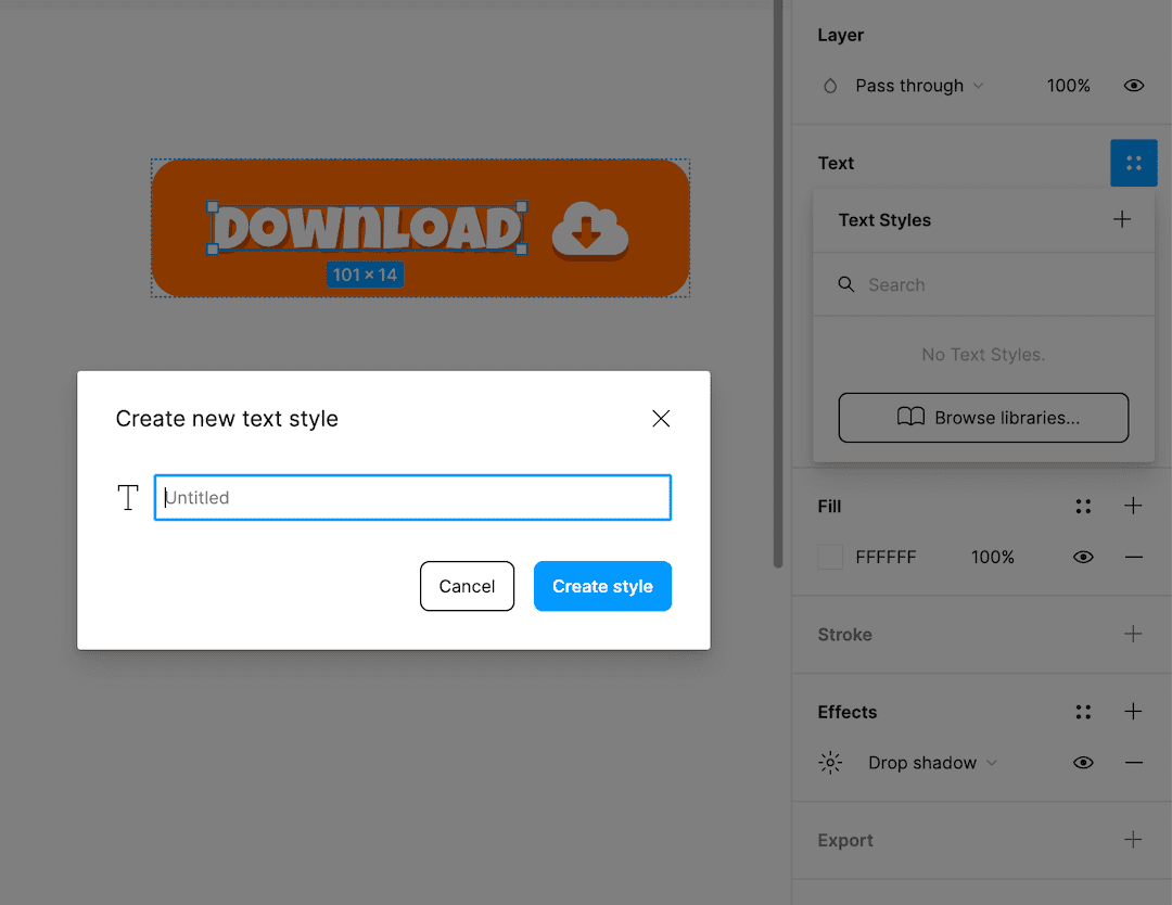
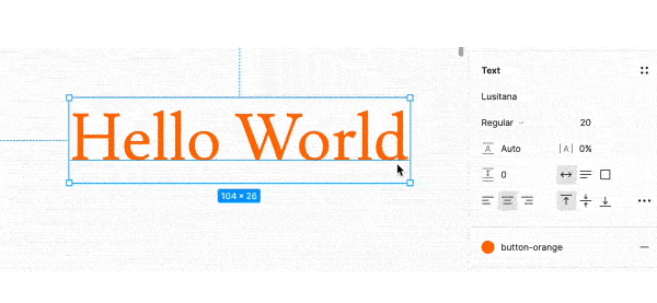
Let's say I want to define the button text style, with Luckiest Guy at 20 points. On the design panel, you can check the Text panel.
The four dots icon indicates the style option. Available styles can be chosen from there. If you want to create a new style, you can click on the Plus icon and name your style.
Then click Create Style to add your font style to the style library.
Now, if you want to re-use the same style of font as the button text, you can simply add the style from the drop-down list of available styles.
Creating Color Styles
Let's move on to colour styles next. No need to keep your hex codes or keep colour picking! Simply tap into the Fill tab, and add your new colour value as a colour style.
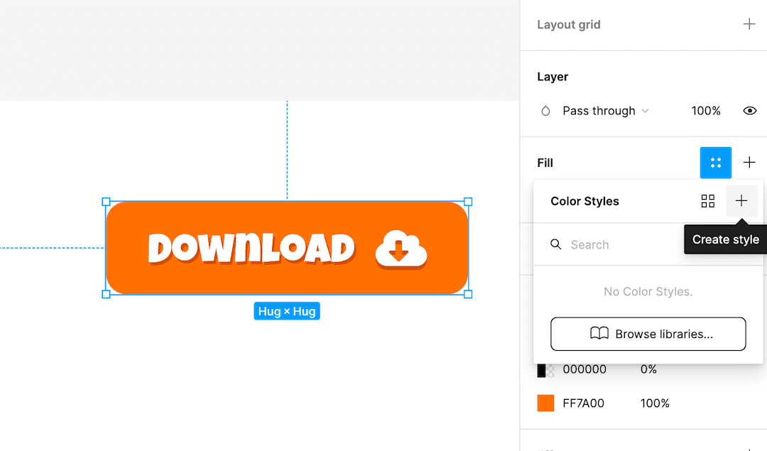
You can use the existing styles by clicking the style button and selecting the available styles.
These concepts should help you out a lot in designing with Figma. These are some of the basic concepts that really helped me make my workflow faster and easier to collaborate with fellow designers.
Thank you so much for reading, and catch you in the next one! Don't forget to subscribe and leave a comment.