Introduction
The constantly evolving field of user experience (UX) design has made it important to look at various psychological principles to build aesthetically beautiful and user-friendly interfaces. Hick's Law is one such fundamental concept that greatly impacts UX design. The relationship between a user's decision-making time and the number of options presented to them is examined in this rule, which is named after the British psychologist William Edmund Hick. In this blog post, we'll examine Hick's Law in detail, as well as how it relates to UX design and practical implementation strategies.
The Essence of Hick's Law
Hick's Law, created in the 1950s, states that a person's decision-making time is directly correlated with the quantity of options at their fingertips. Put another way, the more alternatives there are, the longer it takes someone to decide which one to choose. The fundamental idea is based on the cognitive theory, which holds that human decision-making requires information processing and that too many options might cause cognitive overload and delay decision-making.
Key Components of Hick's Law:
Decision Time: The relationship between the quantity of options and the decision-making process's duration is the basic principle of Hick's Law. According to the laws, additional options will always be available, resulting in a longer decision-making process.
Cognitive Load: Hick's Law draws attention to the cognitive stress that people experience when provided with several options. Making more decisions demands more mental work, which might result in frustration with decisions and a decrease in decision-making quality.
Implications for UX Design
Hick's Law encourages UX designers to take serious decisions when designing user experiences, which has major consequences for them. By understanding and putting this Law to use, designers may improve general usability, optimize interfaces, and speed decision-making processes. Let's examine how Hick's Law appears in UX design.
Simplifying Navigation Menus
UX design depends greatly on navigation menus, and Hick's Law shows how important it is to make them easy to understand. Providing users with too many menu options may cause them to become confused and limit their ability to make decisions.
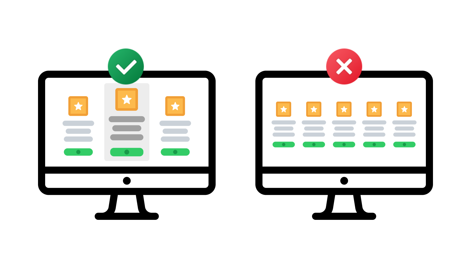
Strategy: To make decisions easier, group similar options, prioritize important menu items, and use hierarchical structures. You may avoid giving consumers too many options by grouping items, adding dropdown menus, or adding the Chef special section.
Minimizing Form Fields
Many websites, such as user registrations, checkout sites, and sign-up procedures, depend heavily on forms. Hick's Law emphasizes that when consumers are faced with a wide variety of form fields, there may be a potential for longer decision times.
Strategy: Simplify forms by excluding all unnecessary fields. Where users expose more fields as needed if more information is required. This method speeds up decision-making and reduces mental stress.
Limiting Choice Paralysis
When consumers are faced with many options, they get confused and unable to decide. Hick's Law highlights the necessity of finding a middle ground between providing options and avoiding decision overload.
Strategy: Restrict the number of choices displayed at any moment. Think about providing guided experiences where users navigate through a sequence of actions that provide possibilities one at a time. Use default options as well to reduce the mental strain of selecting decisions.
Streamlining Menu Navigation in Mobile Apps
Applying Hick's Law is important when designing mobile apps since there is a limited amount of screen area. Many options and crowded menus can create a stressful and unsatisfactory user experience.
Strategy: Use swipe movements, tab bars, and hamburger menus as examples of mobile-friendly navigation patterns. Limit the options available on the screen by using clear labels and easily identifiable symbols. Give important features top priority for quick access.
Real-world Examples of Hick's Law in Action
To grasp the tangible impact of Hick's Law, let's explore its application in various real-world scenarios:
Restaurant Menus
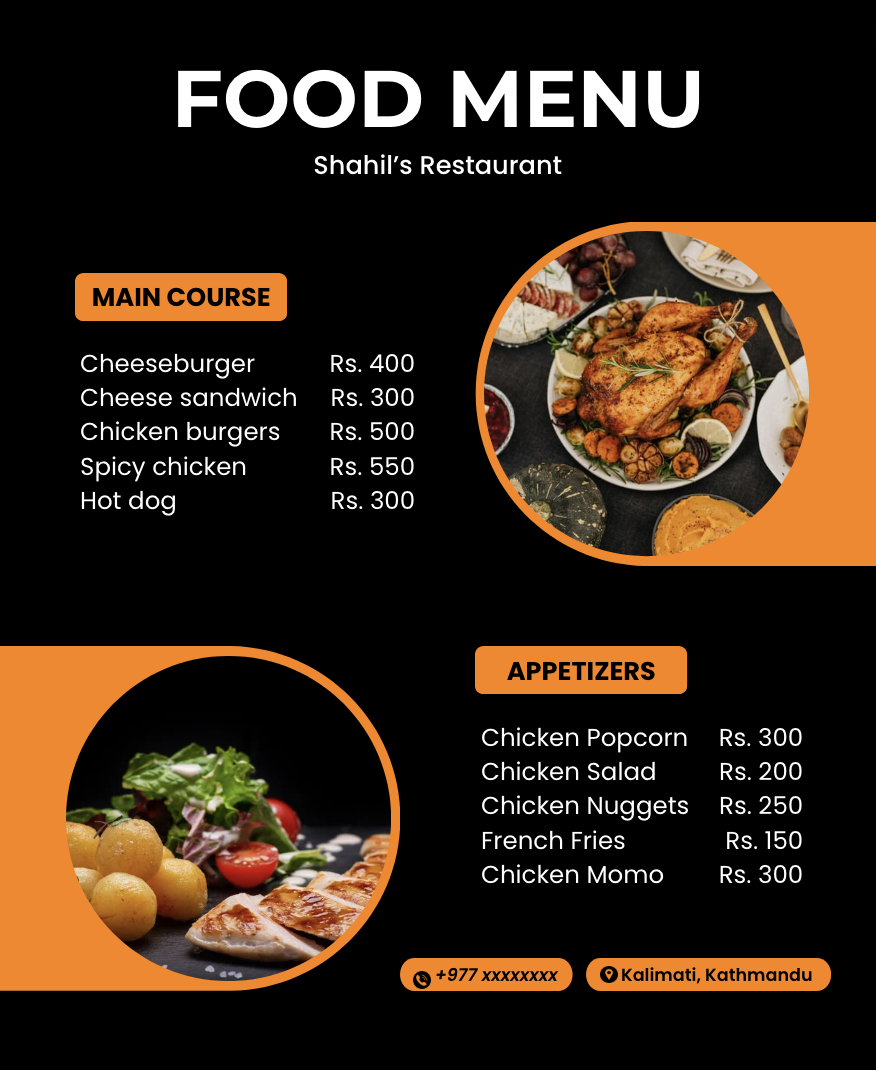
In the restaurant industry, Hick's Law is followed in menu creation. Excessively large menus can confuse customers, causing them to take longer to make decisions and be unsatisfied.
Application: By categorizing items, giving short explanations, using visual components or symbols to denote some type of prioritization and adding sections like chef special so that it's easier to filter out the popular dishes. Restaurants frequently simplify their menus by applying menu engineering psychology. Menus with few options or daily specials let customers make decisions more quickly.

Also Read: Fitts's Law in UX Design: Navigating the World of Precision and Efficiency
Supermarket Shopping
Supermarket shelf arrangements and layouts show an understanding of Hick's Law. A crowded aisle with too many alternatives for products might make shopping difficult.
Application: To help customers, supermarkets use aisle signage, product categorization, and thoughtful product organization. Featured items and promotional displays encourage making decisions more quickly and simplifying the process.

Online Streaming Platforms
With their huge content collections, digital streaming providers must balance providing options without confusing consumers. These platforms' designs are influenced by Hick's Law to provide a user-friendly experience.
Application: To help customers make better choices, streaming services use playlist collection, recommendation algorithms, and personalized content suggestions. Decision-making is also influenced by pointed-out things such as suggestions and recommendations. By studying the audience and tracing their choices, we can customize a package more suitable to them to create a better user experience.

Tangible Products
Our day-to-day used products face the challenge of presenting users with numerous options, and some options we don't even use; Hick's Law influences the design of these products to facilitate efficient decision-making and boost a good user experience.
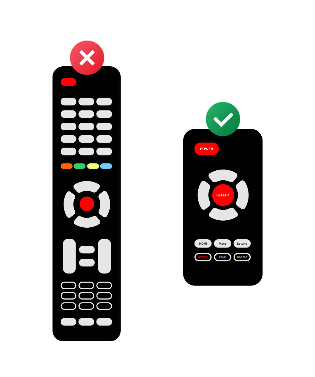
Application: Our traditional TV remote controller is a good example; there are more than 50 buttons, and we don't even use all the features for our daily usage. We just need buttons like power, volume, channel switch and mute. Narrowing down the unwanted options and presenting users with just useful features.

Thank you for reading this article. Please comment below if you have any queries regarding Hick's law.
