
Introduction
Colour has a significant influence on our perceptions, emotions, and behaviours. Colours affect our daily lives in significant ways, from the vibrant spectrum of a sunset to the serene tints of a peaceful ocean. Understanding colour theory allows us to use colours effectively in various contexts, including artistic endeavours, design actions, and routine decision-making.
Through this blog, we hope to illuminate the fundamental principles of colour theory, including primary, secondary, and tertiary colours. Using real-life examples, we try to understand the dynamics of colour interaction and their deep contributions to our visual experiences.
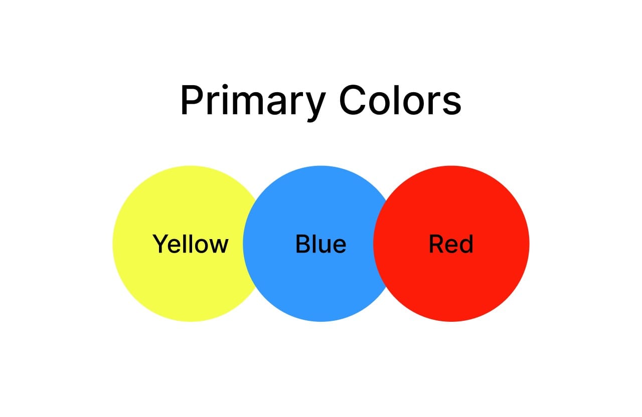
Primary Colours
All other colors are built upon the foundation of primary colors. Although they cannot be made by combining other colours, they are the foundation for secondary and tertiary colours. The three fundamental hues of classic color theory are yellow, blue, and red.
Real-Life Example: The Artist's Palette
Picture yourself in front of a paint pallet filled with tubes of colour. Red, blue, and yellow are the main hues that are the foundation for an artist's creative expression. Combining these main colours in different ways allows the artist to create a vast range of hues, tints, and tones.
Looking at the well-known artwork "Starry Night" created by Vincent Van Gogh, we see that the primary colours have a fundamental role in artistic expression, as shown by the rich reds in the town below, the bright yellows of the twirling stars, and the deep blues of the night sky.
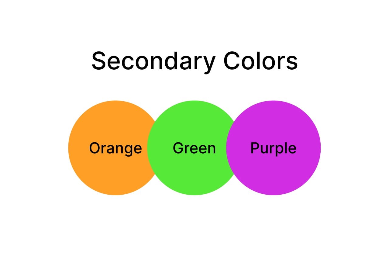
Secondary Colours
Two main colours are mixed in the same amount to create secondary colours: purple, green, and orange.
Orange: Created by mixing red and yellow.
Green: Formed by combining blue and yellow.
Purple: Results from mixing red and blue.
Real-Life Example: A Colourful Garden
Imagine a beautiful garden overflowing with colourful flowers. You may notice a lot of secondary colours among the flowers. Think of the marigold with brilliant orange petals that perfectly combine yellow and red. Close by, plant leaves are a rich shade of green that is a pleasing combination of blue and yellow.
The beautiful hue of purple found on the petals of a lavender plant is the result of the perfect merging of red and blue. These secondary colours highlight the beauty of organic colour combinations and give the garden life and visual interest.
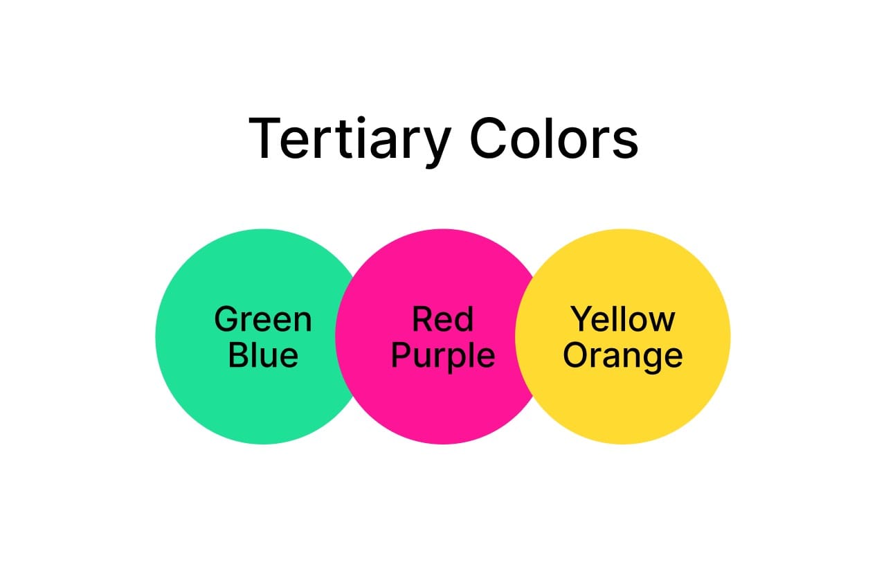
Tertiary Colours
A main colour and its nearby secondary colour are combined to generate tertiary colours. Six tertiary hues, each with special characteristics, are produced.
Red-Orange
🔴 🟠
Yellow-Orange
🟡 🟠
Yellow-Green
🟡 🟢
Blue - Green
🔵 🟢
Blue - Violet
🔵 🟣
Red - Violet
🔴 🟣
Real-Life Example: Autumn Foliage
Autumn brings with it a breathtaking display of colour in the natural world. This time of year, the greenery changes and provides an eye-catching display of tertiary colours. Imagine the brilliant red-orange leaves of a maple tree bathed in the sun's golden light. The complex interactions between primary and secondary colours produce this amazing show.
As you travel down the forest trail, the vegetation turns an appealing yellow-green shade, evoking the sight of newly grown spring flowers. These tertiary hues evoke warmth and nostalgia, inviting us to lose ourselves in the allure of the natural world.
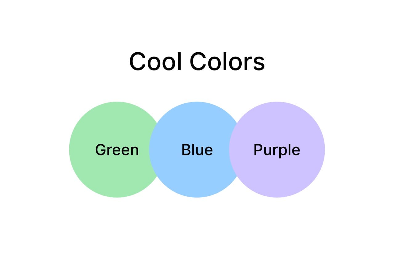
Exploring Cool Colours: Calm, Serene, and Soothing
Cool colours represent tranquillity, serenity, and peace. Whether they are the quiet greens of a thick jungle or the peaceful blues of a calm ocean, cool colours strongly influence our emotions and senses. This blog delves into cold colours, revealing their unique properties and effects.
Cool colours include blue, green, and purple, frequently associated with nature and elements such as the sky and water. Their relaxing effects extend to the body and the mind, making them excellent for creating peaceful and harmonious environments.
Blue, which symbolizes the great expanse of the sea and sky, comes with stability, depth, and peace. Whether in art or interior design, different colours of blue convey clarity and tranquillity.
Green stands for harmony, growth, and rejuvenation, reflecting the rich vegetation of hills and landscapes. It is frequently present in areas intended for rest and renewal, such as bedrooms and meditation studios.
With its regal and mysterious appeal, purple combines the calming properties of blue with the creative passion of red. Purple hues encourage reflection, spirituality, and inner peace.
Cool hues provide safe zones where we may relax, think, and re-establish our connection to the natural world and ourselves, whichbenefitso our general well-being. Whether used in design features, natural environments, or artistic expressions, cold colours offer a refreshing diversion from the hectic pace of daily life.
Conclusion
Colour Theory provides a basic framework for understanding the complexity of colours and how they affect human perceptions. Every colour has an important function in forming our visual experiences, from the primary colours that set the stage to the diverse shades of secondary and tertiary colours.
The concepts of colour theory help us recognize the richness and variety of colours in nature, art, and design. When we become proficient in colour mixing and composition, we may express ourselves creatively and enjoy beautiful things to the fullest extent possible.
Let's embrace the depth and vibrancy that colour theory gives as we navigate a wide range of colours, turning the ordinary into the spectacular with every brushstroke.
Thank you for reading this article. See you in the next one where we'll explore further on the details of complementary, analogous and complementary colours.