
Making a functional and aesthetically pleasing UI card is crucial in user interface (UI) design. In the process of showing information and navigating users to a better experience, the card component is essential.
Figma is a powerful platform that allows us to design various user interface cards. In this blog, we’ll learn how to make different UI cards in Figma and their use cases. We’ll also deconstruct the anatomy of a UI card.
Types of UI Cards
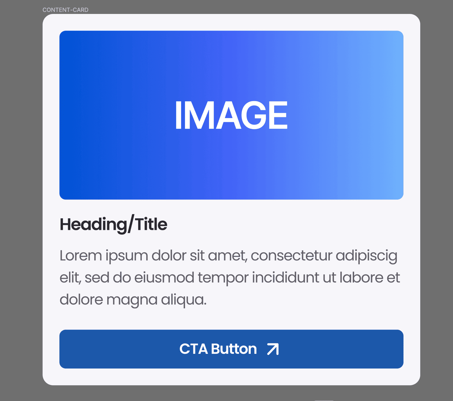
Content Cards
One of the most popular categories of UI cards is content cards. They are organized and visually appealing, showing the content items such as description, images and other UI components. These cards are used in news apps, online stores, and social media feeds.
Content cards can be created in various layouts, scales, and combinations using Figma, making them flexible and adaptable to varied design settings. These components combine to give users a concise summary of the content's main points, enabling them to decide whether to continue reading. Because they make it simple for consumers to quickly skim through many bits of material and select the ones that most appeal to them, content cards are useful for designing engaging user experiences.
For example: In a news app, a content card might display a news article with a headline, a short excerpt, and an accompanying image.
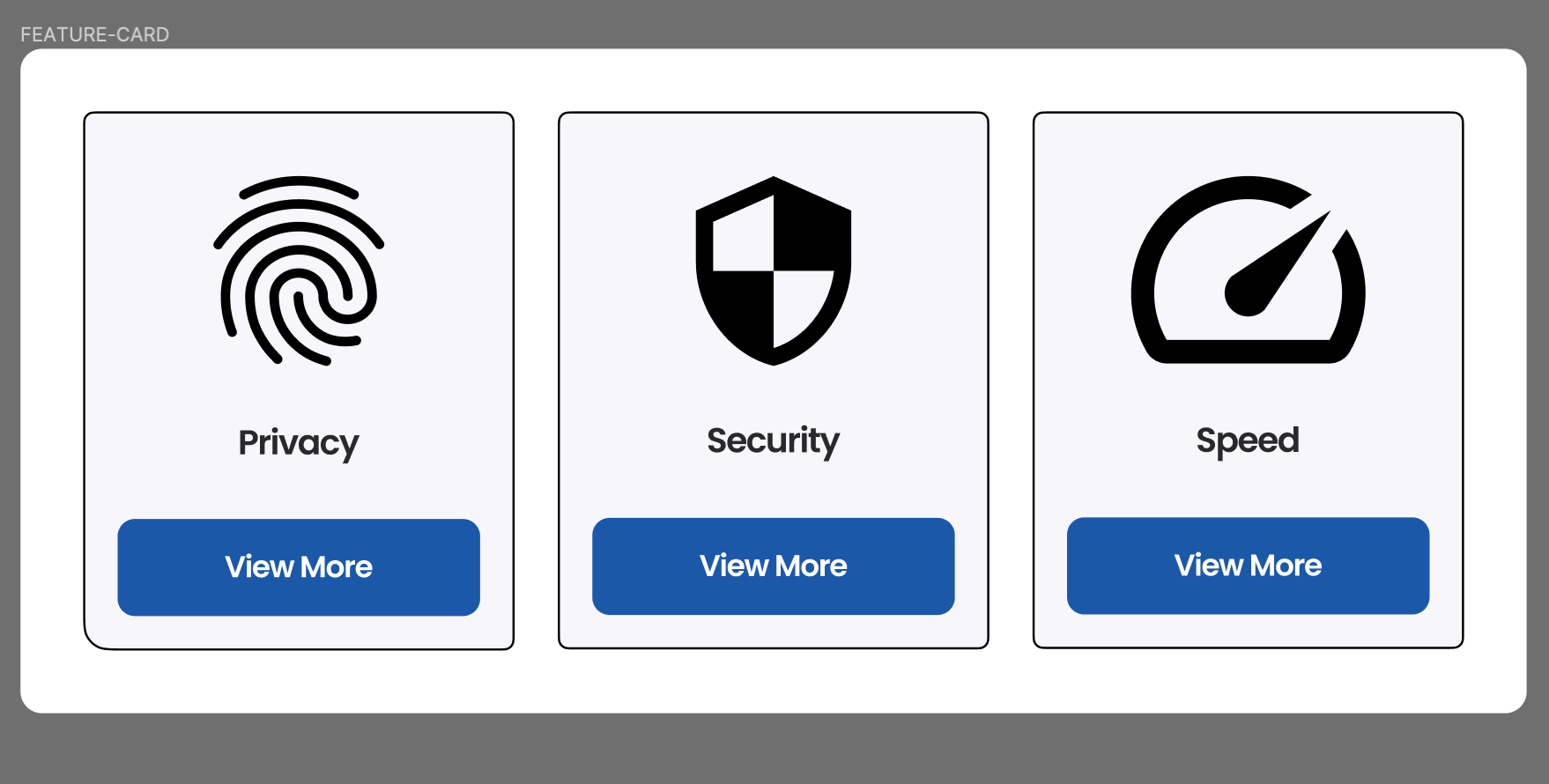
Feature Cards
Feature cards are mostly used to draw the user's attention to a particular function, feature or service offered by a website or application. On most websites, these cards showcase the “WHY CHOOSE US” section. By appearance, they have a short description, an illustration or vector icon and a call-to-action button, which will guide us to more information to investigate or interact further.
Designers can modify the style of this card using font, colour and visual components. Using Figma, we can make a visually appealing card to capture consumers' attention.
For example: In website design, the number of projects completed, the number of alliances and the number of awards won are all presented with the help of feature cards.
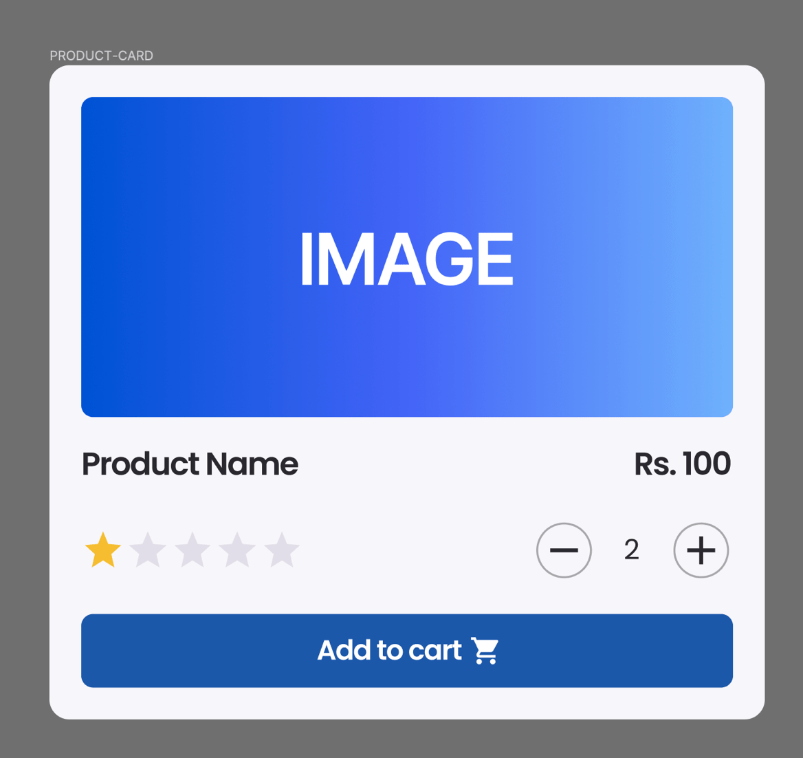
Product Cards
Product cards are common in e-commerce user interfaces since they give customers a thorough overview of each item they can buy. A product card typically includes a clear photograph of the item, its name, price, and frequently other details like user feedback, add to cart, and technical details. These cards are made to give people the knowledge they require to make decisions about purchases promptly and confidently.
Product cards provide a seamless shopping experience by showing products in an orderly and aesthetically pleasing way, enabling customers to browse, compare, and ultimately make informed purchasing decisions. The elements inside the card are carefully placed so the users can easily picture it and know where to click next. This is achieved through the information hierarchy and using primary colour on the call-to-action button.
For example: These cards are used in e-commerce websites in the product section.
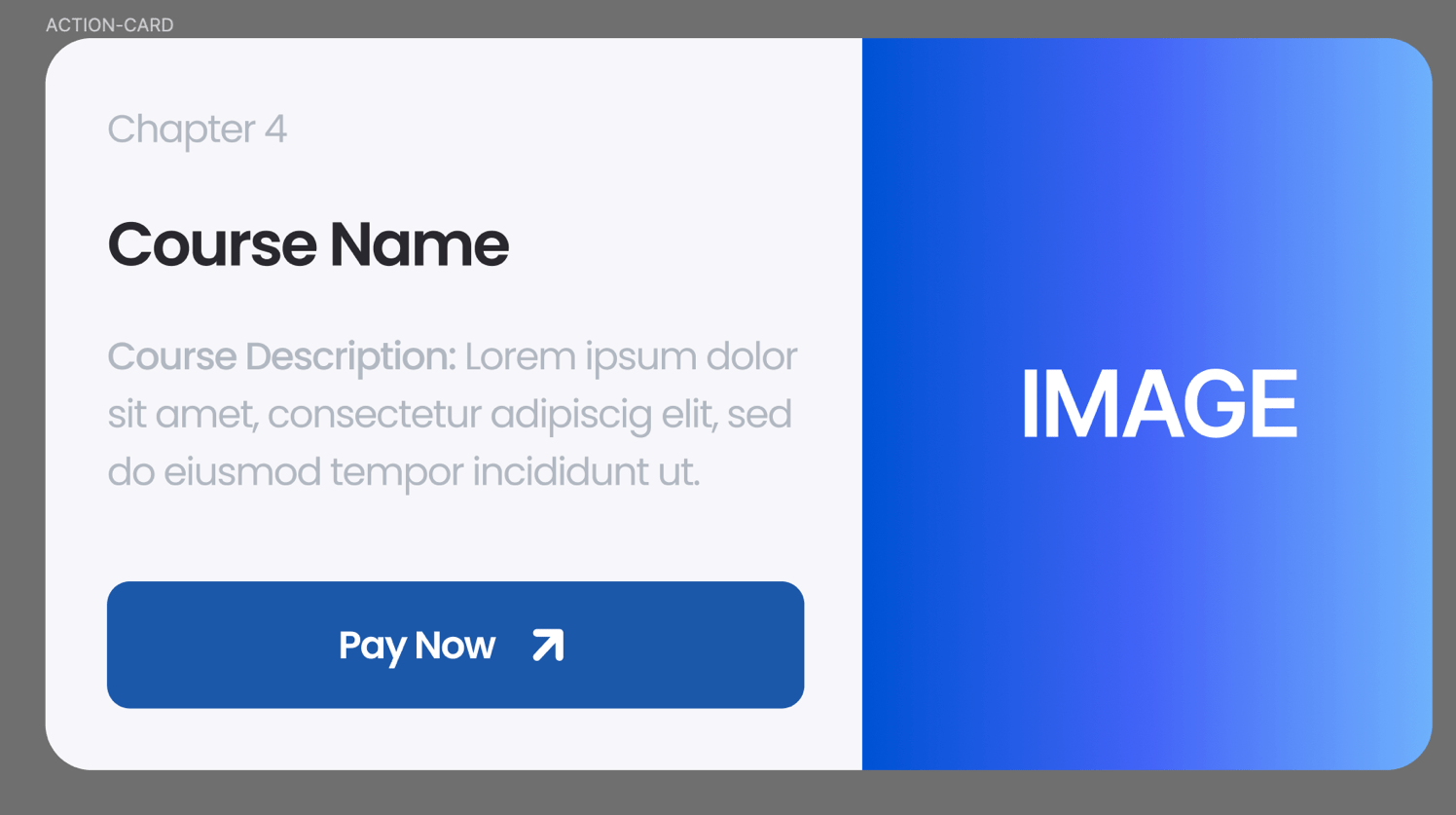
Action Cards
Action cards are thoughtfully designed UI elements that direct users to perform particular tasks within an application or website. These activities include joining a service, signing up for a newsletter, or making a transaction. Action cards combine simple writing, less eye-catching or no graphics, and obvious call-to-action to direct users toward desired activities.
An action card's format often consists of a headline or title that highlights the importance of the action, a supporting description that details its advantages, and a large button that invites visitors to perform the action. Action cards are essential to optimize conversion rates and guide consumers through user journeys.
For example: Widely used in banking applications, action cards can guide you to make a certain type of transaction.
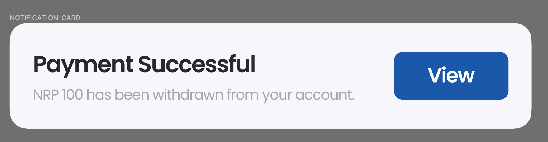
Notification Cards
Users can receive timely updates, notifications, or messages from developers through notification cards, which are effective delivery methods. These cards are frequently seen in messaging programs, dashboard user interfaces, and other settings where real-time data is important.
A notification card is intended to communicate important information using a combination of text and visual signals. Typically, it has a headline summarising the message, a short description giving background information, and vector icons or graphics that help understand the notification type. An experience focused on the user's needs is enhanced with notification cards, which keep users informed about significant events, changes, or interactions.
For example: Notification cards are shown when the user completes an action or to inform them of the do’s and don’ts. You can click on the preview to check the notification message or dismiss them by pressing the close button.
Anatomy of a UI Card – A Detailed Component Breakdown
A well-designed UI card comprises several key elements that harmoniously convey information and encourage user interaction. Let's break down the anatomy of a UI card.
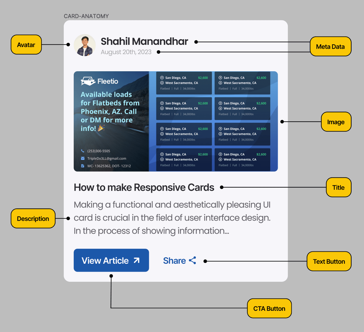
1. Image/Visual Element
In a UI card, the visual component (images and others) is usually the first thing the user notices. It acts as a self-explanatory content and grabs the user's attention. This element, which can be a product image, a featured image, or an illustration, should be relevant to the card's objective and consistent with the overall design style.
2. Title
The title of the card communicates what the card is about. It should be clear and engaging, giving users a quick understanding of the card's content. Designers can experiment with typography, colour, and size to make the title visually appealing.
3. Description
The description elaborates on the card's content, offering more detail and context. It should be short yet informative, providing users with enough information to engage with their interests. While adding description, pay attention to typography and spacing, as it ensures readability.
4. Call-to-Action (CTA)
CTA is an important element that directs users to take a specific action. Whether a "Buy Now" button or a "Learn More" link, the CTA should be visually distinct, using contrasting colours and clear text to prompt user engagement.
5. Metadata
Metadata includes additional information such as date, time, author, or location, depending on the card's content. This information adds credibility and context, enhancing the user's understanding of the content's relevance.
6. Interaction Elements
Some UI cards require interaction elements like dropdown menus, checkboxes, or radio buttons. Figma's interactive features enable designers to simulate these interactions, realistically representing the card's behaviour in a live environment.
7. Branding and Styling
Consistent branding elements, such as logo placement, colour schemes, and typography choices, establish a visual connection between the UI card and the larger interface. Figma's design libraries and style guides facilitate maintaining a cohesive design language.
8. Spacing and Alignment
Proper spacing and alignment contribute to the card's overall visual harmony. Each element should have enough breathing space and align with other elements in a balanced manner. Figma's layout tools aid designers in achieving pixel-perfect alignment.
Lastly, using these elements brings cards alive. In our next blog, we'll learn how to make an Instagram card using Auto Layout in Figma, which will be responsive when other components are added.
Stay tuned for the next one. Leave a comment below if you liked this blog, and consider subscribing!