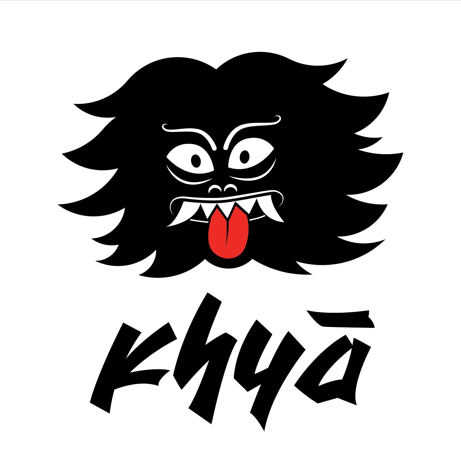
Logos are images that symbolise a business or a company; it is a face that communicates ownership, quality, and the values of any company. As graphic designers, when we design a logo, we need to consider numerous things and strategies to make an image memorable and striking to the audience.
This blog will go through the 7 general types of logos and how, when, and why these types are suitable for a particular business entity – from start-ups to re-designing a well-established brand image.
Letter Mark (or Monograms)
Letter Marks or Monogram logos are images that consist of letters or initials. These are especially useful when a name of a company is lengthy. Since it is entirely based on typography and relies on your font selection, it is important to consider the logo's legibility when printed or displayed on different mediums. By using just a few letters, this type of logo compresses information and makes it memorable and presentable.

The use case of this type of logo can be tricky for businesses that are just starting off; the letters may not communicate the company's message. Consider mentioning the company's full name if it does not have a strong brand image or recognition.
Word Mark (or Logotypes)
Similar to Monograms, Word Marks or Logotypes are font based logos that focus on the business's name or a company's name. These are useful when the company's name is simple, catchy, and can attract the attention of people.

The selection or creation of your font plays an important role in capturing the company's characteristics in this type of logo as well. Moreover, the colours and other visual strategies to present the logo make this suitable for any new businesses who want to get their names out.
Pictorial Mark (or Iconography)
Pictorial Marks or Iconographs are graphic-based logos useful for businesses with a strong brand identity. The symbol or brand mark will be the fulcrum of the company's identity and will be used extensively in its branding. The name and symbol often relate to each other in this type of logo.

This type of logo can be tricky to use for less known brands since it solely relies on the graphic symbol that directly conveys the business's name.
Abstract Marks
Abstract marks are specific types of pictorial logos that emphasise geometric forms and colours. Unlike Logo symbols, its approach to recognition is by emulating an emotion or a feeling of the company.

Abstract Marks compresses a company's message without relying on the cultural implications of a specific image. Nike, for example, uses their swoosh mark to portray victory and swift movement – without having the need to write the Nike brand name on their product. This leads to the logo being instantly recognised by the audience worldwide.
Mascot Logo
Mascot Logos are logos that involve an illustrated character, often colourful, energetic and joyous. The mascot quite literally becomes the spokesperson of your business. It is effective in creating a wholesome experience; moreover, it is appealing to families and children in particular.

Emblem
An Emblem is a traditional type of logo where the typography is integrated within a pictorial image (art, badges, symbol, illustration). Old established brands are very fond of this type of logo since it consists of a classic style which can also be modernised and made suitable for the contemporary.

Since this type of logo usually has more details intertwined with text, it can be less versatile than the symbols and other minimalist logos. Not overdoing the details is key to designing a clean, modern-looking emblem.
Combination
A combination logo is the simplest and most convenient type of logo that any business can use. Since it has image and text components working together, it sparks flexibility and versatility more than any other type of logo.

Like emblematic logos, the text and the graphics go together – but can also be used separately.
Thank you for reading! More soon.
