Introduction:
In User Experience (UX) design, it is essential to understand human psychology and behaviour. The Law of Common Region is an interesting idea that is important to understand how users interact with each other. This law, developed by the well-known cognitive psychologist Gestalt, offers important insights into how people view and communicate with digital interfaces. We'll go through the fundamentals of the Law of Common Region in this blog post and show you how to use it to make designs that are easier to understand and use.
Understanding the Law of Common Region:
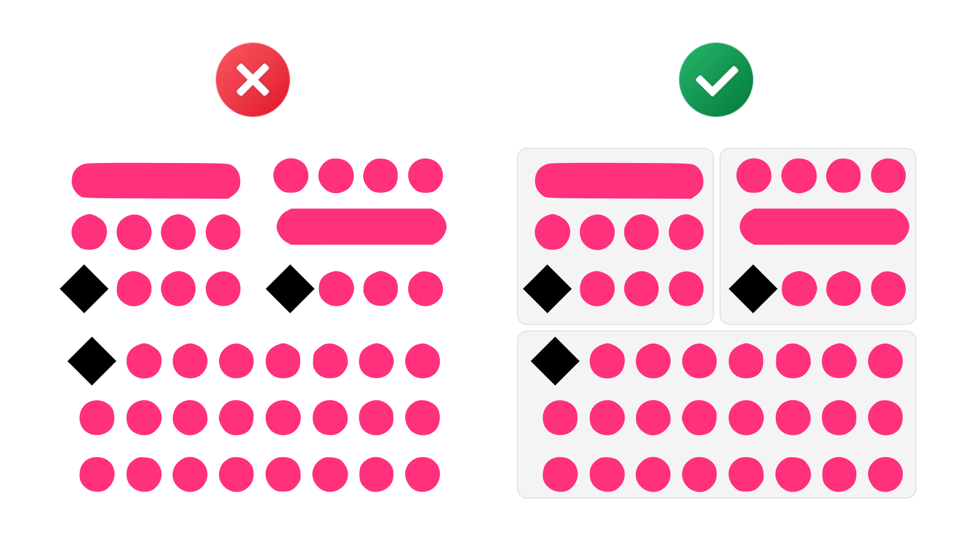
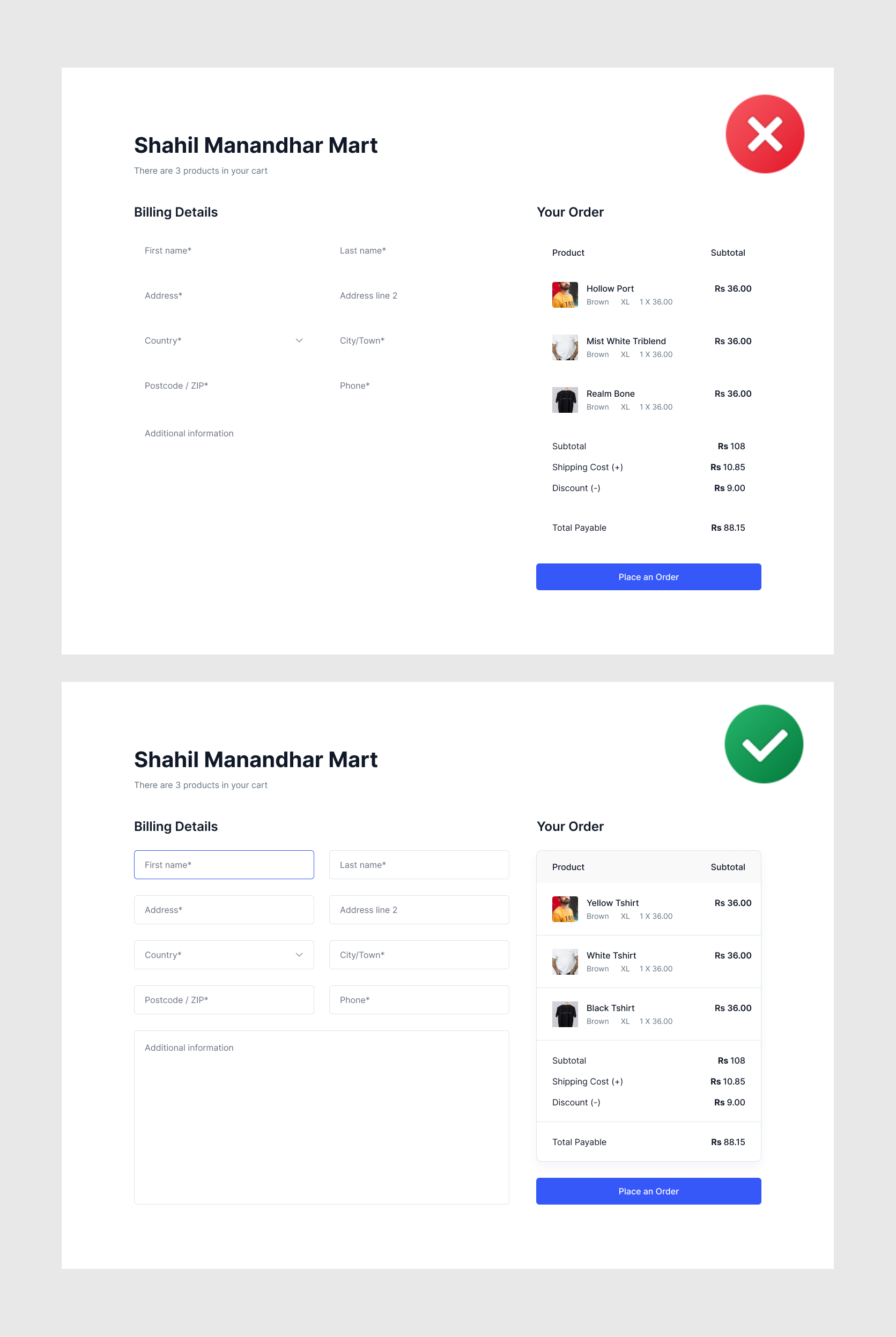
The Law of Common Region is a Gestalt psychology concept that states that users view elements as related or getting into a common category when grouped within a defined boundary or region. Put another way, even if two elements have the same qualities, people tend to perceive them as more connected when enclosed in a shared space.
A fundamental concept in user experience (UX) design, the Common Region acknowledges the human tendency to see things inside a defined border as connected or part of the same group. In the actual world, this law is used to improve the organization and understanding of data, making it more user-friendly. By visually grouping comparable items, UX designers take advantage of the Common Region to make their designs consistent and easier for users to understand. Website designs, mobile interfaces, and other interactive platforms show this idea, thoughtfully arranging content into easily recognized areas to create a smooth and simple user experience.

Benefits of the Law of Common Region in UX Design:
Enhanced Visual Hierarchy:
Designers may generate a unique visual hierarchy within a digital interface using the Law of Common Region. Users may quickly recognize connections and prioritize information based on perceived commonality by grouping related elements together. This allows logical and simple directions of the content for users.
Reduced Cognitive Load:
When processing information smoothly, the brain naturally looks for patterns and relationships. When components are arranged in a common area, users need less mental effort to understand the connections between them. This decrease in mental strain makes using the system easier and more beneficial.
Facilitates Task Completion:
The user journey gets easier when focused on tasks interfaces are designed with the Law of Common Region in mind. It is easier for users to navigate through an interface and achieve their intended actions when elements linked to a particular task or process are grouped together.
Improved Information Chunking:
A key component of UX strategy is dividing information into understandable bits of information. This was made possible by the Law of Common Region, which enables designers to combine similar informational elements to help consumers break down and retain information more effectively. This is especially helpful in situations when consumers have to consume complicated content.
Guides User Expectations:
Based on their past interactions, users engage in digital interfaces with established expectations. Designers can make the interface more predictable and simple by purposefully utilizing the Law of Common Region. Users feel more at ease and familiar with the outcome of this alignment.
Implementing the Law of Common Region:
Grouping Related Content:
Within the user interface, identify and arrange corresponding components or materials. Increasing visual proximity among menu items, product categories, or information blocks helps consumers view these parts as a single unit and creates a sense of unity.
Utilizing Containers and Borders:
Common interface areas can be visually defined using borders, containers, or background shading. This method strengthens the perceived relationships between grouped items and improves aesthetic appeal.
Consistent Design Patterns:
Confirm that the Law of Common Region is applied consistently in all interface sections. Avoiding misunderstanding and improving overall usability guarantees a consistent and seamless user experience.
Consider Context and Content:
Adapt the Law of Common Region's usefulness to the specific setting and kind of content. It could involve organizing interactive components in particular scenarios or graphically joining related informational segments in others.
User Testing and Iteration:
User testing should be used to confirm the efficiency of the Law of Common Region, just like with any other UX design guidelines. Collect user feedback regarding the interface's design and functionality, then continuously enhance the design in light of the new information.

Conclusion:
A helpful tool in the package of UX designers, the Law of Common Region directs the development of interfaces that complement human vision and mental processes. Designers can facilitate natural interactions, speed information processing, and enhance the user experience overall by carefully placing objects within designated areas. Understanding and putting the Law of Common Region to use are crucial for developing user-friendly interfaces that stay over time as digital areas change.
Thank you for reading this article. Catch you in the next one.
