Shape Language is an integral part in understanding the various effects and impressions shapes have in design. By using shapes people are familiar with, this concept focuses on the emotional and psychological impact those shapes might have on the viewers. When this concept is used in background, character and object design, these shapes can relay the intent, and setting and even portray the personality of those characters and subjects.
In this article, I will discuss a fundamental concept that artists and designers should be aware of in art and design!
What is Shape Language?
So what exactly is Shape Language? Well, simply put, it is the process of incorporating common shapes into a design based on the psychological response they elicit from the viewers. It is a concept that is frequently used in design and animation. One could even say that this concept is one of the core essences that make up good character design and animation.
Expanding further, it is a concept where artists use various familiar and common shapes to communicate the intent, meaning and personality behind certain designs. These shapes evoke a psychological response from the viewers based on their usage in the design without the assistance of words or a narrative story.
A simple example of how this psychological response works can be how people instinctively think that sharper shapes portray dangerous things and rounder shapes are mainly associated with being soft and approachable!

Shapes Used in Character Design
3 shapes are most often used in design by following the concept of Shape Language. Those shapes are Circles, Triangles and Squares.
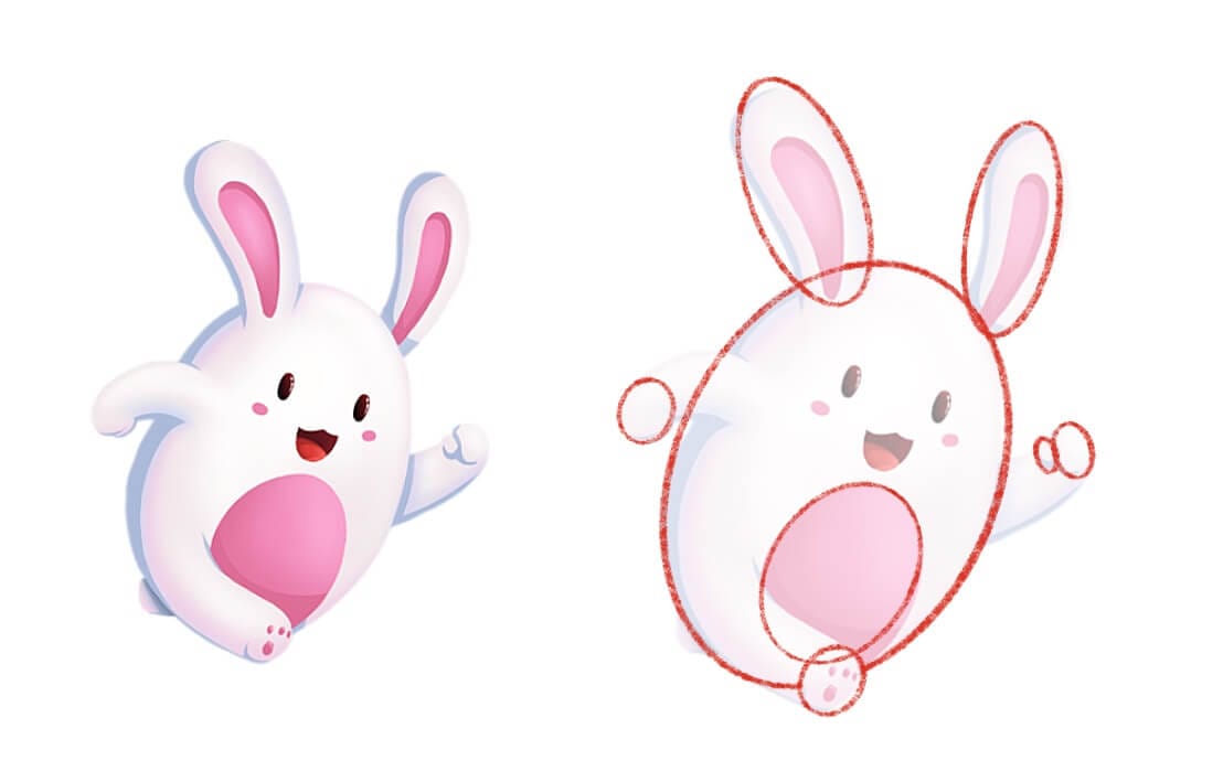
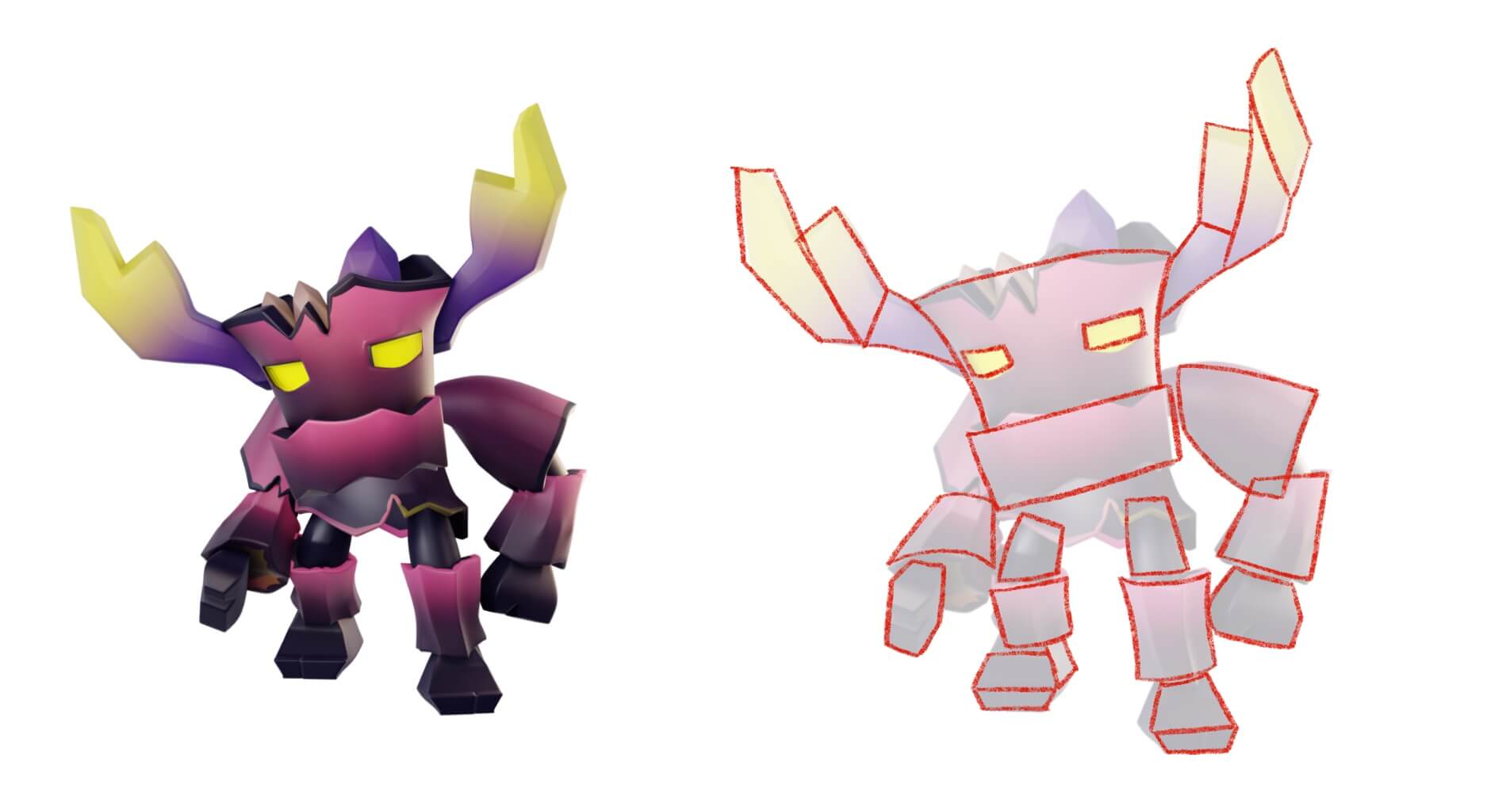
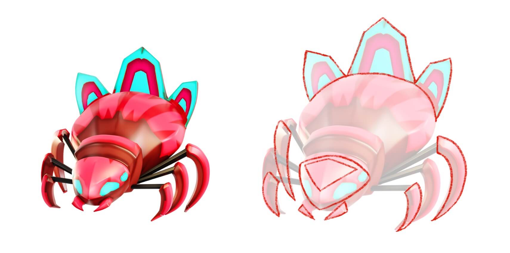
Rounded shapes such as circles are most commonly associated mainly with softer and friendlier characters. In contrast, sharper shapes such as triangles are associated mostly with harsher and unapproachable characters. Whereas, squared shapes are used to portray tough and sturdy characters.
Rounded Characters (Circles)
Circles are the shapes most often used in design to portray a softer, more approachable and friendlier character. One might notice that these rounder and softer shapes are used in the designs of the main characters, protagonists, their friends or supportive characters.
A well-known example of this concept that most people are familiar with can be seen in the design of Doraemon from the popular children's show of the same name. The use of circles in his overall design gives off the impression that his personality is caring, soft and friendly, solely from the design itself!
Squared Characters (Squares)
Characters that are designed based on squared shapes usually give off a sense of being stubborn, reliable, and strong and seem as though they're firm in their beliefs. Due to these characteristics, squared shapes are most often used while designing protagonists or their supportive characters!
Sharp Characters (Triangles)
Contrary to squared and rounded shapes, triangles usually represent threat and danger. Similarly, characters that use triangular and sharper shapes in their design instinctively give off a feeling that they're unapproachable, smart, sly and dangerous. They relay a feeling of aggression and thus, these shapes are widely used to design antagonistic or evil characters.
Also Read: Art Fundamentals: Drawing Life Simply Using Shapes
Shape Language in Character Design
Illustrating this concept further, I've taken more characters from our game Mighty Survivor: Shooter Game. We can clearly see that the character with the sharper shapes and harsher edges exudes a much more unapproachable, angry and evil atmosphere. However, in contrast, the wider and rounder shapes portray a cuter, friendlier and much more approachable character. These shapes can allow the viewers to know what kind of characters these are, before even interacting with them, solely from the design itself.
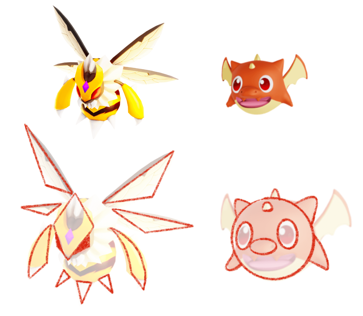
In the visual example illustrated above, we can see that the shapes used are bigger and cover more of a general area, i.e., they comprise the major part of the design. However, using the same principle, we can narrow down the area of usage by placing them in smaller aspects of the design but still relay a similar amount of information.
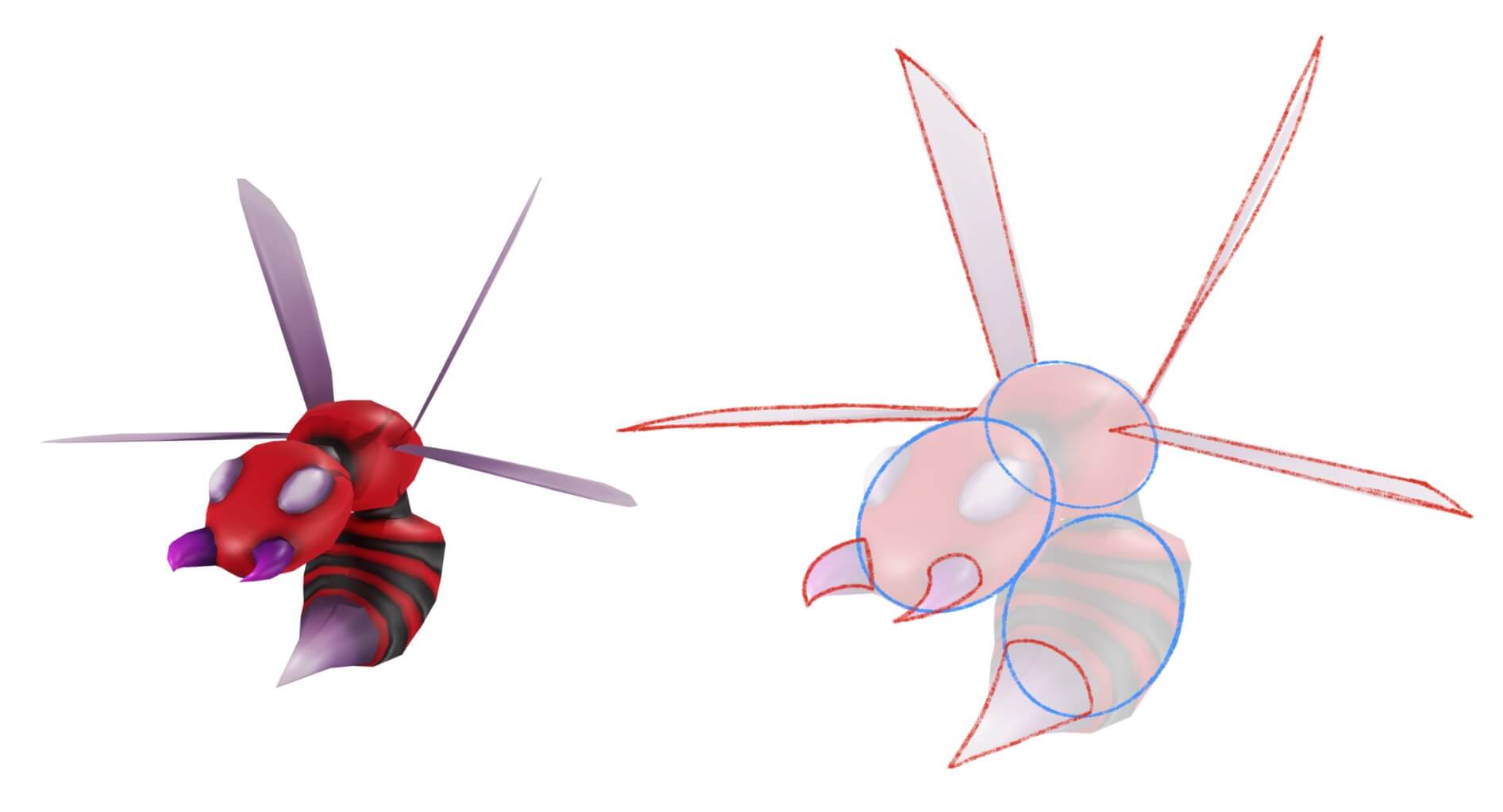
Here, we have another character from the same game. Although the overall body of the character is rounded, there are smaller areas where triangles are also being used in the design. The area of usage is narrowed down in the case of triangles but regardless, the personality and intent of the character is still being relayed effectively due to the efficient application of Shape Language.
The use of Shape Language is very prominent in the works of Walt Disney, where primarily, the 'good' characters use more rounded shapes whereas, the 'evil' characters use sharper shapes and edges.
However, remember that the meaning of the shapes used in character design might not always be the same and fixed to these stereotypes and concepts. Sometimes they can be used as red herrings to intentionally mislead and disguise the purpose and personality of a character, object, or location.
Conclusion
The use of Shape Language as a base for character and object design can make a considerable difference in relaying the intent of the artist and of the subjects that are being designed. It also makes a significant impact on the goal the artist is trying to achieve by designing the character or object, whether it is aimed to be a friendly, supportive character or a nefarious one.
While this concept also makes a significant impact in delivering the intent of the character/object to the viewers, it also further improves the workflow and efficiency of the artists throughout their creative process as the shapes lay a firm groundwork and fundamental guideline for the designs.
I hope you enjoyed this article and find it helpful in your art journey. Thank you for reading!

