
Illustration processes are unique to each designer. All steps between the idea's conception and the final render may vary for each individual. However, it is important to have a workflow so that you can plan out your illustrations well.
In this article, I will be breaking down my process of creating a simple 2D illustration.
Starting with Sketches
Although I am terribly guilty of diving head first into an illustration project with my drawing tablet and laptop, I recommend starting with some pencil sketching. Pencil sketching helps you set the foundation for the illustration and iron out any obvious faults that you might have missed.
I have recently tried my best to start my illustration process with pencil sketching as much as possible.
I try out different compositions and layouts for my illustration during the sketching phase. My sketches usually end with some rough composition ideas, just enough to give me a starting point.
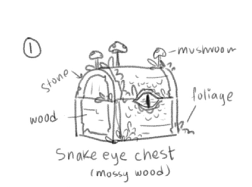
Here is a concept sketch I came up with for this project. It's a mimic chest of some sort.
Vector Shapes with Adobe Illustrator
Adobe Illustrator is hands down my favourite vector illustration software. It is easy to use and intuitive, and I recommend it to any designer.
I usually work with a square canvas of 2000 by 2000 pixels. This is good enough for Instagram posts, and the good thing about working with vectors is you can upscale it as much as you want.
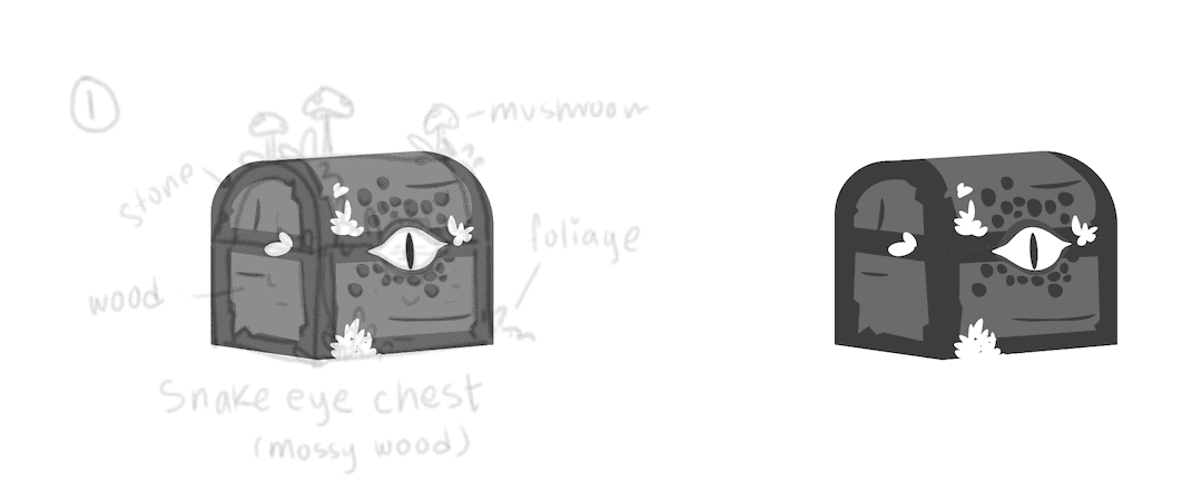
I first bring my sketch to the AI file to use it as a reference. I set its opacity to around 10% and started building my illustration.
Then, using the pen tool, I simply trace out the shapes based on my sketch. I am not concerned about colours at this stage, so I work with grayscale. Using only shades of grey aids my efficiency at this stage because I don't have to worry about colours.
Picking the Color
Once the flat shades are done, I move on to the most difficult part of the process; picking the colours!
Choosing colours is always a struggle for me. There are an infinite number of combinations that can work with any illustration. So, to make this process somewhat easier, I like to use coolors.co, a really cool colour palette generator.
I usually can't settle on a colour option until I've tried multiple combinations. For colouring the chest, I also decided to check out a few colour combination options. Try to be diverse with your colour choices until you find a perfect palette.
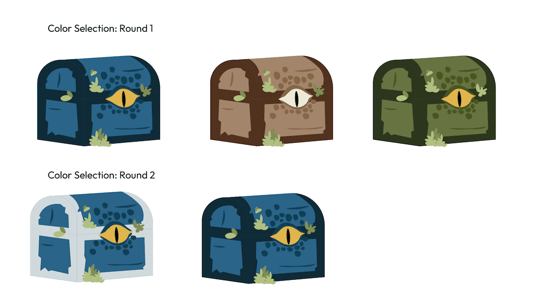
In the end, I settled on a blue monochrome look. I can then use that coloured version to work on further.
At this point, the flats are all done, and I can move on to adding the extra details.
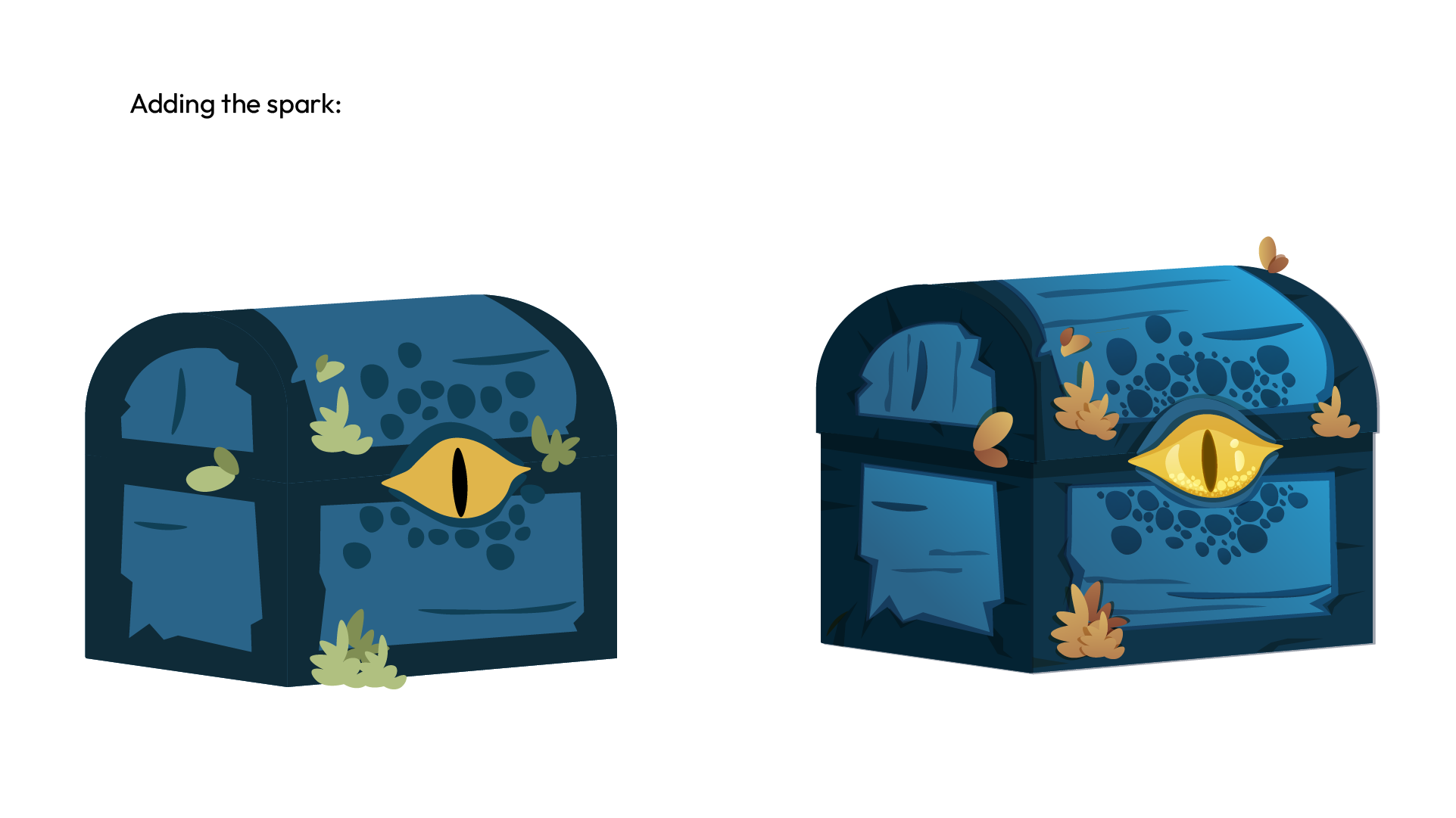
Adding the Spark
Now comes the fun part! After deciding on the flat colours, adding details is an easier and more fun process. I usually start out by adding shadows using darker colours. I used a darker colour shade or a Multiply layer for the blue flats to create the shadows.
Then I move on to adding gradients. Gradients are straightforward to add, so this step shouldn't take much time. I use linear gradients for the most part. After that, I move on to adding highlights.
I use a screen layer for adding highlights. The details on the eye are mostly all on a screen layer to give it a shine/glow.
And we are done with the illustration! Hope you guys enjoyed reading about my process.
Thanks for reading and catch you in the next one!