
The conflict between Responsive cards and Auto Layout cards keeps motivating designers and developers in the constantly changing world of User Interface design. While both approaches have benefits, responsive cards are currently the better option because of their unmatched flexibility and wide range of advantages. We'll discuss the benefits of responsive cards to designers, developers, and users as we understand why they outperform their Auto Layout competitors.
Why Responsiveness Over Auto Layout?
Auto Layout cards leverage Figma's feature to automatically arrange and resize elements within a designated frame, ensuring consistent spacing and alignment as content changes. While they streamline content-driven adjustments, they might not appear as effectively to different screen sizes and orientations.
Whenever you increase or decrease the size of the card’s frame, the content inside the card will not adjust according to the changes. For example, if we increase the size of the image inside the card frame, it will not maintain the padding and spacing and might overflow from the frame itself. Or, if we reduce the card size from all directions, the card's content will remain fixed, causing problems in responsiveness in different screen sizes.
Achieving Full Responsiveness
Responsive cards are design components that fluidly adjust their layout, content, and appearance based on varying screen sizes, devices, and orientations. They prioritize optimal user experience regardless of the context in which they're viewed.
Even while Auto Layout is highly effective at adjusting to content changes, there are situations when you need additional design flexibility to adapt to various screen sizes. At this point, achieving full responsiveness is important.
Full responsiveness allows more exact control over multiple screen sizes and layouts, even though Figma's Auto Layout is useful for adjusting designs to changing content. Designers can control how components behave as the screen's dimensions change by attaching items, applying restrictions, and using responsiveness. This method ensures that designs look professional and are usable on various devices, resulting in an effortless user experience.
Additionally, full responsiveness allows designers to optimize layouts for various devices and orientations, unlike Auto Layout, which primarily focuses on content-driven changes. This results in designs that are not just adaptable but also personalized to particular user interactions and needs.
Here's how we can create a fully responsive card:
Step 1: Creating the Responsive Card
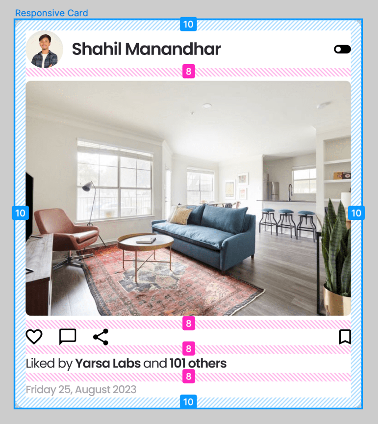
To get started, we duplicate the Auto Layout generated card. This will be the base for your responsive card. Ungrouping the elements from the duplicated card will help us gain more control over how the components are positioned, and flexibility can be modified.
Step 2: Anchoring Elements
Calculate the correct response for each element in the card when the screen size increases or decreases. Element placement concerning the screen margins can be maintained by attaching them to specified corners or sides. For example: Left align or Centre align.
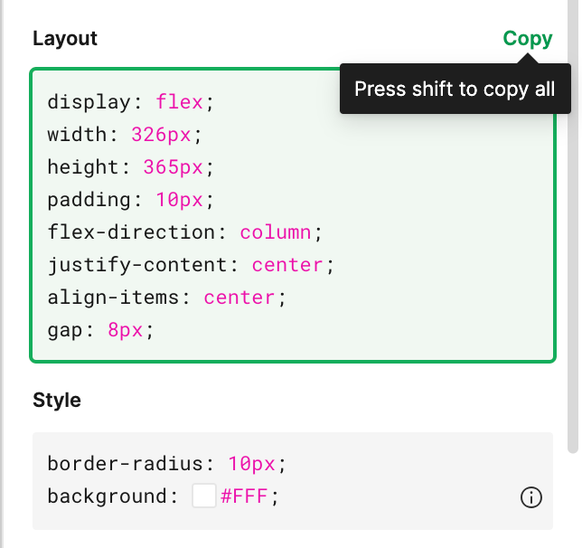
Step 3: Using Constraints
Open the constraints panel to the right by selecting an element. This action will allow an element to react to the changes in size and structure by adapting its parent frame. There are constraints like hug contents, fixed width, fixed height, and fill container; experiment with these until you get your desired results. For example, you can configure an element to be resized proportionally while maintaining a defined distance from the top and left edges.
Step 4: Testing and Refining
Change the fonts according to your style guide for web design or mobile application, and resize the card according to your needs. Preview the card in various screen sizes to identify any issues with responsiveness. Fine-tune the constraints and element positions to ensure the card looks appealing and functions well across different devices.
Advantages of Responsive Cards in Projects for UX and DX
User Experience (UX) pertains to how users interact with a product or service. It focuses on making the user's journey intuitive, enjoyable, and effective. UX design considers usability, accessibility, and emotional engagement, ensuring users can achieve their goals seamlessly and satisfactorily. A strong UX enhances user loyalty and drives positive perceptions of the brand or product.
Developer Experience (DX) refers to the satisfaction and efficiency of developers while working on software projects. It encompasses tools, workflows, and processes that streamline development, allowing programmers to code, test, and deploy more effectively. A positive DX leads to faster development cycles, reduced bugs, and improved collaboration, ultimately resulting in higher-quality software.
1. Efficient Coding
Responsive cards reduce coding complexity, as developers can rely on established responsive design principles. This leads to cleaner, more efficient code that's easier to maintain. Additionally, Figma offers a Dev Mode where we can check our design's properties and code like border, margin, padding, radius, stroke, font styles, colours, etc. This will help the developers to use the exact measurements and reduce the time and effort to code them.
2. Consistency in Branding
By maintaining the properties and layout of the card in every device, responsive cards support brand consistency (colours, size of texts and spacing/padding around them). Consistency maintains brand reputation and recognition in every card size, whether they're used on big or small screens. As developers can check the properties from dev mode, all the properties can be used so the end coding results look the same as the design.
3. Enhanced Accessibility
Responsive cards can be optimized for accessibility, ensuring that content is readable and navigable for users with disabilities. This inclusive approach aligns with web accessibility standards and promotes equal access. As we switch from the Web version to the mobile view, the screen size reduces, and people may have difficulties in reading. Responsive cards auto-adjust to the mobile screen breakpoints, making them easier to read for a better user experience.
4. Cross-Screen Compatibility
Responsive design techniques ensure cross-screen compatibility, meaning the card will function and appear consistently across various web browsers. For example, the screen size may vary from device to device.
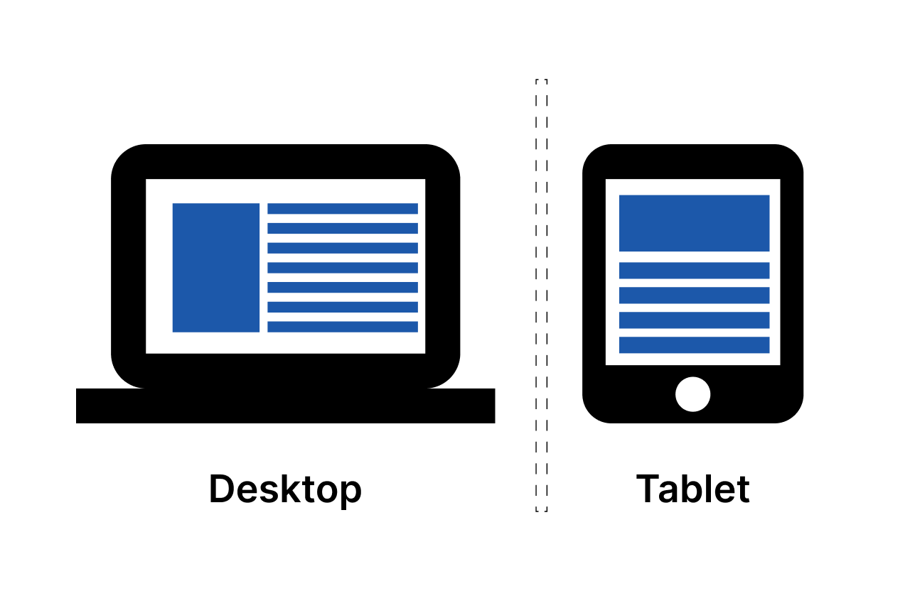
For MacBook Pro 16” (1728x1117px) and iPad Pro 11” (834x1194px) screens, the layout of the card should be different because of larger and smaller screen sizes. Most developers use the same card used in larger screens on smaller devices, which will later cause the design to appear more congested and not fit inside the screen.
5. Re-usability
Developers can reuse components across different screen sizes, reducing redundancy in code. This re-usability saves time and effort during the development and testing phases. When developers make a component by looking at our designs, they can experiment with the card or any component by reducing their height and width to check the responsiveness.
During the changes, the placement of elements will move to different alignments. So developers will not have to redo additional work while making different screen sizes.
Thank you for reading. Catch you in the next one!