A logo is the visual identity of any company, group or brand. It is the first basis of branding, so it should be very recognisable and viewer-friendly. It should reflect the significance and core notion of the brand and not hurt anyone's sentiments or show any bad meanings.
Logos are not supposed to be copied. In most cases, while designing logos, clashes may occur due to a lack of creativity and ideation of the clichés. It should be responsive and adapt to any size and condition without degrading its legibility (on both digital and print platforms).
Today, most logos have gone flatter and use lesser colours for the same reason. In my career as a graphic and logo designer for almost 10 years, I have encountered many clients, experienced many hassles, and learned a lot about logo design.
So, in this article, I'll use my expertise to design a logo in these four simple steps.
1. Understanding the Objective
The in-depth objectification and understanding of the brand are very important. It instils the notion of the brand and brings the designer and client to a common ground on the actual requirement and plans.
Hearing and educating the client is very important at this point. The hearing aspect helps the designer understand the objective, and the educating aspect helps the client understand the current trend on the Dos and Don'ts of the logo. This is important because, in most cases, the client becomes the designer, and the less educated designer who fails to explain to the client will agree to everything the client says. All these events will lead to the end result of standing unprofessional and cluttered.
The client may even ask to copy the elements from the existing logos or the whole logo. Never agree with that because it's unethical, and you're stealing somebody else's work. In this step, the designer can estimate the deadlines and submissions of the logo.
Imagine our hypothetical client is a Nepali mobile game company seeking a company logo, and its name is Himal Game Studios. The designer should ask for the background stories behind the names and creation of the studio before going into the ideation process. Its portfolio, mission, vision and everything else. They should also ask for the reference game studio logos they're opting for and all the concepts in their mind. This will help create a mutual understanding between the designer and the client.
2. Moodboard and Inspiration
In this next step, the designer should gather all sorts of inspirations and moodboards from the internet or the real world. After understanding the type of logo the client wants, the designer should go through all the inspirations and images. The designer should then uncheck the cliches and get inspired by the most unique and semiotically fit logos.
Once this is done, the photographs and the PDFs of the collection can be shared with the clients to help them understand the trends and logotypes you have been working on.
So for our hypothetical game company, Himal Game Studios, all the collection of imageries and photographic inspirations should be related to game studios, game logos, mountains (Himal in Nepalese), text styles, etc. All the collected graphics can be shared and discussed with clients to understand the quality and the type of logo the client is seeking. This emphasises ideating and decision-making between designers and clients and avoids multiple iterations.
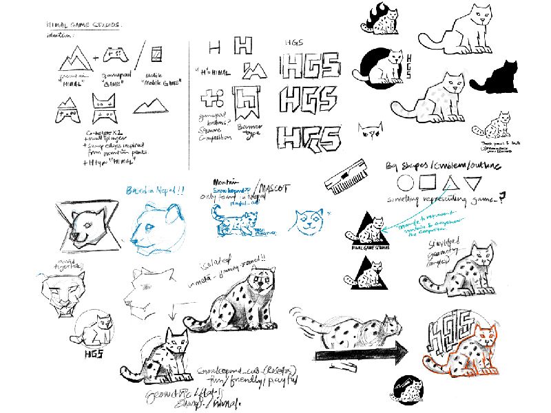
3. Ideation and Sketches
After the moodboard is carried out and discussed, and the designer is clear about what type of logo the client wants, one should start ideating the logo. Let's say the client settles on a mascot or illustrated logo style for their company.
The ideation process is usually carried out in pen and paper, or you can use several digital mediums these days like Wacom tabs, drawing pads and iPads, which can be productive too. Different semiotics, concepts and mindmaps can be generated to create different elements used in the logo and carry out different compositions for the logo.
The logo's composition is usually derived from basic geometric forms like squares, squircles, rectangles, triangles or circles. The logos based on these simple geometric shapes' primitives help understand the logo's adaption with text on different mediums and sizes.
On continuous ideations, this process will slowly generate the imageries in the form of rough thumbnails, thereby documenting the mindmaps and texts side by side. The sketches can be developed on low fidelity. This is only the base version of the logo that will help you achieve the final version.
During the ideation of the concept sketches, different design principles like negative spacing, rhythm, proportions, balance, movement, and unity can be studied. They can be applied to achieve and explain the logo design better. Colour theories and colour emotions can be studied and analysed as well to find out the appropriate colours.
Once the ideation and sketch process is complete, the designer should submit the rough thumbnail sketches of concept variations of the logo to the client and ask them for approval. You can explain the logos in a meeting or in the ideated pdf. If the client disapproves of all the provided concepts and is looking for something different, redo the ideation process to develop newer concepts and issue additional charges for the logo design to the clients as required.

4. Final Construction and Submission
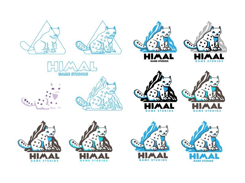
Finally, after approving the logo sketches and colour by the client, we move on to the digital process. The approved sketches can be imported into vector editing software like Illustrator, Photoshop, Corel Draw, Affinity etc., as per your expertise.
You can start constructing the logo on the new layer with the dimmed sketch layer in the background. For construction, you can use pen tools or shape tools. Advanced users can use golden ratio squares or circles, trigonometries and several geometric theorems and principles to convert the sketch to a fully constructed vector or digital version.
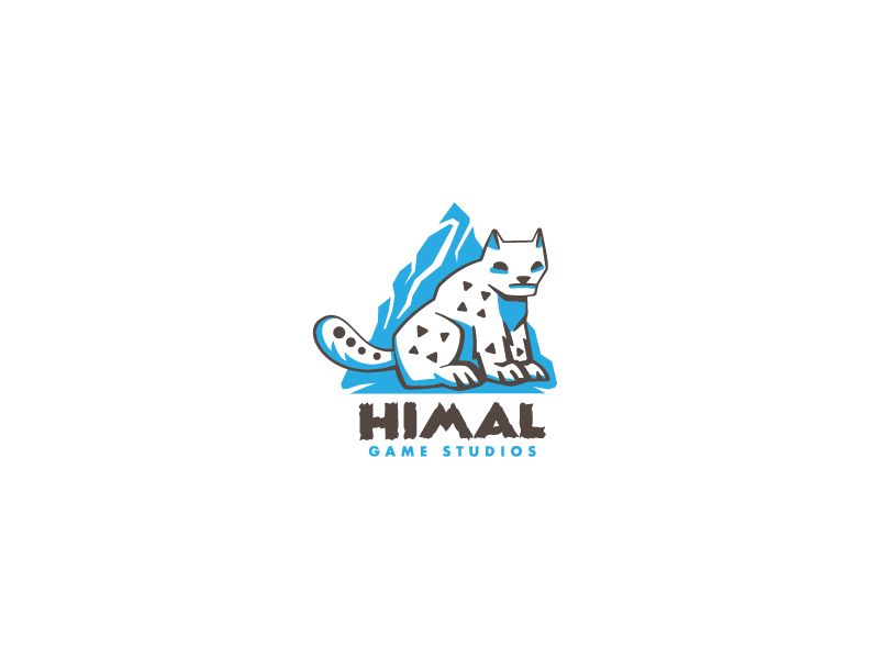
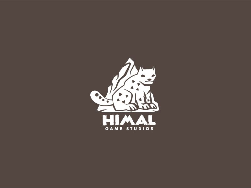
Raster versions are not encouraged because it is not pixel-independent. Being a graphic designer, one should know this very clearly. Once the client approves the final logo, you should submit the logos in all the usable formats (vector and raster formats) and in all colour modes (CMYK for print usage and RGB for digital usage). Brand guidelines and identity kits in PDF form should also be submitted to the client if it falls under the client's budget and requirement.


So that's all, folks! Let me know if this was helpful or if any other simple steps are missing from these four steps.
Thank you for reading this article. Subscribe for more.
