
When deep diving into any material on the internet, you can find yourself surrounded by images and tables, if not visual statistics like bar graphs and Venn diagrams. The colourful visual components grab our attention. Why is that? Well, they easily and entertainingly explain the information the texts want to describe in a short period of time.
Also, approximately 65% of the population are visual learners, so content visualization can do you good if you're an explainer on the internet.
So, What are Infographics?
Infographics (Info+graphics), as hinted, are the visuals used to present an idea, information or data. Some examples of infographics you see on the regular could be pie charts, bar graphs, timelines, flowcharts and others.
Reading the statistics collected from research or a survey in digits can be a little confusing. However, seeing a bar graph presenting the same data can make it much easier to understand and analyze the information. Not only that, but you can also compare past data with no trouble of having to remember the digits.
Infographics in Marketing
With the increase in businesses, the marketing department maintains relevancy now more than ever. Marketers used to go door to door and apply all kinds of strategies when it came to selling a product. The digitalization of businesses has altered marketing strategies.
With online business comes online marketing, which requires the involvement of social media. Social Media Marketing (SMM) requires images and videos to make a statement. A successful example of an SMM strategy is Spotify Wrapped by Spotify.
Before the year ends, Spotify gives you the statistical and comparable information and timeline of the songs you listened to that year. It includes data such as the most played song, your top artist, your top 5 artists, the genre you listened to the most and more.
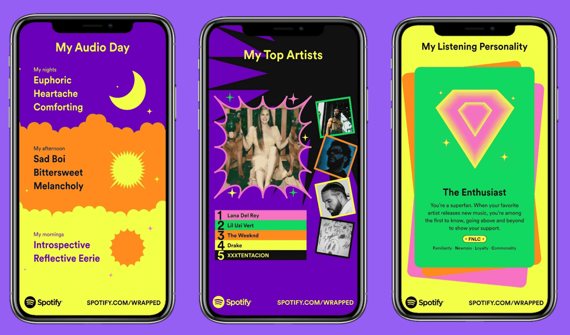
The personalized information is presented with the help of vibrant images and videos, which are fascinating to look at. Spotify Wrapped has become a huge success as an SMM strategy for Spotify over the past few years. Every year, more users look forward to the end of the year just to see the statistics they're probably aware of.
Ways of using infographics in digital marketing
Infographics allow us to simplify and convey complex information. Also, they're easier to understand. Implementation of infographics in digital marketing is one of the best ways to reach your target audience. Here are some ways you can use infographics in digital marketing.
Social Media
As mentioned, infographics could give your social media a great boost. The personalization feature gains the attention of the users, and the interactive visuals multiply them.
Email Marketing
Email marketing is a form of digital marketing done through emails, designed to notify potential and current customers about any new product, updates, offers and additional services. Providing the details with the support of visuals makes a huge difference as it delivers a clear message. So, fusing infographics into your regular email marketing schedule is going to pay off heavily.
Link Building
Link building is when you get a website to link pages on your website. As the main concept of link building is getting numerous clicks that lead to your webpage, infographics make an impeccable choice at that.
Presentation
If you have a new product launch, you can make use of infographics in the form of presentations to present the directions clearly. Visual learning provides effective insight and is better than reading a set of rules.
There are more ways you can include infographics under digital marketing. Using images in blog posts and ads are also a great way to utilize this strategy.
Types of Infographics
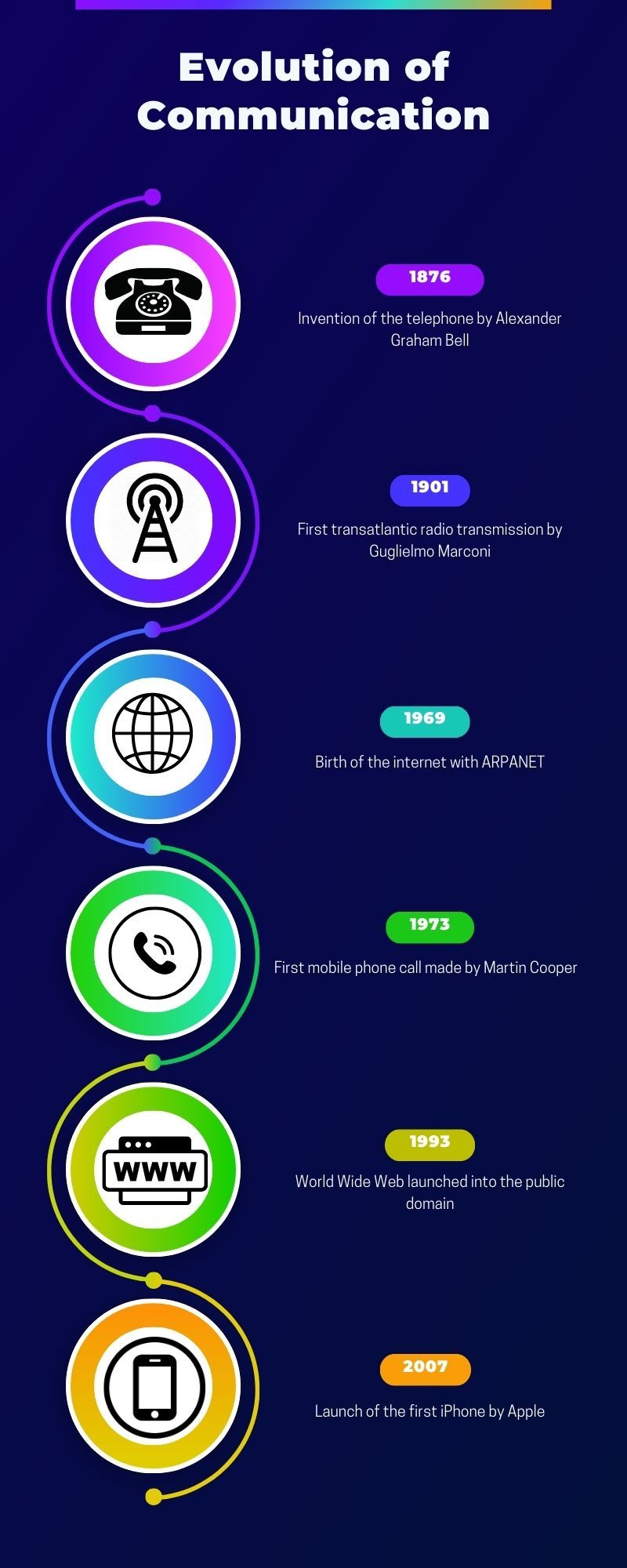
Timeline
This infographic is used to present a series of events or milestones that have been achieved. It is usually kept short and provides surface-level information. In marketing, you can make use of this to present data about your company history, project timeline or evolution of a product/service.
Process
Process infographics can be used to explain complex procedures in a clear and concise manner. With the usage of visuals such as illustrations and icons, it is easily understandable by people. It also helps save a lot of time and budget in digital marketing because you can simply hand over these infographics without going around and explaining them to the people individually.

Informational
This is one of the most important infographic types, as it plays a crucial role in conveying information to people in an attention-grabbing way. This infographic can be made use of in a lot of different conditions. Introducing a new product, sharing tips, and forming lists are some of the popular ways an informational infographic can be used.

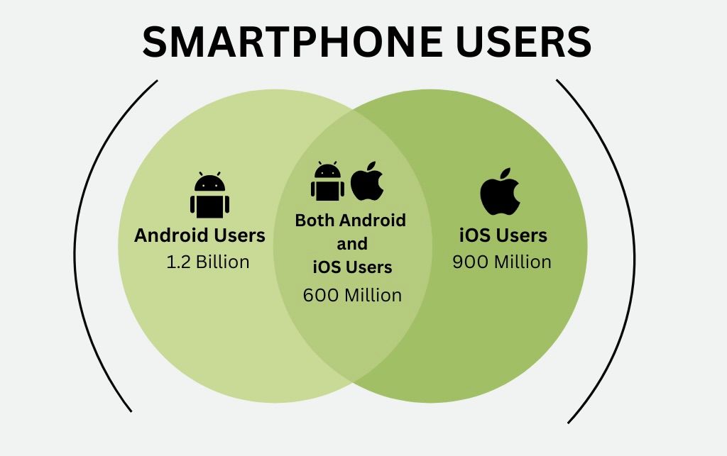
Data Visualisation
Raw data are difficult to portray in terms of visuals. To simplify this trouble, statistical/data visualisation infographics can be of big help. As data can possess different characteristics, there are suitable ways to present them all, such as:
- Correlated data: If there are multiple data that are related to one another, they can be presented using Venn diagrams.
- Imbalanced data: If the data are not balanced and difficult to manage, they can be presented with bar graphs or pie charts.
- Spatial data: If the data is located or scattered around an environment, it can be presented with maps and heat maps.
- Time-dependent data: If the data depends and changes with time, it can be presented with a bar graph or a line graph.
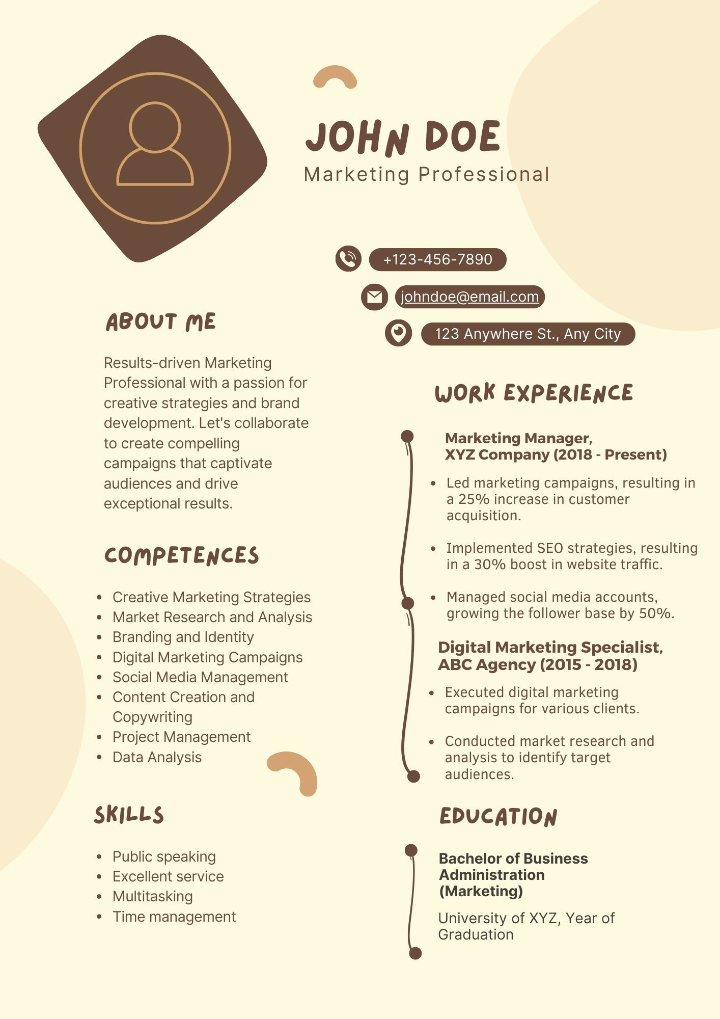
Resume
Using a Word document to make a resume has been traditional, but if you could use infographics in order to stand out and have a creative work experience document, would you not? Resume infographics have been a thing for a while now. Basically, it is a normal resume but in an image format that looks a lot more thematic and organized.
Why Use Infographics?
Infographics are a fun and lucid option when it comes to explaining complex information and details. They are also very valuable as it engages the viewers and saves time in advertising and clarifying the topic of discussion.
Especially when it comes to digital marketing, the internet is a place for entertainment, and infographics can effectively contribute to that while getting the job done consecutively. Making clever use of infographics in visual marketing can help a lot in gaining new customers. When the icons are attractive, the illustrations are vibrant, and the information is conveyed in a crystal clear manner, people become interested in whatever you are offering.
Additionally, the usage of infographics can also contribute in:
- Building brand image
- Providing maximum reach
- Contributing to SEO and high-quality backlinking
- Catering to every age group
So next time you think of writing something, take your time and think if the infographics can get it done effectively. If yes, you have your answer on which option to rely on.
Thanks for reading! Subscribe for more.