
What are Icons?
Icons, also known as symbols, have been around for a long time. These were used to express objects, actions, and ideas in a visually metaphorical way that users could understand and recognize instantly. Icons work as a visual identity without using words or descriptions.
Icons in Computing
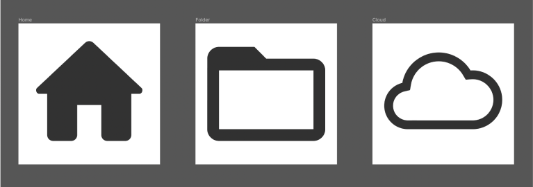
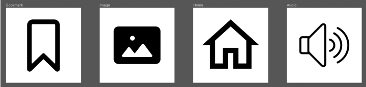
Likewise, in computing, icons can be defined as simple image that describes a real thing. These icons in the digital interface help users to understand and navigate screens. It benefits optimizing content, making it easier to understand, and saving space when used appropriately. It can be seen used often when explaining steps or processes visually with the use of text with minimal to no details.
Using icons can make the content interesting, appealing, and easily understandable. In user interfaces, icons can play an important role in defining the personality of your digital products.
Things to Know Before Designing an Icon-Set
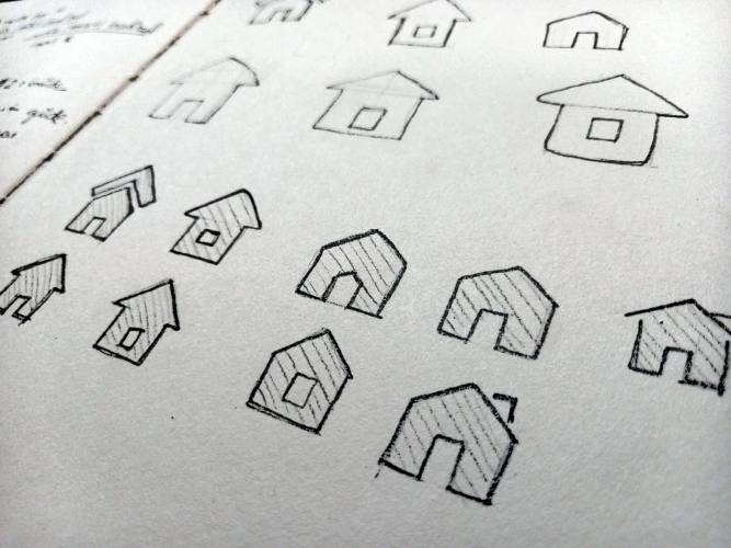
1. Sketch first
Generally, in design, it is always an efficient way to sketch out ideas first before directly jumping to the design software. Same for icons as well. Starting to directly design will kill your time in making unnecessary iterations. So it is always a good habit to sketch out all the possible ideas first and user-test them with colleagues before designing them.
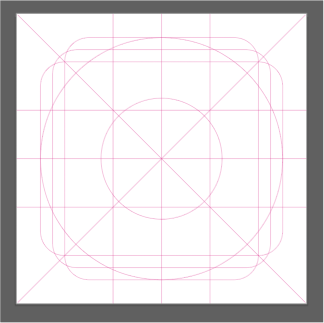
2. Design inside a grid
The main reason to design inside the grid is to make the icon set consistent in size and proportion, whether the icon inside is in landscape or portrait orientation.
3. Create icon guidelines
Self-made guidelines are guidelines set by the designer to make sure that the icons designed are cohesive and harmonious in terms of visuals and feel. Using similar values for corner radius, stroke width, and colour will generally result in a seamless family of icons.
Due to the lack of guidelines, the above icon designs resulted in variable stroke weight, corner radius, and fill style.
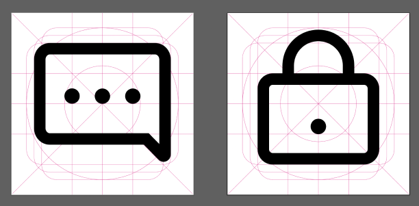
The above image depicts icons with guidelines like stroke width - 1.5px and corner radius - 2px.
4. Clarity
Icons should be simple, less detailed and easily understandable by general users; otherwise, they can convey the wrong message. Designing icons with high details can make them cramped and pixelated when viewed on small devices like smartphones. Another thing to mention is to design in an isometric style so that the icon is not too dynamic.
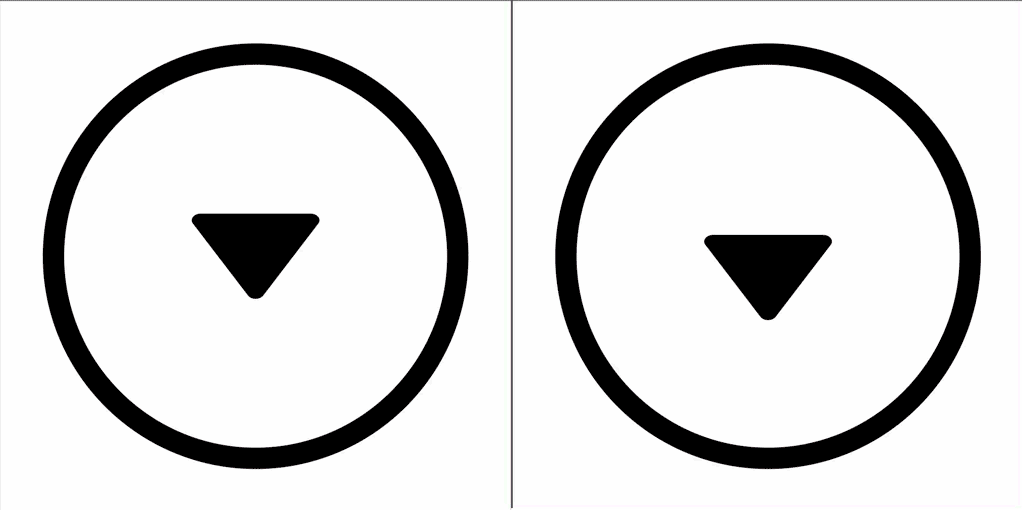
5. Check for optical balance
When finishing designing an icon, check for the optical alignment, as the software uses mechanical alignment to measure spacing within the icon elements. So, remember to check for visual balance between individual icons and their elements.
This can be a perfect example of a design principle known as Balance. This exercise will generally train your brain to perceive the visual weight of objects, colours, textures, and space in the design.
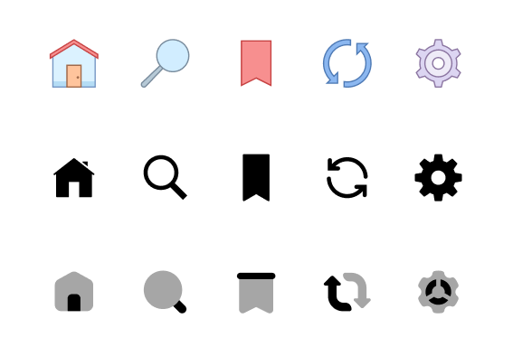
6. Add characteristics to your icon design
To make your icons unique and flavourful, add characters like accents, colour, use of fill & stroke, etc. These characters can be developed from their brand logos. For example, sharp-edged icons can be seen used in sports brands, whereas rounded-edge icons can be seen in beauty products or brands, which convey a message of being casual and playful.
How to Design in a Keyline Grid
Step 1: Sketching ideas
Sketch out ideas. Pick the ones that you find most suitable.
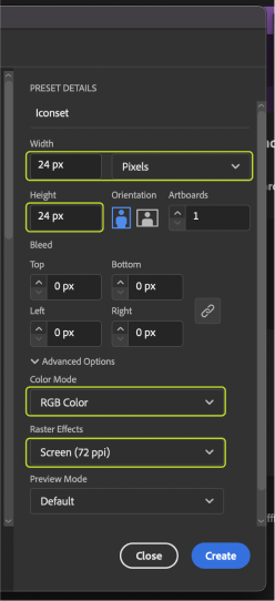
Step 2: Creating a new file
Create a new file in Adobe Illustrator and set 24 x 24 pixels artboard and colour mode to RGB and raster effects about 72 PPI.
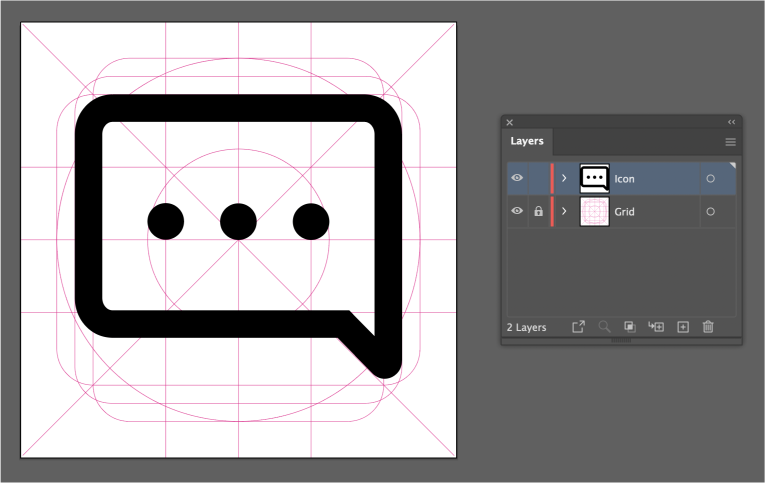
Step 3: Creating layers
Create two layers named 'Icon' and 'Grid'. Now insert the keyline grid inside the grid layer, lock it, and design your icon inside the Icon layer. This way, the grid will not interfere or move while designing the icons. Now start designing in the layer named 'Icon'.
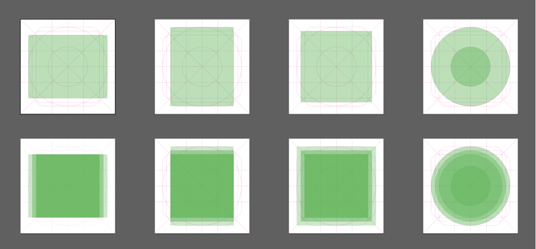
Step 4: Using keyline grid boxes
The basic use of the keyline grid is to design inside the given margins. Depending upon the shape of an icon, you will be using one of the boxes inside the grid. There are three major shapes, and within them, there are micro steps you can use when designing an icon.
If your icon is in a landscape layout, it's optimal to use the wider grid, whereas if it's a taller one, you might have to go with the taller grid. These techniques ensure that the icon you design gets a seamless size, even if it's from a different layout.
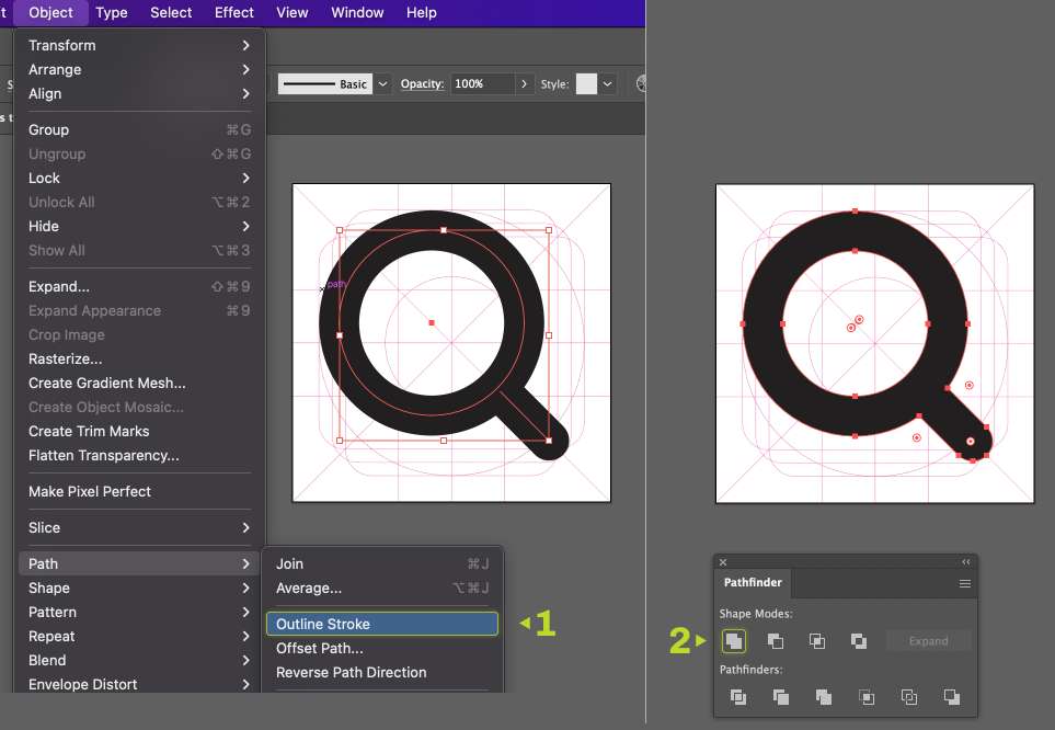
Step 5: Using strokes
Always use strokes to design your icons so that its accurate and you'll have re-editing capabilities.
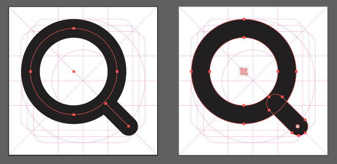
Step 6: Combining the shape
After constructing the design, select the Icon Elements and go to Object > Path > Outline Stroke and expand every stroke. Once again, select the icon and in the Pathfinder panel, click on unite to combine into one block of shape.
Step 7: Exporting the file
Go to File > Export > Export for Screens > Artboard then choose the desired file format and click export.
So these are the steps you can follow to design icons for your next UI project.
Thank you so much for reading the article. Hope you found it helpful. Subscribe to our blog and see you soon.