
Getting Started
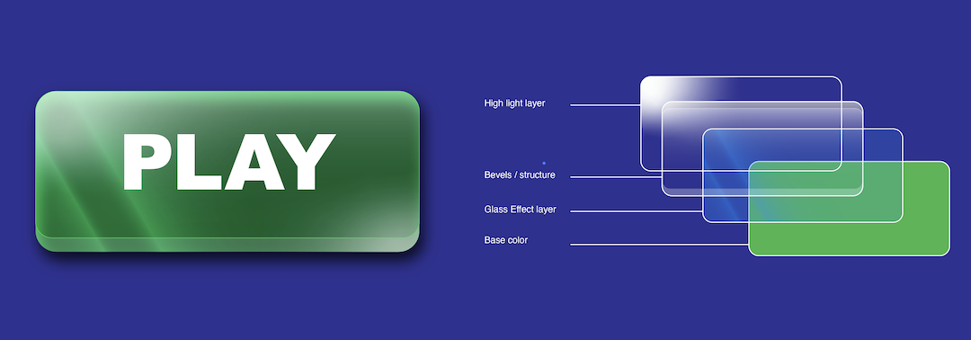
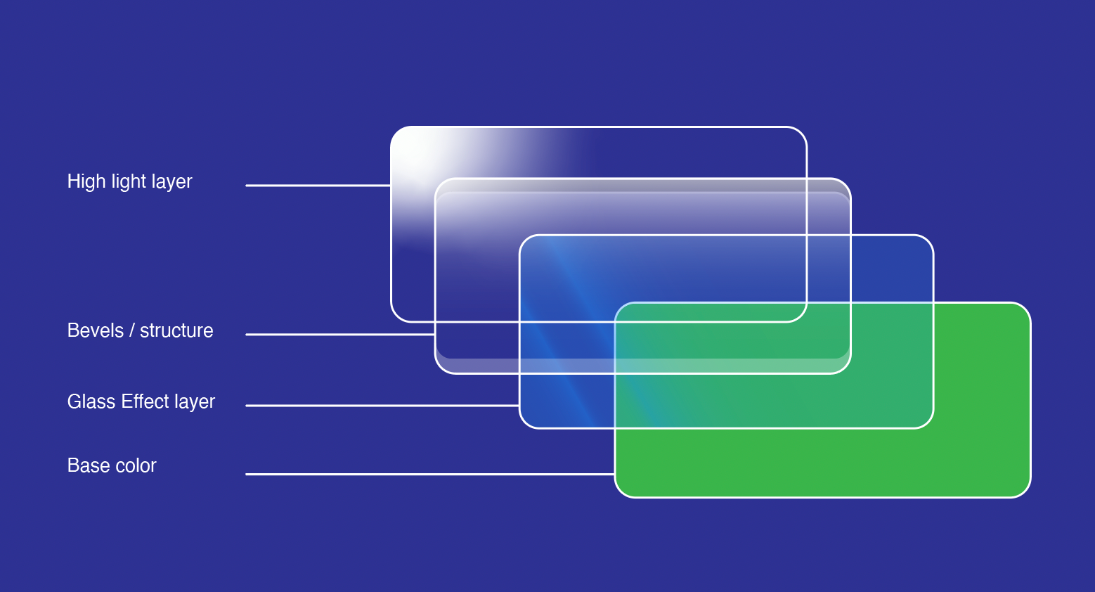
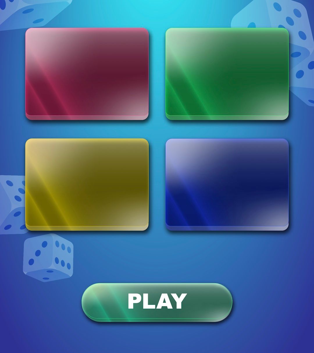
This is a process of creating a glass effect on a button using Adobe illustrator. The button is planned in several layers which will make it easier to make changes according to the different colors and effects when it needs to be changed in the future. Moreover, this is a process of how I created this style through the use of various gradient effects and simple optical illusion to give a 3-dimensional feel.
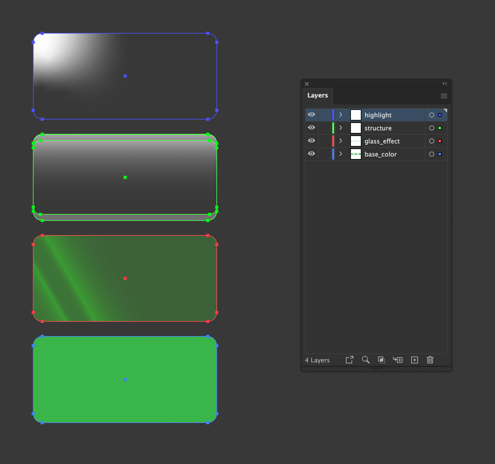
Base Color Layer
This layer will be the foundation of the button's shape, form and color and is the only layer that is opaque (100% opacity).
In this case, a rounded rectangle is used to have soft-looking corners.
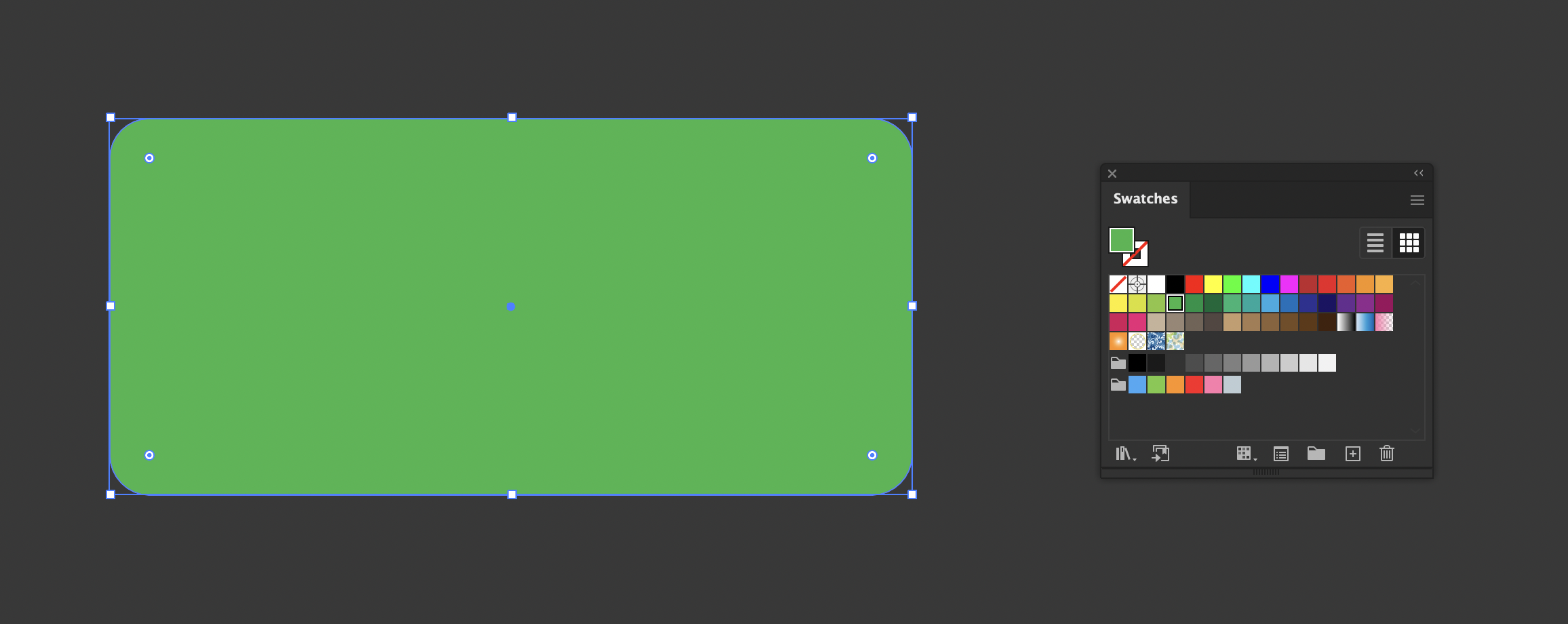
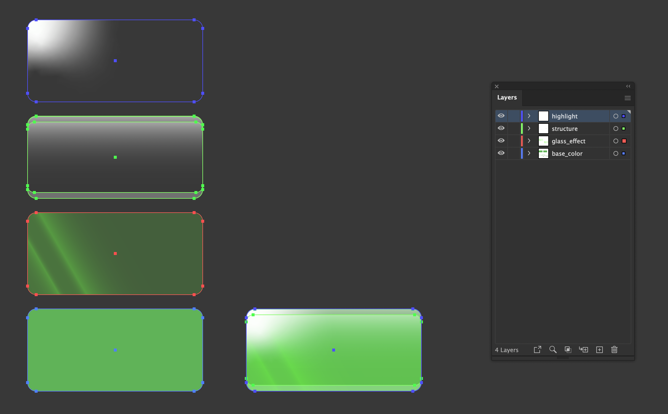
The base shape and color layer (rounded corners are used) This shape is used for all the layer so duplicate and place it on top.
Glass Effect Layer
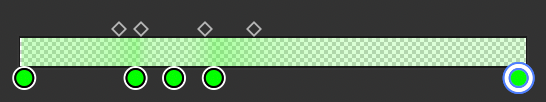
The color gradient for this layer must use a color that is similar and brighter than the Base layer. This is to create contrast from the base color or layer to give a shining effect. The angles are also adjusted to make it look like the light is penetrating through the glass.
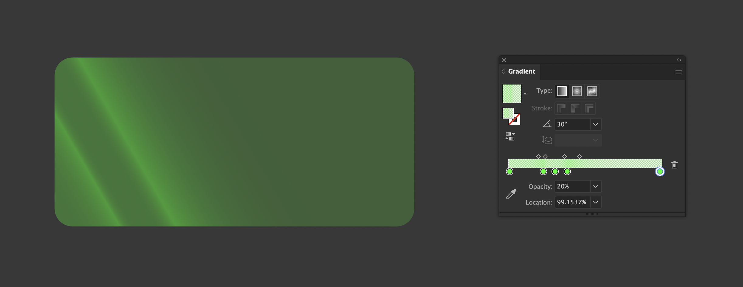
The glass effect layer uses gradients. The color is slightly brighter than the one used in the base.
The gradient slider consists of a color placed in different locations with varying opacity to replicate a light ray. High opacity placed next to low opacity will create a fairly sharp glow effect.
Structural Layer
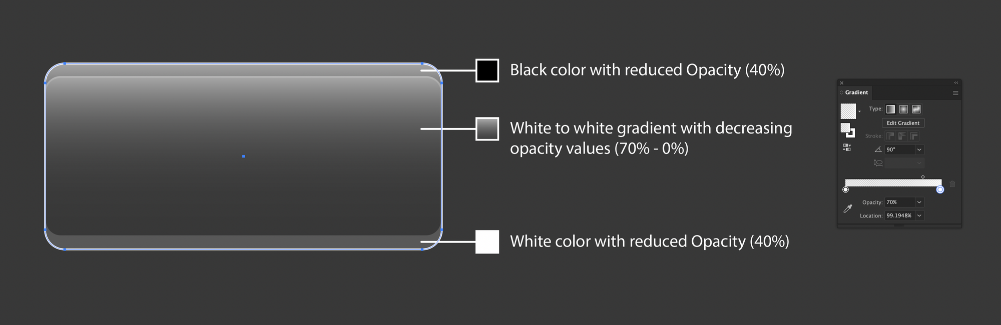
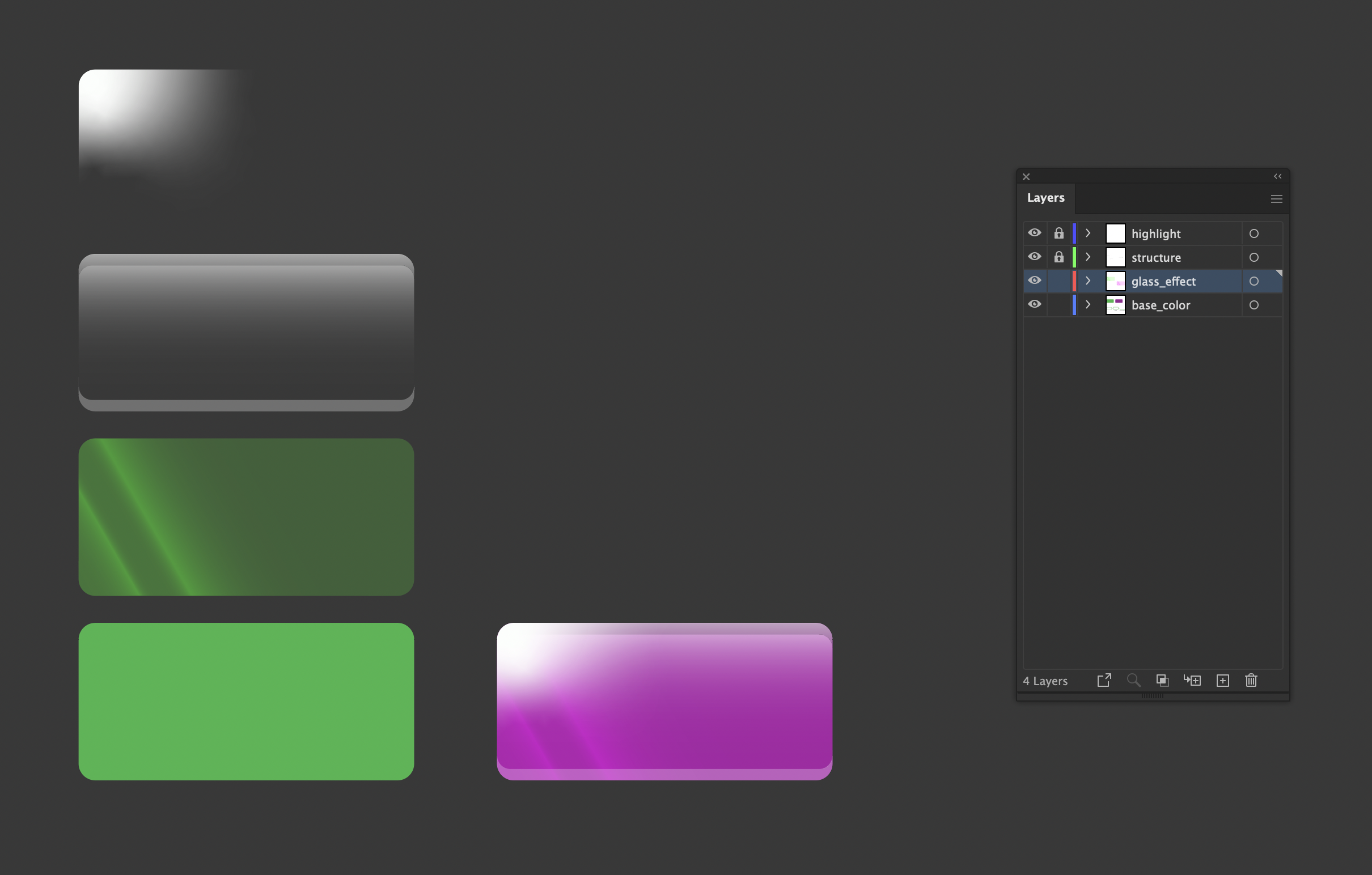
To create a 3D-like tactile feel we will create 3 different layers with reduced opacity; the top and bottom shape that emulates the thickness of the glass. For this, we use the duplicate(Click+Alt+drag), paste in front (Command+F) and subtraction using the Pathfinder tool. The extracted shapes are placed at the top and bottom of the button.
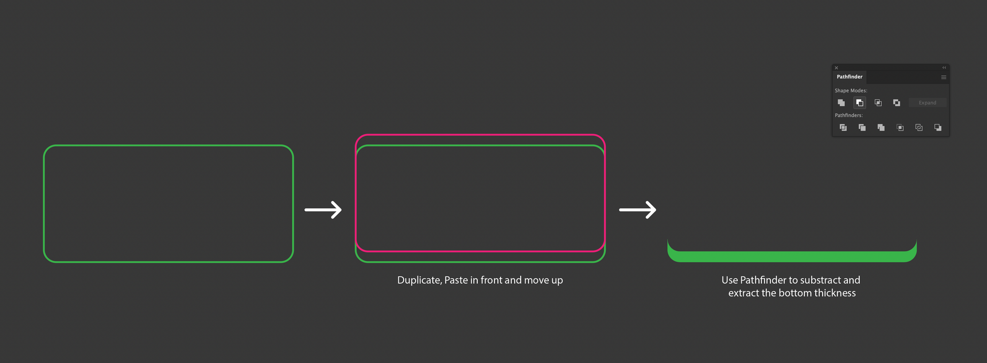
Making of the structural layer requires the same rounded radius of the top and bottom of the rectangle.
Since we want the shapes to have a semi-transparent property we use gradients and reduced opacity. When all the layers have stacked the colors and shapes at the bottom will still show up.
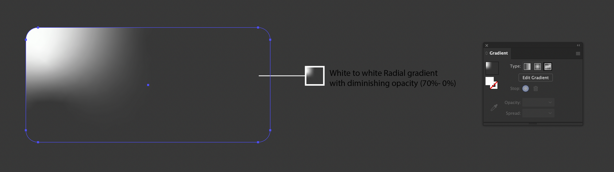
Highlight Layer
This layer specifies the source of light. Using radial gradient creates a similar lighting effect in nature and also maintains consistency if you create a set of buttons with the same style.
Organization of Layers
Having each object or effect on a separate layer will be helpful to select and bring changes with ease layer. Suppose you want to change the base color of the button you can lock or hide the other layers on top and work on the base button while maintaining the placement or alignment of each shape.
Organized Layer names according to the effects or objects helps you to navigate and modify in the future.
When the layers are stacked on top of each other selection of layers beneath will be a tedious process of clicking, instead select layers and hide or lock it.
Lock several layers and change the property of the ones you want; in this case the base color layer and the glass effect layer.
Thank you for reading till the end. More articles on Illustrator are on the way.