
What is Gestalt Theory?
Gestalt is a set of rules to explain how the human brain groups smaller objects to form larger ones. Devised by a group of German scientists in the 1920s, it roughly means 'configuration' in German and suggests that the "whole is different than the sum of its parts".
The human brain always tries to make sense of the world by comparing previous experiences or visual patterns and connecting the dots. It has its particular way of perceiving shape and form, grouping information, and filling in the gaps to draw the big picture. It is also known as Perceptual Organisation.
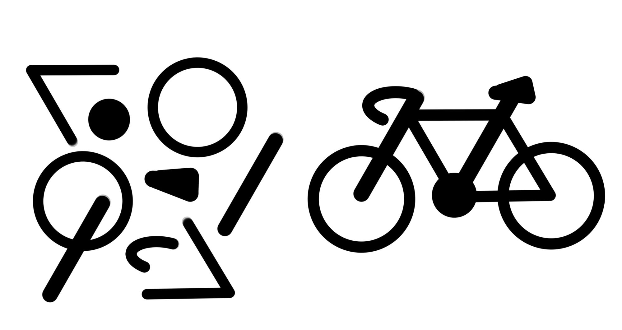
Think of a set of wheels, gears, handles, saddles, chains and frames. Individually it is difficult to make sense of how they work but once arranged and fixed into a bicycle, it becomes a functioning mode of transportation.
Useful Gestalt Theories for Designers
There are numerous theories of Gestalt, from which there are 6 basic principles relevant to interface designing.
1. Law of Proximity
Nearness or close spaces between elements tend to be perceived as related. For example, the home screen of the iPad OS consists of a LaunchPad where most used Apps are placed.
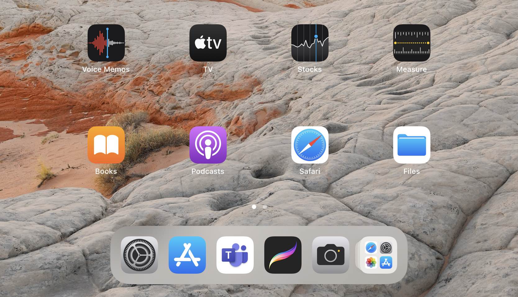
When objects are placed with similar or the same spacing, it immediately draws the eyes' attention, and they are conceived as related. Moreover, this type of layout helps the brain easily recognise closely spaced apps as being from similar categories and helps in quick decision making.
2. Law of Similarity
Elements similar to each other tend to be perceived as a group.
Similarity can refer to any feature, including colour, orientation, size, shape, texture, or function. Once again, the home screen of the iPad OS displays a good example of this principle, using varying sizes and positions of the app and widget icon boxes. The different sizes of the boxes help distinguish between Apps and Widgets.

3. Law of Continuity
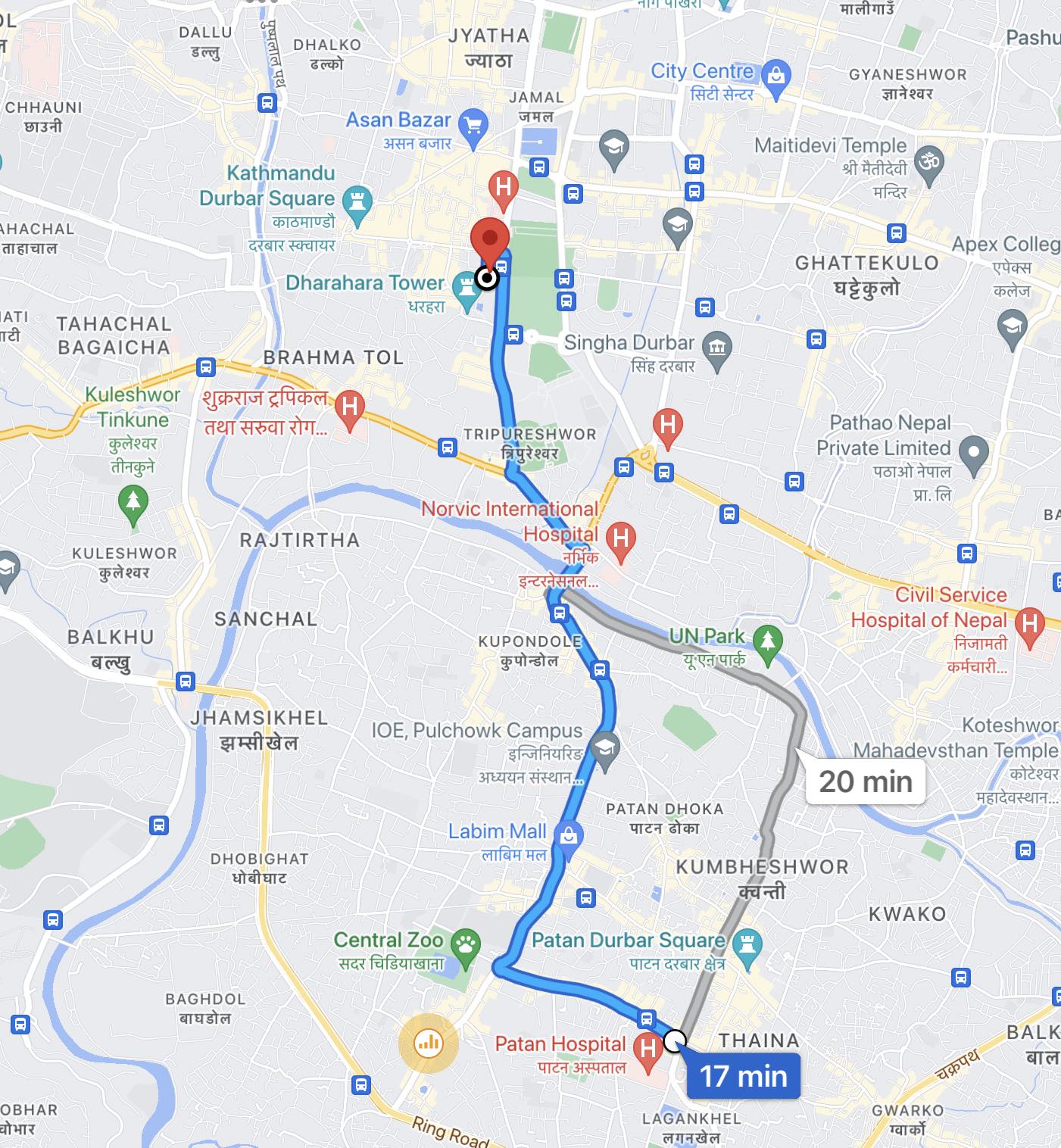
This principle states that elements arranged on a line or curve are perceived to be more related than elements placed out of line. This is because our eyes are naturally designed to follow anything that shows a linear property.
Maps are great examples of various gestalt theories. In this case, the complex road lines are categorised by thickness and colour, making it easier for the eyes to navigate directions.
4. Law of Common Region
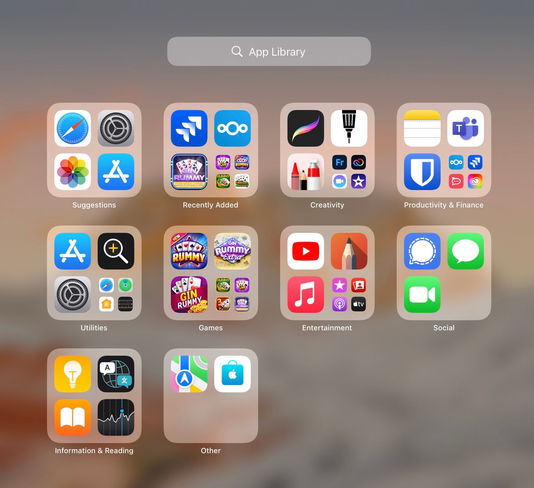
Elements grouped in a closed region are perceived as related or belonging to the same group.
A good example would be the categorisation of apps found on the home screen of Apple OS or iPad OS, where apps with similar functions are placed within a box to help with categorisation and navigation.
5. Law of Closure
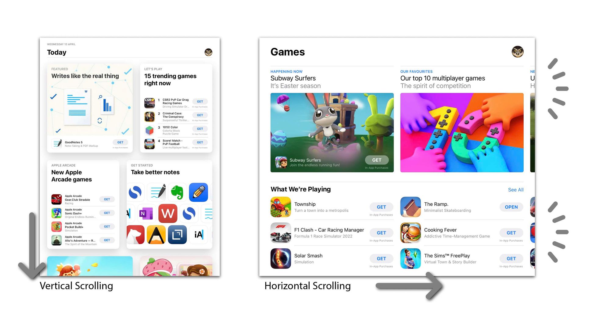
When an object is incomplete or not entirely enclosed, the human brain will subconsciously complete or enclose it, given that there is enough information. It is also used for indicating how the action or visuals concludes, like punctuation in writing.

When designing websites or an interactive page with a lot of content, it is important to let the user/viewer know where or how the flow of content ends. Carousel designs make use of this principle well, where the upcoming contents are partially shown to give the users a clear direction of upcoming content. An example of this is the App Store, which utilises this principle to indicate scrolling directions
6. Law of Symmetry and Order
Also known as the law of Pragnanz (precision in German) or the Law of good figure, consistent shapes and well-designed figures automatically gives a sense of aesthetics. Some of the most recognisable logo marks or icons use this principle for their simplicity and memorability.

The human mind perceives objects as being symmetrical and forming around a centre point, which is easier to process for the brain.
Keeping these basic theories in mind can help you design a cleaner and more efficient mobile interface, from the placement of buttons to appropriate image sizes.