
CONTRAST
Science of Colours could be incredibly complex; it involves knowledge of physics, biology, psychology, art and design. However, digital colour theory differs considerably from theories based on pigments occurring in nature and not all colours can be reproduced even on modern dial displays. RGB values and perception are different when you throw in the variability of display devices.
The main function of colour in a game design is to make visual elements easily identifiable and ultimately eases the navigation process for the player/user.
The contrast effect is the most useful way to make texts and visual elements to be legible or more recognizable for the human eye. It is an unconscious bias that happens when two things are judged in comparison to one another, instead of being assessed individually.
Simultaneous Contrast effects:
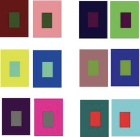
Also known as the Bezold effect named after a German professor of meteorology, Wilhelm von Bezold (1837–1907) the optical illusion occurs when substitution of a single colour causes every other color in the design to shift in relationships. The Bezold effect and ultimately bring change to scale, energy, colour dynamics and desired effects by changing one colour in the palette.
When complementary colours are placed directly together; the colour seems to appear more intensified when put together with other colours. This effect can be diminished by using black, grey or white outlines or separators. Such contrasts are useful to create or replicate fast-paced, passionate or violent feelings.
A large area of dark/heavy colours is balanced with a small number of bright colours. Bringing focus on to a particular area or element requires a contrasting colour of both value and saturation.
Application of this effect is very useful in interior designs where the nature of the colour is altered according to the adjacent colours that are in the surroundings. Pilot controls are also designed with this theory in mind to make certain colours/ indicators more recognizable in order to reduce errors.