
What to consider when selecting font family or combinations for any mobile display app or game? This article tells you the process and design principles thought for while selecting a font family or a combination for a mobile game or an app.
The use of one font family is considered to be the safest yet the best way to maintain a sense of wholeness or unity. Selection of a particular font family is done considering its flexibility: modern UI/UX based on mobile phones rely on fonts adjusting by themselves when transitioning from varying displays. Font family consisting of a wide range of weights, variable optical sizes are favoured. It helps to maintain consistency throughout the layout of the display yet can create significant contrast and tidiness. This help in transitioning from different displays with different resolutions; moreover it helps create a hierarchy with different thickness or weight from a single type family.
SF pro is a great example of modern typography used in all of the Apple devices today. Its Sans Serif font family has a clean yet very flexible variant of over 150 languages. It has considered facts of different panels/screens and title/body text and language localization for various apps and games. Inspired by Helvetica and DIN typeface often used in road signs; an area that requires legibility and clarity; at the same time adaptable to different spaces and sizes. Often described as neutral and flexible.
SF pro was first introduced in 2015 replacing the long-used Helvetica Neue for all Apple devices; came out with the introduction of iOS 7. It was designed to have more clarity and legibility on digital displays (especially small ones) than on their predecessor.
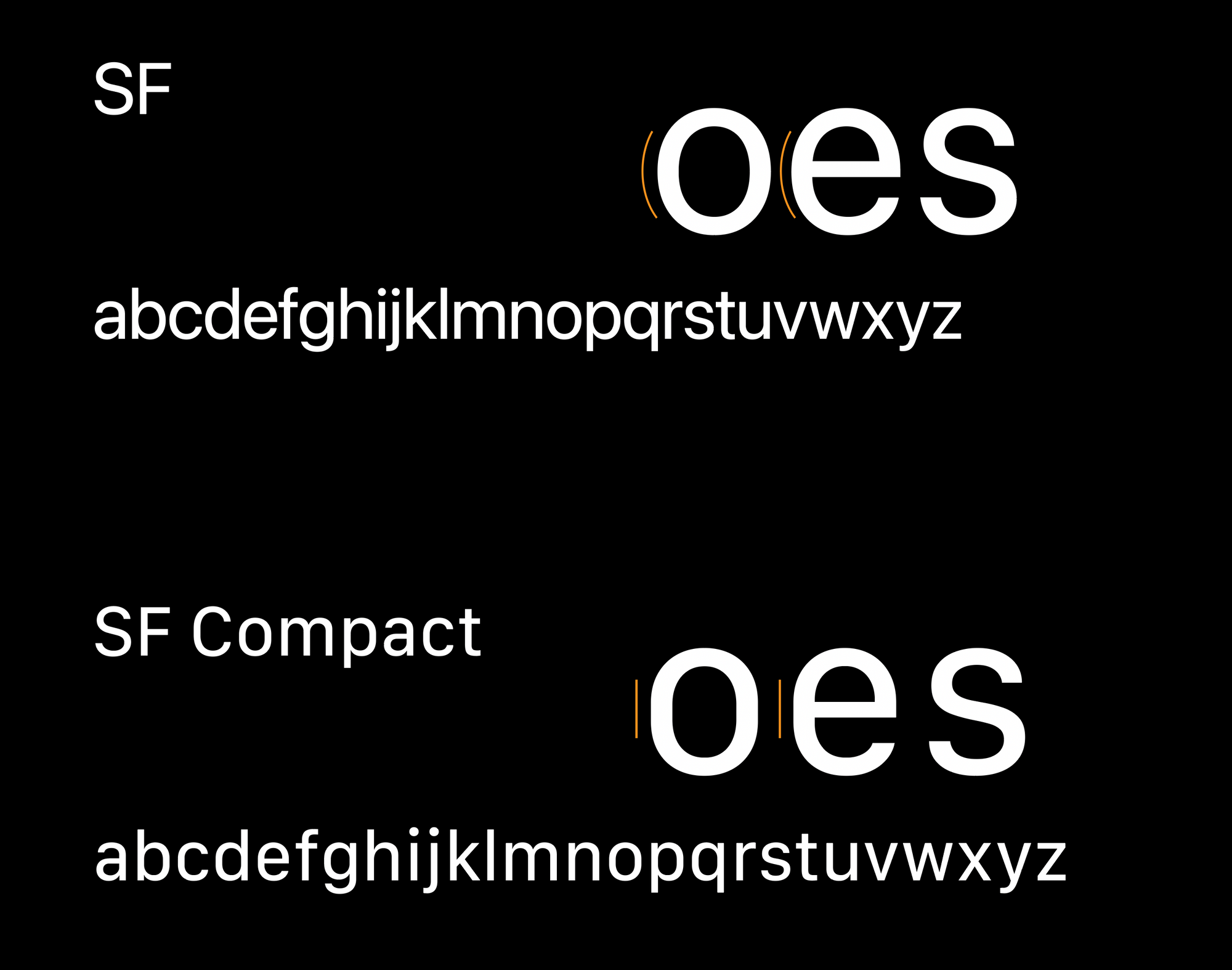
SF pro is compromised of 2 subfamilies: The SF which is used in the iOS, Mac OS and Apple TV, and the SF compact which is used in Apple watches.
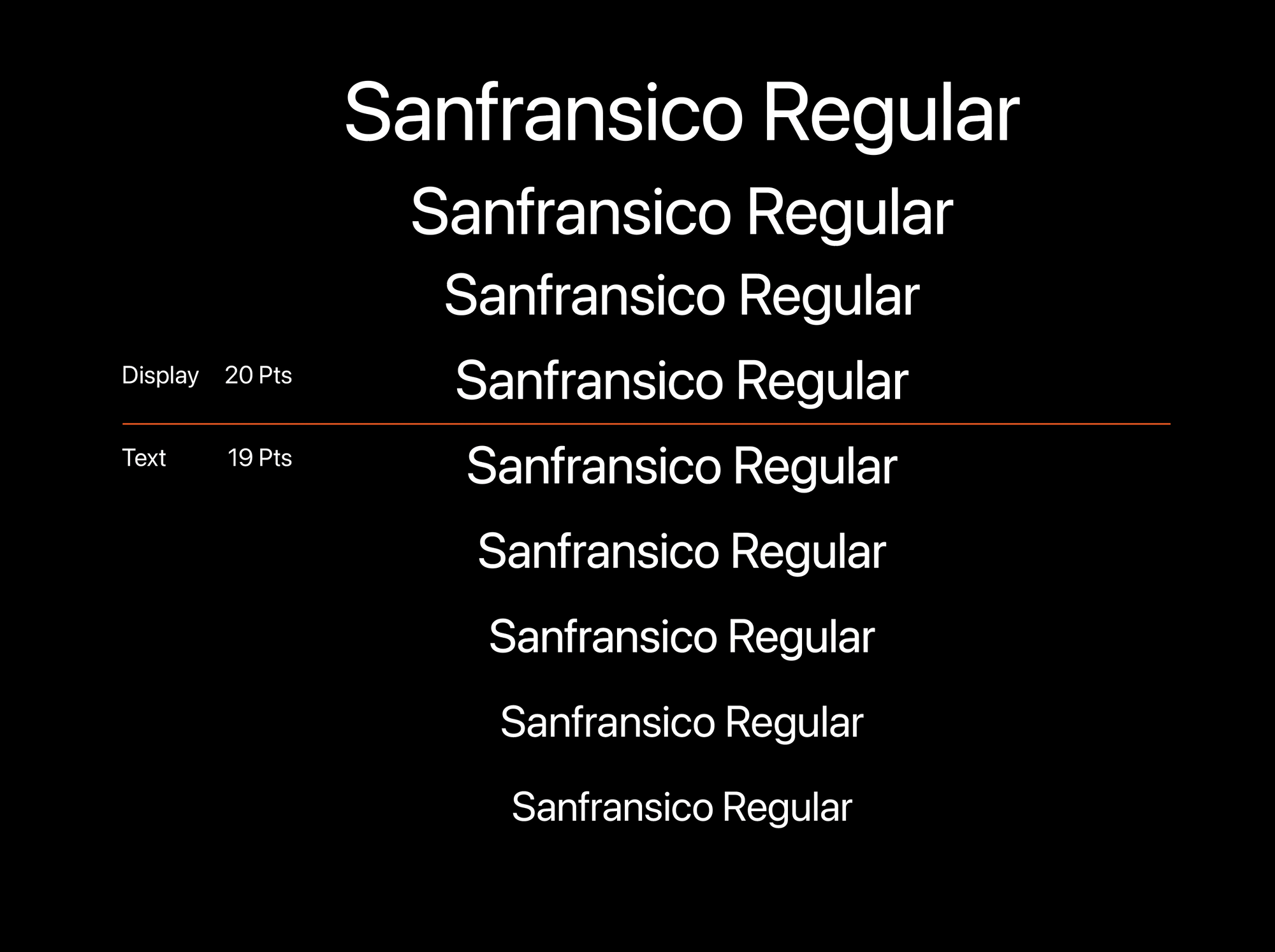
It is a dynamic font that automatically switches Optical sizing and Vertical Spacing according to the size of the font.
The font family automatically switches to Display to Text format under 20 Pts for better legibility.
Graphic designers working in Adobe Illustrator or Photoshop must consider this aspect while using the text for design; expanding/scaling up or changing type settings from a small font size may give different results.
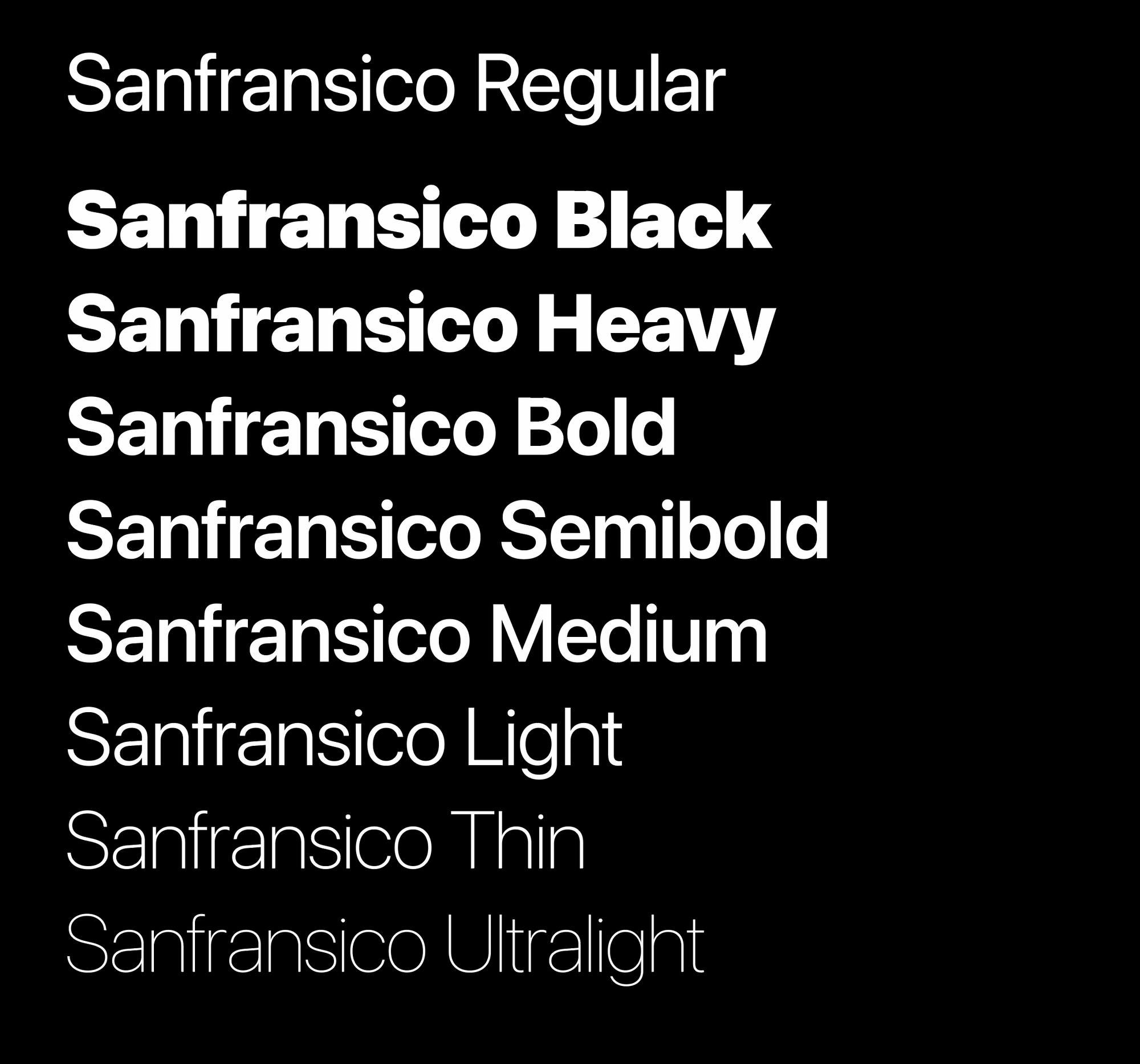
The SF pro text version (1-19 pts) comes in 6 different weights; whereas the Display version has 9 weights.
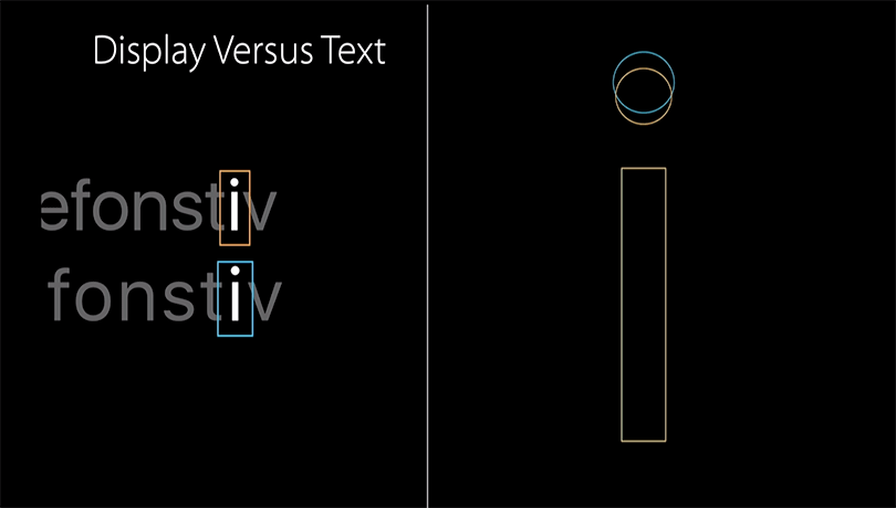
For example, the display font has more spacing in between letter components compared to text format where the components are closer together an example: letter i
Today when designing an app for smartphone display understanding the typographic terms such as leading and tracking/ kerning are vital. Optical alignments according to different fonts may give different results.