
A Brand guideline or a style guide is a collective document consisting of the company's identity and clearly defined rules to help the business maintain consistency in various mediums where it has the opportunity to communicate and stand out among other businesses. Generally, it is a collection of rules regarding how the brand or company wants itself to be demonstrated to its audiences or in public.
Using a Brand Guideline
This brand guideline or manual is useful especially for designers or students to learn how a brand or a company maintains its identity through specific visual elements. If a newly hired designer works for a company with an established set of visual guidelines, it will drastically reduce the time and risk for further branding or promotion of that particular company.
Ultimately it is a textbook for any in-house designers to refer to. Moreover, it could also be an educative material for art and design students.
Making a Guideline
While making a guideline, there is no such strict formula to be followed, but depending on the vastness of the business, it may require elaborate guidelines and strategies that could exceed hundreds of pages.
A brand guideline usually dictates the proper use of logos and their colours on blogs, websites, advertisements, and similar marketing materials. The guide helps maintain recognition thoroughly.
A typical visual brand guideline consists of:
- Brand Story
- Logo Guidelines
- Brand Colour
- Brand Typography and Font
- Brand Imagery
- Brand Stationery
1. Brand Story
This section introduces the company, where it shares its vision, mission and personality. It is usually a summary of what the company believes in and will serve as the base for all the marketing strategies.
2. Logo Design
This is a manual for the main logo image(s) and its specific construction methods. Angles, ratios, shapes, specific font family (if used), and other geometric properties should be considered to clearly show how the logo can be replicated (if needed).
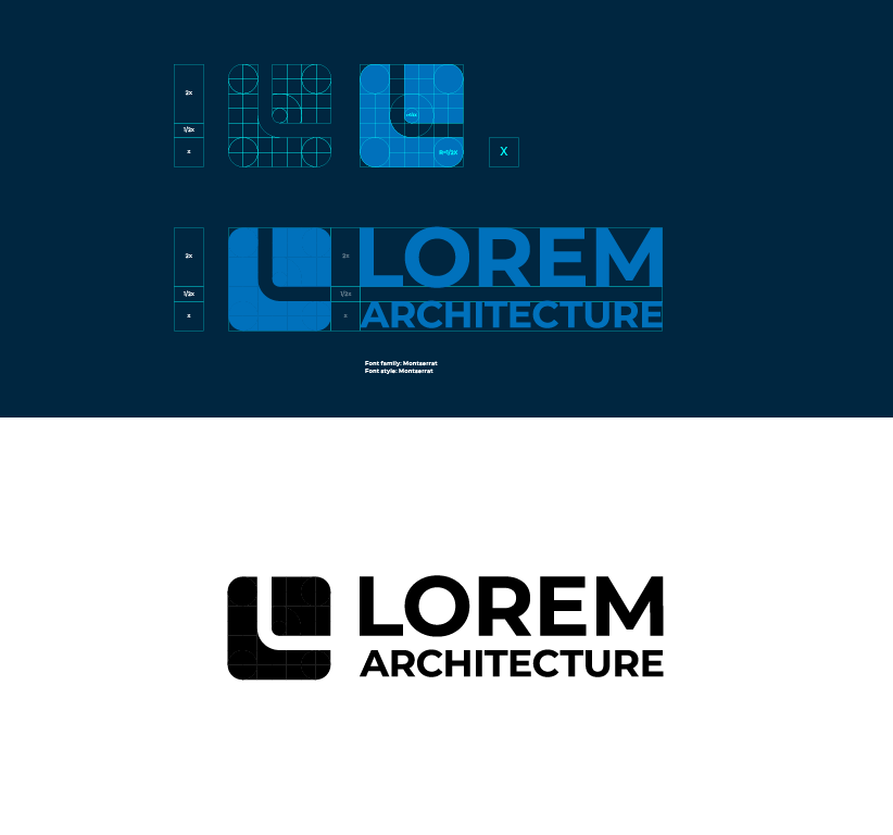
2. a. Logo Variations
This section will include all the different logo arrangements (horizontal, vertical, diagonal, etc.), colour variations, and other specific visual styles depending on your placement (colour and images).

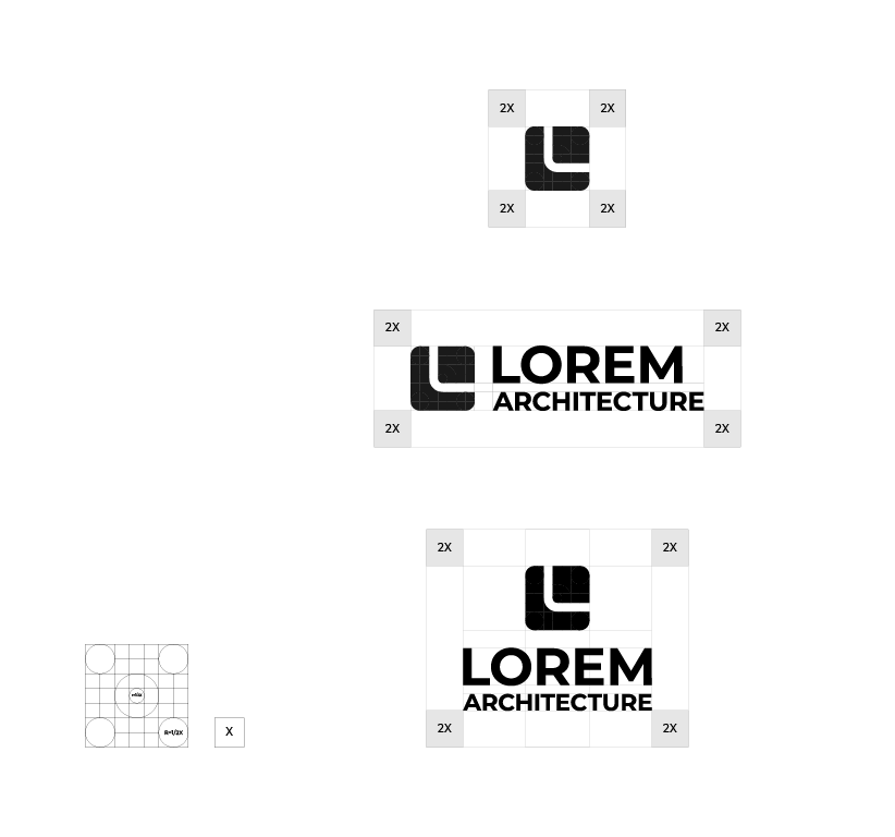
2. b. Logo Spacing
This section shows the spacing required when you place a logo on any medium; the minimum requirement of margin around the image to be considered while placing it for print, online, or any other product.
Margin measurements are usually taken from elements of the logo. Ratios of these elements are used as specific units and simplify the process of placing them.
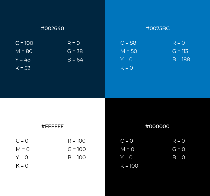
3. Brand Colour
A Brand Colour is a specific palette used by a company which makes them recognizable and relative to the tone or voice that represents the brand's personality. Guidelines must include HEX codes, RGB and CMYK values for display and prints, respectively.
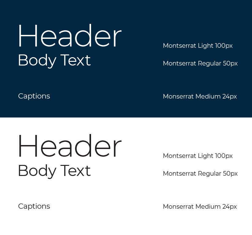
4. Brand Typography
Specific font families, font styles, sizes used for web and prints, colours and usage in ant text material fall under this section. It is the company's most important communication element, so it should be thoroughly sorted.
Creating a rule for text such as header, body, subtitles, and caption should be elaborate; specifying the correct style and sizes can maintain legibility, readability and recognition.
Some important things to note regarding typographic designs are:
- Body text size for desktop displays the Font sizes should be around 16px to 18px for ample legibility.
- Mobile display text requires a point size of 16px, but Google Material design has a minimum requirement of up to 14px for body text and 15px from Apple.
- Headings should be roughly x2 or x1.96 larger than your body text to create ample contrast. This would mean that if you use 14px for body font size, you will use around 28px or 27pxfor headings.
- Font Style sets the font's weight: regular, medium, bold, and italic are the fundamentals. This helps create contrast within the use of the same typeface in different places.
5. Brand Imagery
These include a set of icons, characters/mascots, photographs/pictures, or any relevant visual component to the brand. It is the part where you can showcase the logo in different situations, such as colour and images.

It is also very helpful to include a Do's and Don't section for this section to specify the correct and incorrect use of the visual components. For example, a white-coloured logo placed on top of a bright colour or image reduces contrast, so any company should avoid it.
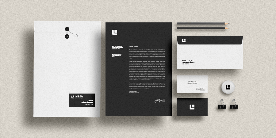
6. Brand Stationery
This section consists of designs of Business cards, letterheads, envelopes, merchandise, signage designs, etc., in the form of digital mock-ups or physical prototypes (photographs). These sections should be able to collectively present the use of all visual elements used on various mediums/products according to the guideline and give a glimpse of what the final product could look like.
While presenting a brand guideline, it should ultimately be able to communicate the look and feel of the company effectively to the client. A visual brand guideline can holistically dictate how the company runs its campaign and projects if planned and presented well.
Thank you for reading. Consider subscribing with the buttons below to not miss out on the latest DevBlog articles!