
What is Colour?
Let's start with the most basic question. What is colour, and why is it so important to us human beings? This question is not as easy to answer. For all we know, colours could be an entirely subjective experience.
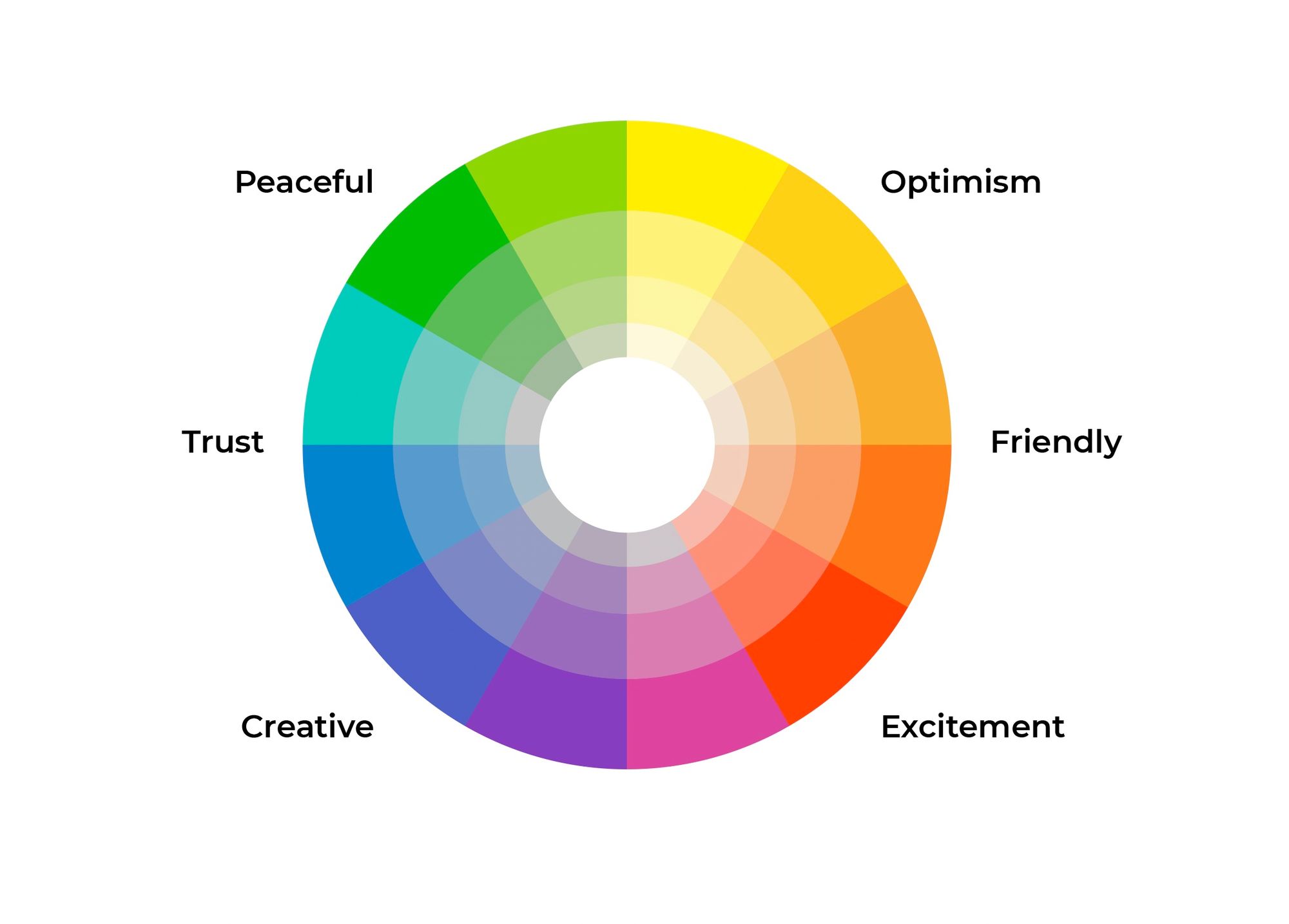
We, as human beings, have a visual response to light; we depend on the nature of the light to make decisions from prehistoric times to the modern age. How we see a certain colour being used usually dictates its effect on us.
- Red is normally associated with danger or blood. It is also a colour of galvanic skin response such as blushing and irritated skin.
- Green and Yellow colours help distinguish between ripe and unripe fruits, which came to be useful for survival and agriculture.
- Another prominent colour combination is Black and White. Every culture has mentioned the colour black and white, or dark and bright. It is thought to help distinguish between night and day. Today the colours black, white and grey are usually considered neutral and are associated with professionalism and minimal identity.
... and so on.
So, it is important that when we design graphics for any company, we consider finding the most appropriate colours that associate with the brand's message.
Combining Colours
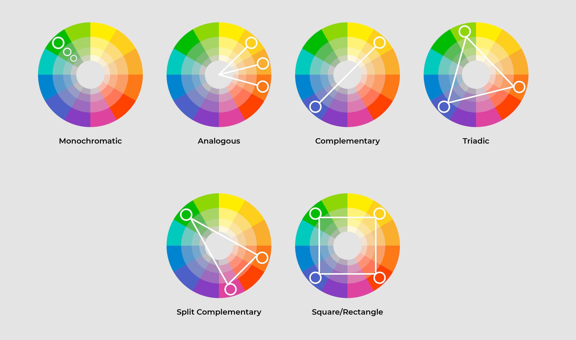
Colour combinations are quite difficult to pull off. Looking at something with two or more types of hues can be difficult for the eyes. This is why designers use colour combinations found in colour harmonies instead of selecting colours randomly.
Colour harmonies come in different types. For example, Monochromatic, Analogous, Complementary, etc., are harmonies that describe the relation between colours on the colour wheel. These systematic colour combinations can be useful for understanding the nature of the combination; however, this does not necessarily mean that they always go well together.
Warm and Cool Colours
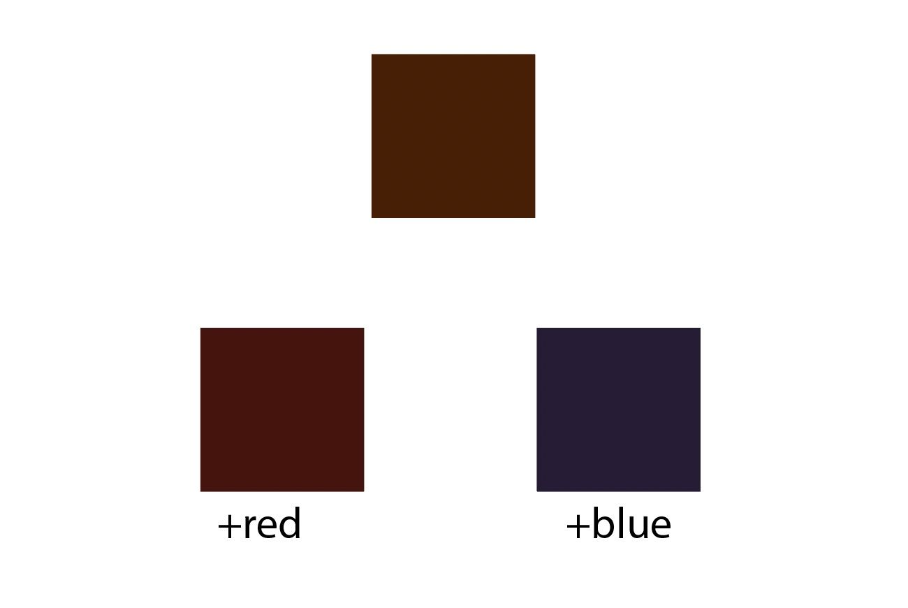
One way to find a working set of colours is by distinguishing the Warm and Cool colours. Warming colours usually have a red hue as the base, and cooler colours use more blue as the base hue. Combining warm and cool colours with similar base hues creates a visual relationship of how each colour (despite the difference) is related to another.
For example, a darker tone of brown can be created by either adding red or blue to the original hue, resulting in a warmer or cooler colour.
Monochromatic Colours
A Monochromatic set of colours refers to the set of colours with the same hue but varying values. In CMYK, each colour has different values of black (K) or values (which can be a combination of other colours).
Note that there is also a difference between adding value and darkness/whiteness to a certain colour.

Combining Neutral Colours
Another safe yet effective way is to combine one lead colour with a neutral colour. Neutral colours are supporting colours and act like a supporting cast for the leading colour.
Black, white, grey, and brown are usually considered neutral. These combinations help one or two colours stand out without overpowering them.

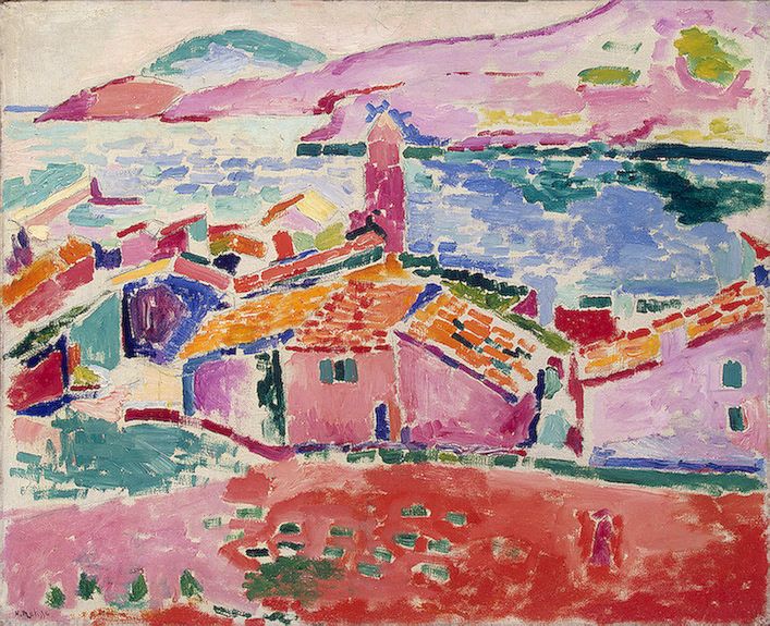
The great master painter Henri Matisse explored complex colour combinations in his paintings by using strong primary and accent colours juxtaposed with neutral colours. The introduction of neutral colours, close to black, grey, or white, automatically balances the strong colours within a composition and makes the harsher tones soothing and easy for the human eye to look at.
Balance
To get a soothing colour combination, colour balance is key as well. Think about a "symphony" of colours with an "instrument" percentage ratio of 60/30/10 for primary, neutral, and accent colours, respectively.
This balance ensures that each colour is used as much as its role, which helps every colour do its job properly in the overall image.

Contrast
The contrast between colours plays an important role too. It is always recommended to compare the value of hues on greyscale first.
The use of greyscale, or changing the value of HSB (Hue, Saturation, Brightness), CMYK (Cyan, Magenta, Yellow, Black) or RGB (Red, Green, Blue) and other colour interfaces can be used in image editing software like Adobe Photoshop and Illustrator.
Low contrast can push your viewer away, especially when typography is involved in the design. It is very important to start a composition in grayscale before picking the exact hues you like.

Ultimately, colours are still subjective, so explore and make your own rules. However, there must be a sense of consistency that the viewer can recognise if you want to replicate your colour combination.
Thank you for reading. Consider subscribing by pressing the subscribe button to get these articles directly in your inbox!