
Introduction
Brand colours are probably the most significant part of shaping a brand identity. The carefully chosen hues are responsible for not only defining the aesthetics but also emotions and values and creating associations with the target audience that resonate. Consistent use of the brand colours also boosts memorability and recognition of a brand.
We must first understand colour psychology to understand how brands can use different colours to establish their brand identity. It is, however, a topic that can be studied in great depth; for the purpose of this article, we are going for a surface-level sweep through the whole topic as follows:
Understanding Colour Psychology
Now that we understand the significance of brand colours, we need to understand the basics of colour psychology, which is the study of how different colours affect human behaviour, emotion, and perceptions. Understanding colour psychology and its impact on the brand's audience can give helpful insight into building a successful brand.
Different colours evoke different distinct feelings. For example, red can signify passion and energy, while Blue can signify trust and reliability. When integrated correctly, brand colours can help a brand to stand out.
Most of us might already be familiar with the concept, as it comes intuitively to us. Following is a basic breakdown of the primary colours.
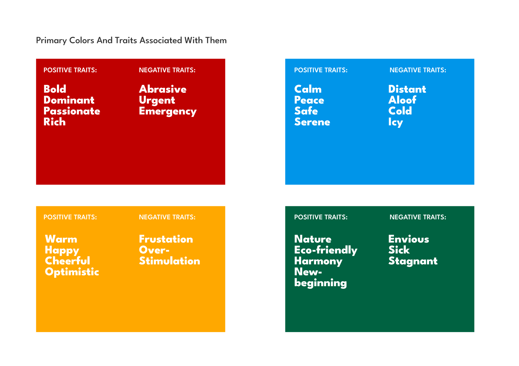
Red:
Red is a powerful and dominant colour. It is associated with energy and passion. Red always stands out and is very attention-grabbing. In branding, it can evoke a sense of excitement and confidence. However, since it is a strong colour, too much Red is not the way to go, as it can be abrasive and urgent. Red is mostly used by brands in the food and beverage industry.
Blue:
Blue is associated with a sense of calmness, peace, and stability. It is also linked with feelings of tranquillity. Since many people like Blue, it can be considered a conservative and safe colour.
One can play around with various shades of blue while choosing brand colours. However, too much Blue can also be linked to loneliness or being distant and cold. Blue is primarily used by brands in the healthcare, finance, or technology sectors.
Yellow:
Yellow is a bright and warm colour, and as a result, it is associated with positive emotions like happiness, optimism, and creativity.
You might be tempted to use a ton of yellow, but since it is quite bright, it reflects a lot of light, making it difficult for people to read or look at it for a long time. It can overstimulate our senses and can also increase frustration. Most brands, therefore, lean towards a warmer yellow than pale yellow.
Green:
Green is abundant in nature and is associated with nature, growth, new beginnings, and harmony. It also conveys a sense of being eco-conscious and a sustainable ideology that is environment-friendly.
However, darker and less saturated shades of green are also associated with being sick, stagnant, and envious.
Here is a chart I made based on my research to give a quick overview of the positive and negative traits associated with the primary colours:
Colour Psychology in Action: How Popular Brands Do It
Now, let's move on to some examples of popular brands that have successfully established their brand colours.
Apple:
Apple's branding is pretty iconic as it combines minimalism with innovation. Their branding consistently puts their product on the main stage and makes the best use of the white space, making the product in display shine.
From the websites to the products' physical packaging, their branding choices are mostly monochromatic, with dominant sleek grey accents. It exhibits simplicity and cutting-edge technology. That also reflects their company values of clean and user-friendly product interfaces.
Starbucks:
Starbucks has also done a great job with the iconic green and white colours in their logo. Starbucks' iconic green is central to its identity. The earthy green signifies the brand's commitment to ethical sourcing and suitability. It creates a sense of trust and responsibility in the minds of consumers.
Besides the green and white, they also use Black as a secondary accent colour in their website and packaging. It adds a sense of luxury and sophistication to their brand, making the consumers feel like their coffee is a premium experience.
KFC:
KFC's branding is pretty much their bold Red, prominently used in all their packaging, website design, and physical locations. They also use white and black in their logo and other design aspects as secondary and accent colours.
KFC is not the only fast-food brand to use Red in its branding. Red is a powerful and attention-grabbing colour, making us feel urgent and hungry. Brands tend to use it to stand out, and customers are also more likely to make the impulsive decision because of the bold Red colour.
Conclusion
Choosing the right colour for your brand is perhaps the most significant step in building a brand; it is the most essential part of your visual identity. When done correctly, the brand colours can shape the entire brand identity.
Let's keep that in mind when working on your next design project!
Thanks for reading, and catch you in the next one!