
In the context of UI design, a Component means an element that is used multiple times within the design. For instance: buttons, forms, cards, or other text elements. Such elements are more likely to be used repeatedly and must be consistent throughout. If you want to make certain changes to them halfway down the process, replacing every copy of the same element can be quite troublesome.
So, the component feature in Figma solves that problem by helping us create and maintain consistency throughout our design process.
How Components Work
Components in Figma can be broken down into two objects: the main component and an instance.
Main Component
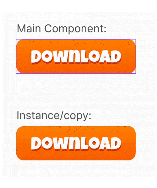
The main component is the original design of the UI element. It defines all the properties of the design element, like the padding, colour, border radius, and text colour of a button.
Instance
An instance is a copy of the main component linked to it. Any changes made to the main component will automatically be copied to the instance. Changing any copy property will unlink that particular property from the main component.
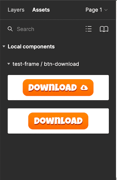
The components created in a file can be accessed by all team members or those who have access to the file. They are stored in the Assets panel. These components can also be shared outside the working file using the team library, which can come in handy when working on a large design project.
Creating a Component
Let's say you have a download button, which will likely be used in multiple places throughout a design project.
1. Creating a Main Component
You can turn any element into a component by right-clicking it and selecting Create component or with the keyboard shortcut ⌘ + ⌥ + K in Mac and Ctrl + Alt + K in Windows.
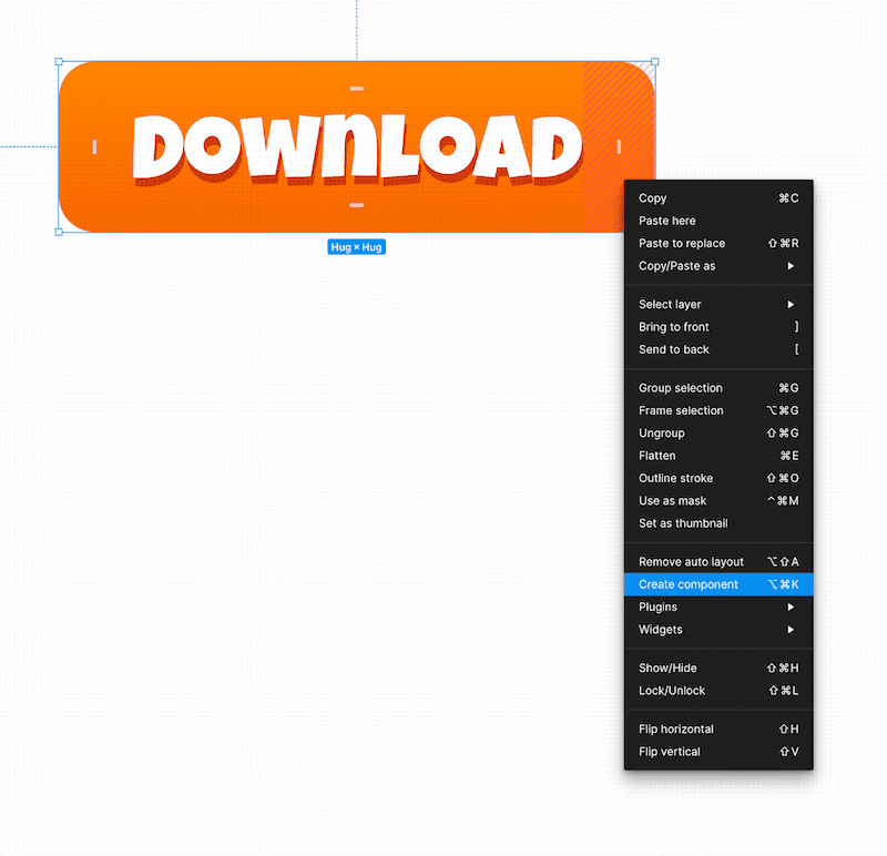
You can also click the Create component button from the top navigation bar.
2. Creating an Instance
Now you have a component! Make a copy of the button with copy and paste or Alt + Drag to duplicate it.
You can now use the instance of the button throughout your design and update the button as much as you want. If you make any changes to the main component, the changes will automatically be copied to all the instances.
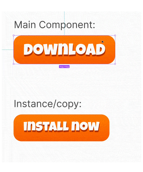
The parent-child link will copy all the property changes, but once you change the copy of the instance, the specific property change will unlink.
Say you have changed the button text; the changes to the text property of the main component will no longer be copied to the instances. All the other properties will still transfer over to the child instances.
You can also detach an instance from its component by right-clicking the instance and selecting Detach Instance. The detached instance will no longer copy properties from its parent component.
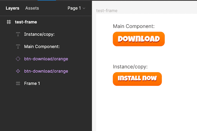
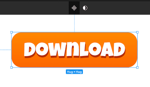
You can see if an element is a component with the component sign in the layers panel. A component and instance will be shown with a purple colour in the layer panel and a purple outline in the document.
The four filled squares in a diamond shape indicate a component, and the outline only square indicates an instance.
Instance Swapping Property of Components
The Components Feature can also create and manage multiple variations of the main component so that an instance can swap between different component variations.
Although Figma has another feature called Variants that helps make variants with much more functionality, simple variations can be handled with components. However, if there are many features within an element to make variations, Variants are better than components. Variants are also better for interactive content.
Creating a Component Variation
Say, for instance, you need to have two variations of the download button. One with an icon and one without an icon. After designing them, you can use both of them as components.
To make variations, you must rename them according to Figma's convention. Figma uses the slash naming system to organize the components.
Each \ in the name of the component in the layer panel will create a new hierarchy level. This makes it easier to navigate the Assets panel and the Instance menu.
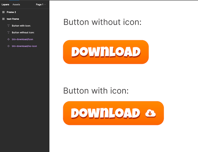
I have named the buttons btn-download/icon and btn-download/no-icon. So any instance of these components can swap between these two components based on the property after the \. The components are organized in the same hierarchy in the Assets panel.
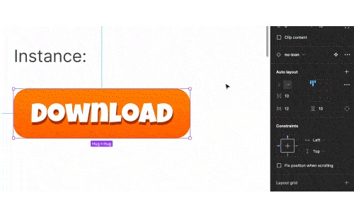
The instance swap can be done via the instance menu on the Design panel. After you make an instance from any of the buttons, you can check its Component menu on the Design panel. You will see a dropdown button with variations of the components.
This way, you can easily swap out the instances with components.
Components can achieve more functionality; these are just the basics. But it should help you get started!
Thank you so much for reading! Consider subscribing and leave a comment below.